HOME | DD
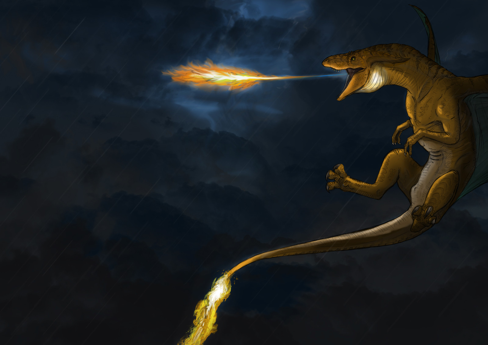
 JoshuaDunlop — Charizard (Better fire?... dunno)

Published: 2014-02-02 20:34:13 +0000 UTC; Views: 6457; Favourites: 229; Downloads: 0
Redirect to original
Description
RedoRelated content


Comments: 30

I love the fire in this one
Plus, the shadow work is perfect with it
Excellent
👍: 0 ⏩: 1


It looks better on the tail, but personally I think the last design for the fire breath was better  (Smile)")
👍: 0 ⏩: 0

I liked the last one better. It blended better with the rest of the picture. In itself the fire is nice, though.
👍: 0 ⏩: 1

Yer I know what you mean
👍: 0 ⏩: 0

I like that the flame is larger and brighter.
👍: 0 ⏩: 1

Nah, the fire looks almost like a 3D render cut and pasted from a screenshot. I love the fire on the other version.
👍: 0 ⏩: 0

Unlike everyone else, I like how the fire looks in this one. I think it fits pretty well. I like that it's brighter so it contrasts more with the darkened surroundings
👍: 0 ⏩: 1


Hmm...I'd have to say that I like the vibrancy of this version, but the painterly style of the original. I'm not 100% how to do this without experimenting myself, but I'm sure there's some layer styles you can add to the original to make the fire pop more, and perhaps make it bigger like this one too? Maybe a combination of a few styles.
Overall I like what you've done with this evo set <3
👍: 0 ⏩: 0

I think you need to shape the fire more like this, but drawn like your other edit.
👍: 0 ⏩: 1

This fire to me does not fit the style of the rest of the image, and to be honest it looks more like an explosion cloud than fire. I'm not saying that you actually did this but the weird style difference between the fire and the rest of the image makes it look you just photoshoped in the fire from another source. Again I've seen your work and I'm not saying you did that, but that's the way it makes it feel.
👍: 0 ⏩: 2
To be honest, this was just a test, not a final piece, but it seems people like the original better
👍: 0 ⏩: 0

Hngh! As much as I hate to say it I agree with you on this one. It almost looks like the fire is photoshopped in and seriously does not fit the style of the picture at all
👍: 0 ⏩: 0

The fire is better, but now it doesn´t fit in the picture
still a good job
 (Wink)")
👍: 0 ⏩: 0

I like how bright this one is, but I kind of agree that the fire doesn't fit. It's almost too realistic compared to the charizard. Looks awesome either way though.
👍: 0 ⏩: 0

This one looks more realistic and powerful then the last one.
👍: 0 ⏩: 0

Nah dude, the other one was much better.
The fire here on this one doesnt go well, and the lightning and naw man, overkill.
The one right before this is DEFINITELY the bomb.
👍: 0 ⏩: 1