HOME | DD
 jugga-lizzle — Conclude of an Evening v2
Published: 2009-01-13 01:49:20 +0000 UTC; Views: 6807; Favourites: 81; Downloads: 1197
Redirect to original
Description
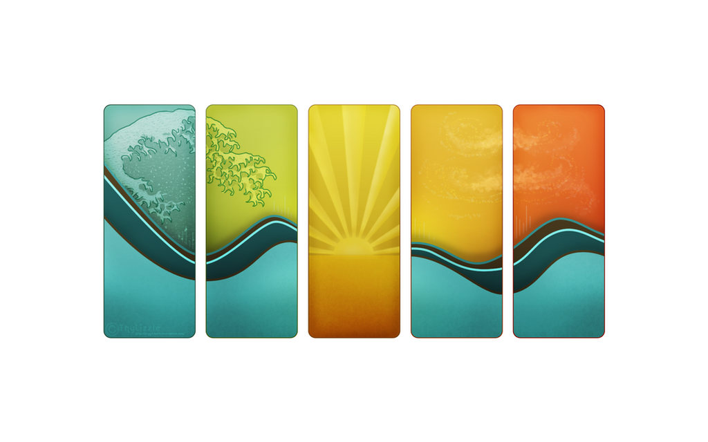
Original is 1920 x 1200.This is a "simple" version of my newest wall [link] minus all of the BG imagery. There was a part of me that, at the end, felt like all of the other things didnt fit as well as they should. And instead of adding this that and the other thing to tie everything together I decided to try out a simple version with a simple white BG. I like it. Thought it would be a good second version for anyone who might also feel the same as I do

 If you download, please comment/fav!
-----
-----
© !Do not redistribute, or repost my images on other sites! ©
Related content


Comments: 20

")

the other one is pretty, but i prefer this one--i think the lack of background looks clean, simple, pretty. beautiful either way, though. nice!

👍: 0 ⏩: 0

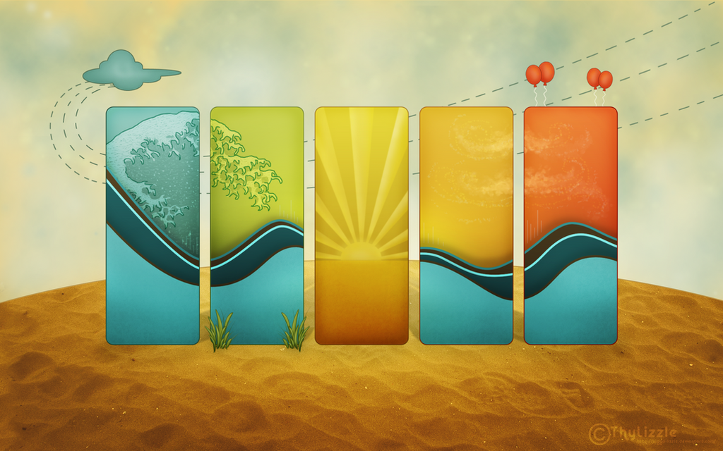
its gorgeous! i love the hokusai wave reference ^^
perfect for a background. not too plain and not too cluttered. juuuust right
")
👍: 0 ⏩: 1

Thank you very much!
I also enjoy this version for those reasons, not too plain, but not too cluttered either ^^
👍: 0 ⏩: 0

Hi! Your deviation is featured in our new article!
[link]
👍: 0 ⏩: 1
Oh my, Im flattered! Thank you very much!!
👍: 0 ⏩: 0

lovely - stylistic and simple, and utterly beautiful
 (Smile)")
👍: 0 ⏩: 1


you're welcome
you've deserved it... definitely
👍: 0 ⏩: 0

I like this one better! Don't get me wrong though, the other one isreally good too. I'm just more of a simplicity fan. I think this one would be really good as individual, large prints, hung side by side on a wall.
👍: 0 ⏩: 1
Yea I enough this one better as well, and it looks so clean when its a really small version. Like when I have the thumbnail view for my myspace default pic.
Thanks for the comment!

👍: 0 ⏩: 1

I think the other one is the better one, this one looks too empty
 (Wink)")
👍: 0 ⏩: 1
For this one I mainly love how the colours and details inside the rectangles stand out a but more.
Thanks for your comments!

👍: 0 ⏩: 0
