HOME | DD
 KestrelWings — Summer Cookout
by-nc-nd
KestrelWings — Summer Cookout
by-nc-nd
Published: 2011-09-26 06:08:12 +0000 UTC; Views: 2505; Favourites: 64; Downloads: 0
Redirect to original
Description
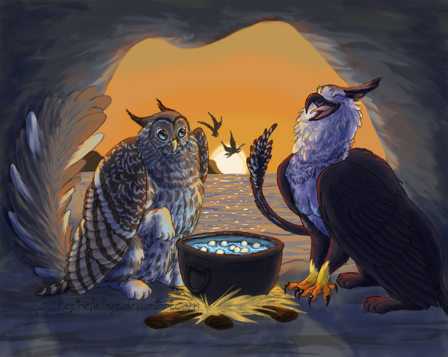
“What’re you doing with that thingamajig?”
Cadence hooted in fright and very nearly dropped the cast-iron pot full of water that she’d been dragging up the rocks from the sea. The pot, which she’d swiped from a human encampment a while back, was her prized possession….Too bad it was just so heavy! “N-nothing!” she stammered as she turned and tried to hide the pot with her fluffy bulk. The other griffon, a harpy eagle mix by the looks of it, seemed to be somewhat older and larger than her, and if it came to a squabble she wasn’t sure how she’d be able to keep her ground. But at least the newcomer wore a friendly smile.
“Looks like one of those human things.”
“Uhhhhh….”
“I love human things! Can I help?”
“…..I guess so? As long as you promise not to tell anyone about it.”
“Promise!”
As it turned out, Zephyr, as the other griffon identified herself, was a huge help and a wonderful (if a tad enthusiastic) companion. Together, the two hauled the heavy pot up to a small cave and set it up with a small fire (something that Cadence had managed to puzzle out how to make after watching the humans do it), then gathered as many turtle eggs as they could find to dump into what Cadence hoped would be a fine soup.
However, this was the first time Cadence had been able to attend the festival in the evening (since her parents had always insisted on going home early when she was younger), and she had no idea what to expect with the coming of dark. So when the sun began to sink and the soup suddenly flared into sparkling blue brilliance she did what most startled owls and cats would do—she poofed. Much to Zephyr’s amusement, and her own mortification. Though she did get back at Zephyr later by eating most of the soup.
~~~~~~~
FINALLY FINISHED~
This is the first background I've painted in MONTHS, and the most complicated one I've ever finished. I have to say I'm rather proud of it, even if I think the griffs' poses are a tad boring. Oh well~
Was SO excited to get Zephyr as Cadence's partner for the Turtle Festival. These two seem to be surprisingly similar in more ways than one. Zee and Cee are gonna be best buds for LYFE. <3
Zephyr is (c) ~Sentinel-Nyx
Cadence and art are (c) me
Related content


Comments: 25

"The secret is the three-alarm chili!"
"Mind if I add Pepto-Bismol to my ration?"
👍: 0 ⏩: 0

Your griffin designs are awesome! I love the expression and the camaraderie captured!
👍: 0 ⏩: 1

First of all, I think you captured a nice moment in time. Even without your tidbit, the image itself seems to tell a story. secondly, I think the lighting here is really nice and you did a good job keeping The character appearing to be in an area of mostly shadow with a strong light source outside.
You said you weren't that fond with the poses, but I actually think they're cute. They have a lot of character to them. I'm not really going to touch on anatomy of characters here as much as I'll touch on "anatomy" of an environment.
So, I pulled your painting into photoshop because I feel I can best explain what I'm going to say with visuals :3 I hope this doesn't bother you in any way.
Now first of all, while I told you that I really liked that you made sure to keep your character in shadows in order to make the outside light source feel strong, I also think that this is one of the elements that you can even push farther! One good method while painting (especially digital, since you can always undo) is to see how FAR you can push your painting. Now, in this scenario, I'm going to entirely care about the atmosphere of the image, and make the characters secondary. I'm assuming that wasn't your intention with this image, but the good thing is you can always take any shadows I've applied to the characters, and lessen them with an imaginary second light (perhaps from the pot) if you so wished.
Now, the first thing I noticed when I looked at this image, is that the silhouetted flying gryphons near the sun actually become the focal point due to them being really dark next to the strongest light source.
This can be solved with atmosphere (which is really you're greatest friend while painting an environment!)
If you're not aware of atmospheric perspective, I'd recommend googling it, and finding some wonderful tutorials on it! This is the shortened version of things:
As items go further back into the distance, due to particles of dust/water/etc in the air, they actually appear to fade until they're almost the same color as the background.
Here's a photo of a real life example of this: [link]
here's a painting using this artisitcally: [link]
What this can do to help you is other than making the image appear more realistic, it can really help you make your viewer's eye look where you want them to look! I'm assuming the focus is supposed to be on the gryphons, so make sure they're the first thing the viewer sees!
[link]
Here I took some orange and allowed it to somewhat cover the mountains and gryphons. Even the darkest parts of the gryphons and mountains isn't that dark due to how far in the distance I assume they are. If you notice, the gryphon main characters are now the first thing you see. I also allowed the sky to darken as it moves away from the sun just to give an overall feel that the sun is setting. This is an artistic choice, though, if you were trying to be less graphic and more natural. There's nothing wrong with choosing to be more graphic, however.
[You can also use this to make certain objects appear closer to the foreground than others. You can even REALLY push it by having superforeground elements (Yeah, that's the actual technical name.) These are darkened, almost black objects super close to the screen that you can use to make your characters feel even more situated in their environment.
[link] <-- this would be an example of some very rushed rock elements used as superforeground.
While that image above is not necessarily a good design decision, you can see how it really creates a foreground, mid-ground and background. Not always necessary, but a really good way to make an image feel more 3-dimensional if that is your goal.]
However, I'm going to ignore those, and return to your gryphon image, and move onto lighting.
One trick I always use when doing any detailed painting, especially one where the lighting itself is important is I frequently test the image in grayscale.
A shortcut to doing this is to create a black or white layer above all your other layers, and set it to "color" It'll make everything below it appear to be in true grayscale and you can use this to make sure your values are reading.
Here's your image if it's placed in grayscale: [link]
The first thing I notice is that without the sun on the horizon, it's hard to tell what time of day it is. You come very close to achieving the full scale of value (from 0% white to 100% black) but you're not quite there. While you don't ever want TOO much black or white in an image, it's always good to be aware of how your lights and shadows may appear once they're set in color.
[link]
This image shows two steps.
Step 1: shadows.
I added a multiply layer and added some shadows over the interior walls of the cave as well as over the inside bodies of the gryphons. You'll notice the tail, which is closest to the sun, is the darkest. This is both because the sun would create a silhouette feel from objects being close, and also so more light and therefore, more focus can be given to the gryphon's faces.
Step 2: light
Here, I did a screen layer, and added some light to the faces of the gryphons as well as key parts that would be hit by the sun. You already did this to the original image, Kudos!! I mostly had to re-add the lights, since my multiply layer darkened everything. One thing is to make sure that any highlights you add are not just a color change, but a lither value change as well. If you refer back to the grayscale of your original drawing (here: [link] ) you'll notice that all of those beautiful red rim lights you added to Zephyr seem to vanish except around the face where it's the strongest value change. It's also nice to make the cast shadows from the gryphons and the pot nice and dark and long! You did them in a very beautiful blue in the image, but it needed to be pushed just a little farther, value wise, to read best!
[link] For reference, here's the new grayscale where I darkened and lightened certain areas. Things already look a little more dramatic.
Now, color:
As you can see, adding in those multiply layers and screen layers while making the image more dramatic do loose a lot of the beautiful colors you were pulling in all throughout the cave. Don't lose that! I'm not sure if you've heard "warm light, cool shadows; cool light, warm shadows" but the basic principle is that with really warm light source, you should have nice cool shadows. Your choice of blues in the shadows of the cave, and expecially on the gryphons is wonderful, and I definitely wouldn't want to see that go  (Smile)")
the good thing with colors, though, is you have some freedom to play around.
[link] there is an image where I did a really fast variations adjustment and made the lights extra warm, and the shadows extra cool. They came out more purple than I thought, but I guess that shows another (one of thousands) of ways you could solve this image.
Now, you don't have to think that what I did (rather fast, mind you) is any better than your original, but it's just me taking steps to make it more dramatic. Now, of course from here, you could always make sure to put more (or less!) focus on the main characters to direct the viewers eye anywhere YOU want it to go.
My last critique will be this:
design.
One thing while designing backgrounds is to try and pay attention to what sort of object you are creating. When I look at this, I can tell the gryphons have feathers, and I can tell that outside of their cave is water. The hay looks softer than that pot does.
Now, when I look at the rocks, I understand that they're rocks, but their textures don't read rock to me. Sometimes it's hard to give the same amount of care to something that seems as mundane as the rocks they're standing on as you gave to the gryphons, but it will actually really round out an image if care is given to every piece. I actually love painting rocks, myself, and probably stylize them too much, but they're really super fun once you start taking a look at them.
[link]
[link]
[link]
[link]
There's thousands of types of rocks, and due to their strange jaggedness, thousands of ways you can play with your line to make something feel like rock (and this of course goes for any bg material). Even as a secondary element, I think it would have added a really nice touch if the mouth of the cave had some extra bit of design to it... you could make it feel either friendly, and well lived, or even menacing if you chose! Maybe it's a secret place the gryphons weren't supposed to sneak off to.
Anyway, I hope I gave you some food for thought :3 Sorry this was a little long, and if I wasn't clear on anything, or you want me to go into more depth, just ask.
I know that a lot of this is more theory than very exact (do this to get better) type advice, but you mentioned a lack of schooling, and I can verify for a fact that so many seemingly simple concepts never even entered my mind until people told me, or a professor corrected me!
That being said, don't be afraid to tackle tutorials all over the website. While they're not always going to be the best tutorial ever, they'll give you some good foundation. And get a ton of books! Art how to books, art anatomy books, and even just reference books :3 I have so many 'art of [insert Pixar/dreamworks film here]" books, and they're super inspirational and also have very good technique.
Anyway, keep drawing!
👍: 0 ⏩: 1

OKAY. SUPER-LATE AND KIND OF LAME REPLY GO!
Been reading over this a lot since I got it in my inbox, and I just gotta say that this is pretty much the best critique I've ever gotten EVER. Seriously. This is INCREDIBLY helpful. <3 I dunno if I'll ever get around to fixing up THIS piece with the advice and tips you've given me, but I can sure as heck keep this in mind for future works.
So yeah, thank you! ")
👍: 0 ⏩: 0

Haha, thaaaanks.
OWL CATS ARE FUN.
👍: 0 ⏩: 0

I like the colors, the lighting, the scene all over. But best of all, the XD and 8O faces!
👍: 0 ⏩: 1
Haha, thank yooou! Cadence is very adept at making the "8O" face. xD
👍: 0 ⏩: 0

I've been meaning to comment on this; it's very good work! And I thought those looked like eggs in the pot! Haha, good choice. I love Zephyr's expression. A wonderful story for sure. And the coloring is fantastic--I look forward to seeing more art from you like this piece!
👍: 0 ⏩: 1
Awww, thanks so much! Haha, the griffs' expressions were a lot of fun to do. It's interesting to try to make bird-like faces be as expressive as human ones. xD And yeah, I dunno how well Cadence's turtle egg soup REALLY turned out, but I'm gonna guess it was tasty~
Once I can finally get going on Cadence's rank challenges, you'll definitely be seeing more~ This has been really great practice for things like backgrounds and variable light sources.
👍: 0 ⏩: 0

I love this! Cadence is uber adorable and you captured Zephyr's personality perfect in your description AND deviation. The effort you put into the background definitely paid off-I love the soft golden hues of the sunset and the gryphons' sillhouettes in the background. Fantastic job! Cee and Zee are going to have lots of fun adventures in the future! Can't wait to see more.
👍: 0 ⏩: 1
Awwwww, thank you so much! I'm sooo glad that you like it! Truthfully I was a little worried that I'd gotten Zephyr down wrong somehow, especially since I'd never drawn a harpy eagle or a panther before. I looked up soooooo many reference pictures, haha.
The background was hard, but it was definitely a lot of fun. I'm happy to know that you think it turned out so well.
Man, they totally will. I miiight end up including Zee in one of Cadence's rank challenges at some point, or at least some random fun art. These two are just too awesome together to ignore~
What's funny is that Cadence kinda has a human buddy too, lol. Hope you don't feel like I'm stealing your idea or anything, it's an idea that popped into my head a while ago when I was first designing her...
👍: 0 ⏩: 1
I'm glad you liked it. : ) And no, I don't mind at all that Cadence has a human friend. I'm sure a lot of gryphons on Windsonde do! I look forward to seeing more art with those two.
👍: 0 ⏩: 1
Haha, I can see Cadence trying to organize some kind of party for everyone. There'd be so many confused humans sitting around with the chatty griffs. xD
👍: 0 ⏩: 0


That is adorable.
👍: 0 ⏩: 1
Awwww, thank you SO much! <33 I worked seriously hard on this one (stayed up laaaate during the weekend so I could work on it, lol), I'm so glad that it shows.
The lighting was actually really fun~ Lots of orange and blue, strangely one of my favorite combinations.
👍: 0 ⏩: 1
You're welcome, it does show. :3 And it's so warm to look at~
👍: 0 ⏩: 1

Aww, this is so cute! I can tell you worked hard on it, so it will be a great addition to your gallery dear~! Candence is sooooo cute. c:
👍: 0 ⏩: 1
Heehee, thank yoooooou! Really tried to work to get this one to be awesome, so I'm glad that it shows.
Cadence is a poofball and I officially love drawing her. SO MUCH FLUFF. <3
👍: 0 ⏩: 1
The orange and blues are really nice for color contrast as well.
What is "poofing" though. When the tail gets all poofy out of being startled right?
👍: 0 ⏩: 1
Hooray for color theory~
Yeah, when I say she "poofed" it means that she fluffed up because she was startled. I've seen both owls and cats do this to rather spectacular degree. xD
👍: 0 ⏩: 0