HOME | DD
 kibus — eremdesign

Published: 2008-02-28 19:14:10 +0000 UTC; Views: 23396; Favourites: 230; Downloads: 794
Redirect to original
Description
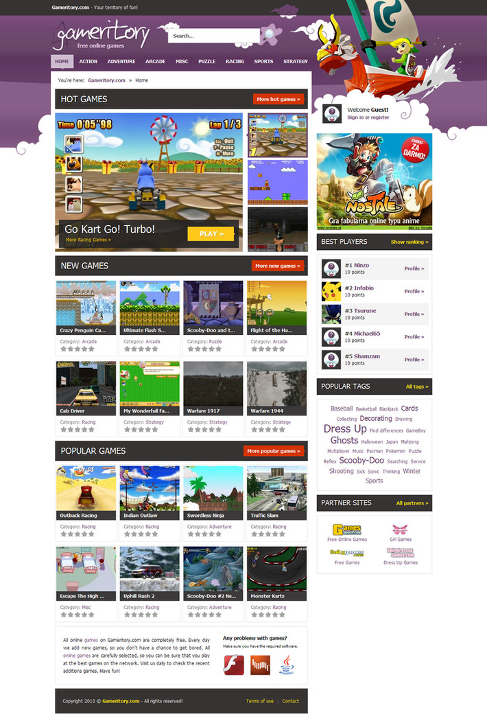
Portfolio / Miniblog / Indywidual agency in one ; ). All important things in one place... version alpha.what do ya think? ; )
===========
update.
changes:
- typo in top's menu
- stock in top
- cloud's opacity
- some details
===========
update 2.
changes:
- font family and size
- top (finall)
===========
feat. BboyWicked (color scheme)...
Related content


Comments: 47


")

Wow very nice design. awesome concept and very good colors.
👍: 0 ⏩: 0

i like the logon form, great.. how you put image un th form.. great design!!!!
👍: 0 ⏩: 0


")

are you serious LOL
COMPARE THIS :!!!! THIS ROCKS
👍: 0 ⏩: 0

Great colors! Good layout the clouds seem a little too heavy, but over all i like it. Good job!
👍: 0 ⏩: 0

 (Wink)")
nah its nothing like bboys work  (Smile)")
beleive me!
its just a coincidence that the colors are the same.
👍: 0 ⏩: 0


Thought this wad badboywickeds work
It's nice tho, but you should credit bb imo.
👍: 0 ⏩: 1

I know what project you think.
It's accident : )
Meybe i saw this project once. I have photographic memory and meybe i used few elements that i saw in past... well, meybe i should chenge some things.
-
Sorry for my english : )
👍: 0 ⏩: 1
Well right now I'm sure everyone thinks it's bboys work. He has a UNIQUE style..
It's nice, dont get me wrong.. but still
👍: 0 ⏩: 1
Hm... style? I see here litle likeness only in colours.
👍: 0 ⏩: 1


I'm in love with it. Its very nice, and very clean. + Fav.
-John
👍: 0 ⏩: 0

