HOME | DD
 kmkibble75 — Random Superhero Project: Captain Triumph II
#brunette #comicbookart #dccomics #digitalart #drawing #superhero #woman #captaintriumph #dccomicsfanart
Published: 2018-04-25 00:38:50 +0000 UTC; Views: 1872; Favourites: 123; Downloads: 0
Redirect to original
Description
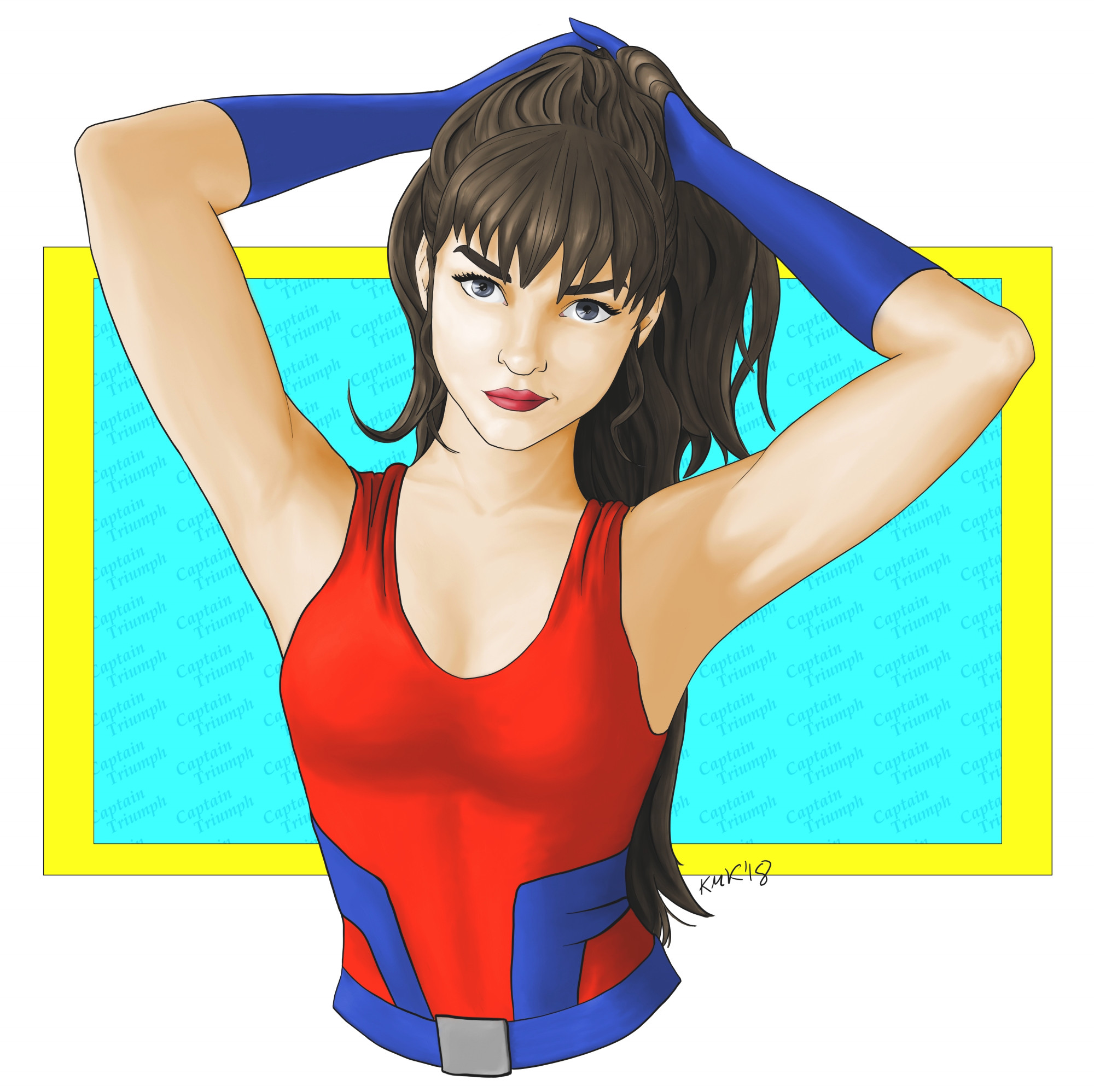
So, the DC character encyclopedia I have has about 342 pages and has about 6 characters, give or take, on each page. And even with that, there are still hordes of characters that merit nothing more than a brief, one paragraph mention in an all-text "Oh Yeah, And These People Exist, Too" section in the back.It is in that section that you'll find Captain Triumph (the second). She doesn't even have a real name, she's just referred to as "a young woman" in her own bio. She's so unknown, I felt the need to use her name in the background. That's telling you something.
And that's exactly the kind of hero I wanted to find in doing this. I was only able to find three pictures of her online, so I can't honestly say whether she's likable, but I *am* a fan of how she turned out here. I started with some really dark (for me) shading, and lightening it up as I went, so any thought on how that looks would be appreciated. I also kind of fell back into some old habits with her hair and going for fewer definition lines throughout, so if you have an opinion on that, let me hear it, please.
Based on the three pictures of her I did find (and off the poll I put up for a few days), I altered her costume a little bit -- I raised her neckline (it was very 90s and very low, close to her belly button, previously) and gave her a belt to hint that she's wearing some pants rather than a bathing suit. I imagine in this, she's pulling her hair back into a ponytail before heading into action because, seriously, loose hair that long is just asking for trouble when it comes to crimefighting.
(Maybe I should subtitle this "The Sensible Hero Costume" project, too?)
Anyhow, as always, any comments, tips, and critiques are welcome and appreciated.
(More info on Captain Triumph: comicvine.gamespot.com/captain… )
____________________________________________
Disclaimer: I’m red-green colorblind. Because of this, it’s difficult for me to tell similar shades/hues of different colors apart, and, therefore, I need to work with very limited palettes when I color pieces. For shading and highlights, I’ll generally adjust the ‘value’ portion of the HSV setting to make the base color lighter or darker; I’m unable to ‘cool’ shadows by adding blue or anything like that. I’ve often been told to be bolder in my highlighting and shading, and I’m trying to be so, but… sometimes it still seems pretty tame. I’m just saying this in case you mentioned I need to do that on a previous piece – I’m not ignoring you, and I appreciate the input. It’s just not very easy for me to implement confidently.Related content


Comments: 41

👍: 1 ⏩: 1

👍: 0 ⏩: 0

love her expression and body wise she does look very sensible. I like it!
👍: 0 ⏩: 1

Why are all your random superheroes the hottest ones? Lol love it!
👍: 0 ⏩: 1
I have to admit to tilting the scales a little bit -- I randomly choose the page of the encyclopedia, but not the specific hero. So if a page has 6 different heroes and three of them are women, I'll pick the woman who catches my eye first. (Maybe I'll start choosing some men now and then, too, just to practice, but... women are so much more fun to draw.)
I think Captain Triumph was one of 32 heroes on her page, so I had to look visual references up online.
👍: 0 ⏩: 1
^ Well I guess it's subjective because I guess those are the ones that I think the hottest out of your deviations ")
👍: 0 ⏩: 1
I'm glad you think so! I agree that it's nice to let lesser-known characters get some time in the sun, too.
(Captain Triumph will be showing up again soon, I think... she's like my own personal cause celeb, at least until she has an actual real name. I want to draw her in action, but haven't gotten there yet.)
👍: 0 ⏩: 0

Here's how outre Captain Triumph, the girl, is:
A nerd like me ain't even heard of her. I've read about Captain Triumph, the WW II guy who's a meat robot for his brother's ghost, but not her, and couldn't pick the old Captain out of a lineup of All Star Squadron members.
And yes, your costume is WAY better. Sensible Hero Costumes sound great.
(But then some folks are just not gonna join that project. I've got one - Taloner. Never wears a shirt, but has a cape. XD)
👍: 0 ⏩: 1
Yeah, this was a really obscure one -- and I even bought *all* of the comics she appeared in just to see, and I think she had one dialogue bubble. But that just gives anyone who wants to create a story for her a blank slate to start with.
The Taloner... given the cape/no shirt combo, I'm already picturing someone who maybe takes himself more seriously than most other people would.
👍: 0 ⏩: 1
I do love a blank slate character.
Given Terry’s lineage, creatively, of Namor, Hawkman, and Black Panther, yeah. He’s got a bit of an imperious attitude.
At least he’s not always an asshole. XD
👍: 0 ⏩: 0

I am not familiar with this character, but I love your version of her. She is beautiful... love her facial features and her costume! And, by the way, the colors are perfect!
👍: 0 ⏩: 1
Thank you, sir, I really appreciate that. You're definitely not alone in not being familiar with her; I couldn't even tell you her actual name.
👍: 0 ⏩: 0

Considering what you mention in the "disclaimer" I think that in general it's quite well done !
I like the eyes and the look that she has, besides the hands. Where I would have put some more detail is in the belly zone... more shadows, texture and/or wrinkles.
Although I understand that the viewer's gaze is directed to the head, I usually look at almost every detail
👍: 0 ⏩: 1
That's a fair observation -- My abdomens definitely could use more work and detail. I'll have it on my radar for future works, that's for sure.
Thank you for taking the time to let me know what you think of this -- I really appreciate it!
👍: 0 ⏩: 0

I really like the way you painted this superhero woman - because she looks like a practical realistic woman and not some sexed up fantasy dreamed up by male writers. The little smirk in her expression is great and I like the fact that you have her tying up her hair and not in a low cleavage top. I quite like your shading - you can see the subtle musculature here in the arms, face and abdomen. I do think some more highlights and darker shadows would make it better but I also understand what you're trying to work with. I think varying the line weight would definitely help this piece a lot and help make it pop. I like the way she is composed out of the background but I don't really like the background itself so far. It took me a while to notice it read Captain Triumph in the background which is tiny. I also feel as though this kind of font doesn't really suit the general comic book style going on here. I'm also questioning why you're using this yellow blue window as a background. Is it supposed to be saying something? I suppose it contrasts with the character but other than that feels like a bit of a random choice of background. I think if it was done in a way that looked a bit more dynamic like on an angle or something that could have really added to this drawing.
Other than that this is a fantastic piece! I hope some of my words were useful - if not, feel free to disregard.
👍: 0 ⏩: 1
Thank you so much for taking the time to comment.
The background colors actually were picked specifically because they contrast with the main colors of the piece,in an effort to get the Captain herself to pop out visually, Maybe I missed the mark on that, though. I agree that it could have been more dynamic, though -- I'll need to keep that in mind in the future.
And I'm really glad that you like the costume changes and the general pose -- I do try to have the heroes I draw wear stuff real people would when getting into fights or saving the day, so it's good to know that worked.
Thank you, again -- I really appreciate the input!
👍: 0 ⏩: 1
the contrast I do get and I do understand - I guess I just think the window itself looks a bit static. If it was a bit asymmetric or something that could be a bit more interesting.
You're very welcome!
👍: 0 ⏩: 0

Hello, It's me again from
First off I really just love this piece, from the pose to her face and that half smile to the attention to musculature. Defiantly make me curious about Capetian Triumph. You have a good use of color, the vivid blue and red actually mix well with each other (not something that you see very often) so you can definitely use that color palette in the future. I like how you tied in the red of her suit to her lipstick color and the blue accents of her suits to her gloves, very balanced. The hair is gorgeous, its got flow and just the right amount of line definition. I think that the fewer definition lines works better because it matches the rest of your piece. There is no other area that you use that many lines. Also, you utilized shading beautifully to fill in the "gaps" left by the lines to create the differentiation in the strands. That looks cooler than if you had relied more on lines. I love how you did her face, it's got a lovely balanced quality to it, great shape for the bangs. Her eyes say clearly that she's ready for action.
This brings me to the epic-ness of the sensible costume. She just looks ready for action. It's tight, in a good way, the way that makes it difficult to grab or get caught on something. Also, there's that lovely muscle definition underneath (really appreciate that) and an appropriate use of the bones in the rib cage. Brest are a real size, what you'd expect from a fit and active young woman (thank you). Neckline is amazing (trust me, you don't want to be going about your business and get a wasp trapped down your shirt) Keeps her cool and gives her full range of movement. I like the belt, really ties in nice with the blue trim work. I'm glad you're putting up her hair (because it is a pain to deal with down, gets in your face, easy to grab, gets caught on the most random of junk) up is good. It's cute how you slipped in her name in the background. At first it looks like a strange texture, but when you blow it up, you really get an eye full of Captain Triumph II
Now for the critique. Not much here, save for some tiny, nit-picky things. Her right eye doesn't have as many highlights as her left. I understand that you're working with the light source (and you've kept that consistent throughout) but it looks a little flat up close. The arm on the left is also a little flat compared to the one on her right and looks a tad long. The right arm has beautiful muscle definition and a great transition from armpit to bisect. Finally the collar bone. The collar bone tends to follow what the solders are doing, so if both arms are up, pulling back her hair, then the v of the collar bone should be at a more acute angle and a little lower Collar Bone
it's a little thing and I only noticed because collar bones are one of my favorite things to draw.
Overall it's a beautiful piece. I just really love how you brought this character design back to life and made her clothing realistic and action focused. Beautiful work on anatomy, gorgeous work with the eyes and hair.
👍: 0 ⏩: 1
Hello again! And thank you for taking the time to write such an awesome, in-depth... well, basically a review of the piece, more than a comment. I really appreciate everything you said, both for what was done well and what could use work. It'll be a great help as I work on future stuff.
I'm glad that the more sensible costume gets its kudos, as well.  (Smile)")
Collarbones are one of my favorite areas to draw, as well, so thank you for the example. I'll need to keep an eye on that if I do something like this again (which I'm sure I will).
And I'm glad the hair works for you -- that's something I seem to have been wavering on in the last few pieces (going between a lot of ink lines and not many at all), so I'm glad this worked. I'll probably keep trying to hit it as a happy medium and just accept that it's my natural way of doing it.
Thank you again --I really appreciate all of this!
👍: 0 ⏩: 0


It is quite awesome. It is simple and quite complete! Also i like how you kept the proportions correct and also good! Your shading is also very good. Also she is very beautiful! Great job
👍: 0 ⏩: 1


The subtle dynamism in this pose really gave you a chance to let your skills in shadowing and deepening the image into something three-dimensional shine here. Especially around the armpits and her shoulders, as well as the bridge of her nose. Massive texture in the hair as well. The only thing I could suggest would be to add a little more of a material texture to the outfit itself with your brushstrokes/digital art witchcraft strokes, because although it's barely noticeable when you're focusing on all the things that make her look larger than life, it would definitely just add that final layer of "comic-cover realism" to the piece. Awesome work with this.
👍: 0 ⏩: 1
Thank you! Do you think the shirt is hurt by how thick the lines of the blue detail are? I'm wondering whether that might be affecting how the shading and such looks on it. I do have to admit to not giving the material texture much thought, so you kind of got me there. I'll have to keep it in mind in the future.
👍: 0 ⏩: 0


Niiiice! Great shading, and I like what you did with the outfit. I love the idea of the "Sensible Hero Costume Project," too.
👍: 0 ⏩: 1
Thanks! I used that "50% of the way to black" technique you suggested before, and it seems to have gone alright.
👍: 0 ⏩: 1
