HOME | DD
 kmkibble75 — Random Superhero Project: Devastation
#dccomics #devastation #drawing #supervillain #wonderwoman #comicbookart #digitalart
Published: 2018-03-19 00:00:18 +0000 UTC; Views: 712; Favourites: 26; Downloads: 5
Redirect to original
Description
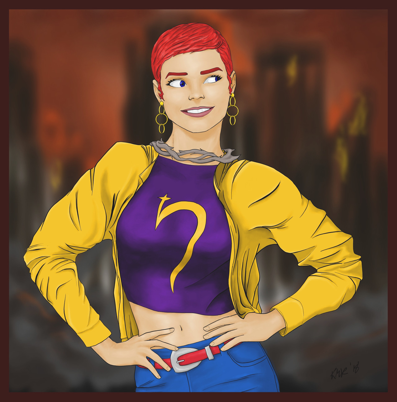
So, I decided to draw someone from the DC Encyclopedia of characters, and so I chose a random pose from my folders and a random page from the encyclopedia, and wound up on Devastation, a child of Chronos created to be an equal to Wonder Woman.That said, if this is your first time hearing of her, you can understand why I some trouble finding resource images of her to go off of. Some had her being 4-foot-two-inches tall and wearing armor with a thorny crown, while others seemed to show her regular size in street clothes. So I kind of went my own way, using one shot of her in casual wear as a basis, and adding the thorny necklace as reference to her other look. (I would have done a crown, but... I'll be honest, I really like how this pixie looks on her and I didn't want to muck with that.)
The background is something I threw together in 4 minutes rather than doing the usual monochrome ones I do for these pose pictures. I like how it turned out, though.
As always, any comments or critiques are welcome and appreciated!
Info: dc.wikia.com/wiki/Devastation
____________________________________________
Disclaimer: I’m red-green colorblind. Because of this, it’s difficult for me to tell similar shades/hues of different colors apart, and, therefore, I need to work with very limited palettes when I color pieces. For shading and highlights, I’ll generally adjust the ‘value’ portion of the HSV setting to make the base color lighter or darker; I’m unable to ‘cool’ shadows by adding blue or anything like that. I’ve often been told to be bolder in my highlighting and shading, and I’m trying to be so, but… sometimes it still seems pretty tame. I’m just saying this in case you mentioned I need to do that on a previous piece – I’m not ignoring you, and I appreciate the input. It’s just not very easy for me to implement confidently.
Related content


Comments: 16

I like the "Plainclothes Costume" look here. Then again, Jenny Sparks, Elsa Bloodstone and Jubilee are great examples of the "plain brown wrapper" superheroines.
When I first clicked on this Devastation, I was thinking that this was one of Dream's siblings from Sandman, who was a red-head.
But that's Destruction ( dc.fandom.com/wiki/Destruction…)
👍: 0 ⏩: 1

Thanks! This one was fun to do, even though there were precious few references online.
👍: 0 ⏩: 0

This character appears likable and relate able right for the start! Then she goes on to have a sexiness and feels like she is fun! This is a great character! Good work!
👍: 0 ⏩: 1

Oh , this girl have a realy beautiful and sexy body !
. You do very delicately imagine and image a pose !
👍: 0 ⏩: 1

You're just one of those people that makes me realize how little I actually know about Marvel and DC, Kevin. It's ridiculous, every second time you upload it's some weird and wonderful female hero from the depths of the 234th wiki fanpage no one's opened since 2001 and I LOVE that, I love that you share all of these unrecognized and underrepresented characters instead of drawing endless interpretations of Wonder Woman and The Flash. There's something subtly stylistically different in this one from your regular pieces, and I think it does have a lot to do with what ElissaKArminakira said about the sharpness of the lines, which really gives it a crisp sort of finish against the unfocused background without being unrealistically cartoonish and still maintaining depth with the skin tone and shadowing. The whole body language and expression definitely makes me want to click that link too. She looks like a master of sass, which I guess you'd have to be at 4 ft 2.
👍: 0 ⏩: 1
You have no idea how cool that is to hear -- and you pretty much nailed exactly why I love doing this. There are so, SO many heroes and villains in these universes, and it's just cool to be able to give a little bit of love to the lesser known ones (especially if I'm having trouble pinning down an idea of my own). It's really fun to do.
Having the sharp lines against the blurry background was a fun effect to try, so I'm glad that kind of worked (though I do get what EK was saying in regard to having some of the color shine on Dev's shoulders).
Thanks for the boost -- I'm really glad someone else is enjoying these, too.
 (Smile)")
👍: 0 ⏩: 0

Hello there! I'm from ProjectComment and I am here to comment on this sassy lady!
I like how the lines are sharp. It is like in some comics (good point for a DC inspired character!) and though I understand people who would advise you to blend the character with their environment, I'm not sure the blending must be on the lines. However some blending with colors may be needed, either on the color blocks or by coloring your lines. I won't tell you to cool the shadows or whatever, then, but something that may work would be to pick colors from the background and softly adding them to the main character.
An overlaying layer to adjust hues may work as well, but here again, I don't know what your colorblindness allows you to do.
On the drawing itself: as her purple top folds on one side, I assume it is not very tight, and therefore it is odd that is sticks so much to the skin on the left. I think it would feel more accurate to have it stick out. Finally, I find the gaze odd. Maybe the eye on the right is too far on the right (it almost disappear)? Also the eyes may catch the viewer's eye more if there was a sparkle in there?
I get it that you are colorblind, so congratulations on doing art despite that condition! (same as Mozart who in the end was deaf and still made music ")
👍: 0 ⏩: 1
Thank you very much for taking the time to comment!
You know, her eyes really struck me as odd, too, but they were like that in the reference photo -- I probably should have changed them a bit, though, knowing that it wouldn't come across the same way in a drawing as it would in a photograph (where at least our brain has the option of saying, well, if it's a real person, I guess that is possible!). So it's good to know that I need to keep that in mind in the future.
I think you're right about her shirt, too. It worked in my mind, but I don't think it carried over well. So I'll need to keep an eye on that, too. The color thing is a bit trickier... you offer some good ideas, but I'd have to be really careful about it. It's a technique worth trying, though!
Thank you again -- I really appreciate that you let me know what to work on.
👍: 0 ⏩: 1
Ahah, I also work with reference pictures myself and often find in the end that what looked just normal on a picture looked definitely odd on my drawing.
Keep up the good work! It was a pleasure commenting your drawing.
👍: 0 ⏩: 0

Hey! I'm from ProjectComment ! How are you today?
First of all: I love your art! Always keep creating and making amazing stuff!
Let's talk a bit about this. I like the lineart you made, It's sharp and clean. But I think if you make a lineart with this type of hard edge, it's a bit odd to do such a soft lighting/shadowing. You can see this clearly on the blouse: It's soft and looks like real brush-on-canvas, and it's contrasting with all the other shading. Try to keep the same shading in all painting. A good tip that I just learned recently is to try using the same brush in whole picture. Looks a bit hard on first but sure worth it.
As I can see, she is in a dark background, but she has a hard light on her. You may use some dark colors when doing subjects on dark background, to get the impression that they arent just on front of a photo, but inside the scene. In this one, if you apply a low-saturated red on multiply mode up her, and with a low-oppacity eraser reduce a bit on the edges, you would achieve a nice look of light becoming from her back.
As you are red-green colorblind, you can try doing all the piece in black and white to see the values, and then color it. It's a common technique, and it's pretty useful.
I hope this could help you!
You have a great potential and creativity! Practice is the key to achieve mastery! Keep doing! I do believe in you.
👍: 0 ⏩: 1
Thank you for taking the time to comment, and for the compliments.
I actually did use the black and white/colorize technique for this -- I started doing so late last year, and it's had an awesome effect on what I can do. (You should have seen the stuff beforehand...)
I get what you're saying about having a hard line for the shadows. 90% of the time, I tell myself I'm just going to use a blender to soften the edges of the shadows just a tiny bot, so they're clean... and it never turns out that way. I wind up going whole hog into the blending and shading. But it is something I try to change every now and then, and I'll keep your comment in mind next time I do. And I really like the technique you describe for the backlighting, so I'll make note of that. For this one, the background was something I literally threw together in 4 minutes, so I didn't give too much thought to how it would affect her. It was just a matter of considering her name and seeing whether I could make a distant flame effect for the background, rather than the usual box or color cloud I would have had otherwise. (This is just me trying to convince you I didn't fail miserably at the background and lighting. I really do love the technique you noted, and may give it a go despite the addition of red to an existing color kind of frightening me.)
Thank you again -- This really was a huge help, and I appreciate you taking the time to give me these tips.
👍: 0 ⏩: 0

Thank you! I like how it turned out, too.
👍: 0 ⏩: 1