HOME | DD
 LarsSamsoe — PC character concept : Martian

Published: 2007-05-05 17:44:49 +0000 UTC; Views: 5408; Favourites: 61; Downloads: 295
Redirect to original
Description
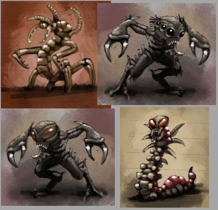
Character design for the upcoming game 2317: PRIMAL CHAOS by the badass non-profit organisation BlueWave Studios. There's nothing final about the brutal martian here. It's a polished sketch, so to speak.Hope you like - critique and comments are greatly appreciated, so let me hear what you think!
Line: Pencil ([link] )
Color: Photoshop
Visit BlueWave Studios here
Related content


Comments: 50

It looks like a Zerg evolution and I saw a comment about a Warhammer critter, so I think it can't pass as an original creature. Love the paintwork and the details though! Great job. ^_^
👍: 0 ⏩: 1

Thanks man - I have no idea of what you just said, but it has something to do with RPG's right?
BlueWave wanted a creature that consisted of many things from different monsters and aliens that they liked. So no, you're right ... it's not 100% original - it's a hybrid of many evil things
👍: 0 ⏩: 1
Hybrid of evil things... I like it.
The characters I talked about seem to be pretty common sense on the www but I haven't played those games myself.
Wiki on Zerg: [link]
👍: 0 ⏩: 1
Ooooh - yeah, I see your point.
👍: 0 ⏩: 0

This is really good, although I wonder how much 'Tyranids' inspired you 
👍: 0 ⏩: 1
Thanks myphrill - Yeah, Bluewave wanted some Tyranid woven into this guy
👍: 0 ⏩: 1
thought of showing it to games workshop?
👍: 0 ⏩: 1
No, not really - I made it for BlueWave Studios, so I can't really try and sell it elsewhere
👍: 0 ⏩: 0

dude that is reall nice!!!!
by the way check out my work [link]
👍: 0 ⏩: 1
Thanks Abdul - your stuff is real cool. I especially like this dude ([link] ). You should try and color him
👍: 0 ⏩: 1
yeah man!!!! i really wanted to but u know i dont have the confidence yet,,,,,,but still i already imgine how it look in color......i will color it soon!!!! thnx man for the comment!!!
👍: 0 ⏩: 1
No problem - you're doing right in getting comfortable with your pencilwork before starting on color. It'll come - keep it up.
👍: 0 ⏩: 0

Curious... What process did you use to color this and keep the paper texture? I've got a sketchbook full of that paper now and I want to some concepts like this! ")
👍: 0 ⏩: 1
I just kept my sketch as the top layer on multiply, and did all my coloring on layers beneith it. The only downside is, that you can't colorpick directly without turning the top sketch on/off, due to the papertexture darkening everything under it. Can't wait to see what you whip out of that sketchbook
About the "Artist of the Month" stuff ... uh, thanks man! - I've heard those freaky rumors too, but i haven't received my magazine yet ... Seriously, i'm going out of my mind! But if it's true, you'll hear about it - and probably nothing else for a while
👍: 0 ⏩: 1
Gotcha, thanks dude. I didn't know if you just let it keep the darkened effect on the drawing, seems the most logical way tho. Also, I'm thinking about subscribing to ImagineFX, and that'd be so cool if you really did get that feature! I'm sorry to say I only really found out about the mag a couple months ago.... Way back last year I was looking for a magazine with its exact purposes but never found it, but here it is!
👍: 0 ⏩: 1
- it's a great magazine too. Impressive quality in both print, layout and subject. I'm definitely gonna subscribe too.
👍: 0 ⏩: 0

I don't have much to say other than it's totally awesome
👍: 0 ⏩: 1

WTF..... i could swear that i've commented on this piece a day ago
anyway!..then ill have to remind again
err.. yeah! first of all: really cool design. i like the horns and the way you bent them .they fit perfectly!
the overall skin/surface of the marsian is pretty interesting. great job there.
his 2 claws are really badass ^^ but he needs more muscles on the upper arms and shoulders to handle them .. in my opinion.his chest is very muscular and therefore the rest must match that strenght!
")

👍: 0 ⏩: 1
Thanks Adam
Thanks though - and don't get me wrong dude, I really appreciate the input
👍: 0 ⏩: 1
lol ^^ theres no reason to explain yourself that much! and ill definetly wont get you wrong
👍: 0 ⏩: 1
hahaha - was that too much? I'll restrain myself in the future
👍: 0 ⏩: 0
Yeah, I noticed the "water soluble" stuff and tried adding some water. Nothing happened, but maybe it needs to be on a more even surface - like normal paper or something. I'll try that - Thanks
I gave the environmental pieces a go, but failed drastically - never made it past a bunch of really bad sketches, so i'm really excited to see what you come up with! I really have to practise doing stuff like that.
👍: 0 ⏩: 0
Awesome design dude, loving it
👍: 0 ⏩: 1
Thanks man - lol ... i think your thunder is intact dude  (Smile)")
The paper i'm using has no name, and when i've used my last piece, i'm kinda screwed. However, it's pretty standard recycled paper, so you'll have no problem finding it, i think. I'm not inking it, but starting very loose and just accentuating where needed in the end.
I just put this into my scraps folder ([link] ) so you can check out what i'm using. Maybe you can even help me figuring out what the top pencil is for?
👍: 0 ⏩: 1
I should be doing mostly environmental stuff for BlueWave, but also some character/creature design I believe
And that top pencil is water soluble graphite... Take a piece of paper, sketch some stuff and add a teeny bit of water to some areas to test it out. It'll give you smooth tones and gradations and stuff. Never found a real good use for it myself, but it's interesting.
👍: 0 ⏩: 0

very nice, he (it) looks to be the adult version of your dancing crab monster
👍: 0 ⏩: 1
Thanks Knight - I do agree with you on the feet-issue to some extend. Problem is, that the dude would have a tough time balancing himself on a couple of stumps like that - having only two legs. Then I'd have to give him more legs, and that would probably push him over the edge and make him look too insectoid imo. Do you think maybe some big nasty claws on the hoofs would make them blend in better?
👍: 0 ⏩: 1
yea that would definitley be better
👍: 0 ⏩: 1
Yup - the dude needs claws - big raptor ones, i think! Thanks for helping out
👍: 0 ⏩: 0

Well done chief, as always.
A definite Rasmussen feel upon first glance.
👍: 0 ⏩: 1

That must be the big brother of that crabmonster-thingie you did last time.
Looks great!
👍: 0 ⏩: 1
Hahaha - yeah, can't really blame him
Thanks man.
👍: 0 ⏩: 0

i agree with mr randoph.brilliant drawing and concept.
👍: 0 ⏩: 1

I love the scaly look and particularly the head design - congrats on artist of the month btw
👍: 0 ⏩: 2
Holy moly - you weren't kidding about the "Artist of the Month"-stuff! I haven't seen it myself yet, and imaginefx.com haven't updated their site with the new issue. That's really insane - Thanks for telling me
👍: 0 ⏩: 1
Oh damn - I spoilt the surprise! Well, you've got yourself 80 dollars of book - well done
👍: 0 ⏩: 1
Heheh - nope, i'm still surprised! Thanks man
👍: 0 ⏩: 0
Thanks a lot! - For the head i wanted to make something Alien-ish without ripping off completely.
By "artist of the month" you mean my imaginefx feature right? - thanks mate
👍: 0 ⏩: 0

.....wow.........
this is probably the most amazing "rough sketch" ever done in the history of mankind.
Perfection. 11 out of 10.
Let's hope the 3d modeller does justice to the concept.
👍: 0 ⏩: 1
LOL - Thanks man - really glad you like it. 11 out of 10 sounds great to me.
And yeah ... poor 3D guy - i guess i haven't been all that nice to him hehehe - but of course some practical ajustments have to be made in order to make it into 3D - that's no prob ... for me, that is
👍: 0 ⏩: 0

my pleasure -- love your imagination...
👍: 0 ⏩: 0

An evolved version of your crab monster
looks even better then the crab
the best parts (in my opinion) are the legs the tail
love the gradient effect of the background
👍: 0 ⏩: 1
Hehehe, yeah maybe they're related in some weird way. Something this guy will probably want to keep a secret
👍: 0 ⏩: 0

looks great
looks like the same cool paper as last time...and I love that paper.
Cool Character design
 (Wink)")
👍: 0 ⏩: 1
Thanks a lot - yep, same paper hehehe ... I think I'd better let that be for a while
👍: 0 ⏩: 0