HOME | DD
 Mark-S — Deformation V2

Published: 2007-01-03 08:12:32 +0000 UTC; Views: 7152; Favourites: 152; Downloads: 0
Redirect to original
Description
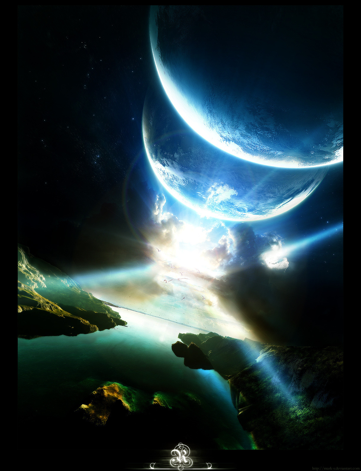
DEFORMATIONInner Feeling
------
Trying out some new techniques with cloud photos
 (Smile)") .
.This one turned out nicely in my opinion but alas I saved it 10 quality to keep the filesize down.
Again I wanted to keep areas of the scene empty so it would add more depth... Did it work?
I need a new monitor as well :/, I'm positive your monitor's will be able to see the grain/sharpening much more then mine can..
Nonetheless I'm going to keep working on this style and hopefully come up with better results
!Hope you all enjoy it!
")
Edit: Updated with version 2. The original will be Scrapped.
Related content


Comments: 115


^__^~ no problem! i'm an astro person so i love artists depictions like this! they're so fun and beautiful!
👍: 0 ⏩: 0

Very very very nice!!! How does one go about getting the lines bursting from the light rays?
👍: 0 ⏩: 0


nice colours mate...its nice to see some landscape/matte like painters
👍: 0 ⏩: 1

That's pretty cool! Tho personally I'm not a fan of cloud-neb manips... real nebula are pretty transparent and ... well, nebulous - gassy, etc.
In terms of the style your working with tho, it's done really well 
👍: 0 ⏩: 1
")

Yes! Just the style of heavily textured nebula/gas clouds i've been trying to work with. [link] except your lighting is soo much nicer. Simply beautiful. Nice perspective. Truly unique in a genre that might have a schtic for being repetitive. Thanks
👍: 0 ⏩: 1

Haha
👍: 0 ⏩: 1

Very nice, makes me want to keep practicing my technique on such pictures. You're right on the sharpening, it seems a bit excessive on some of the cloud sections - doesn't detract from the image, just gives it a somewhat odd look. It looks awesome on the star portions, though, just the right mix.
As I said, makes me want to get better at this style so I can crank out kickass pics like this one. XD I'm still learning on spacescapes.
👍: 0 ⏩: 1
Thanks for the critique mate
👍: 0 ⏩: 0


I really love this piece. Most of the time, I don't find 2 color space pieces to have that much depth, but you've definitely given a sense of it with this work. There are aspects of the clouds that seem extremely high contrast though, and it feels like it washes out some of the detail that could otherwise be present.
But still, keep up the good work.
👍: 0 ⏩: 1
Thanks for the in depth comment
Yeah those highly contrasted areas were where I added light and set the mode to Colour Dodge.
I got slack..
👍: 0 ⏩: 0


The quality just jumped up a notch, good stuff.
👍: 0 ⏩: 1

Yah I agree but sadly I made it too small :/
Oh well
👍: 0 ⏩: 0

cool. kinda looks like something is going on behind a castle. awesome. i love it!!!
👍: 0 ⏩: 0

fcking awesome!!! although I dont like the use of cloud photos for the whole nebula this is just perfect
👍: 0 ⏩: 1

The bottom right corner is really gorgeous and has that nice hanging sensation. To me though the bulk of the nebula seems rigid and overexposed as is often the result of using cloud photos. Keep at it and I'm sure you'll get some really cool results, but don't get boxed into a corner by those images!
Cheers.
👍: 0 ⏩: 1
Thanks ")
👍: 0 ⏩: 0


transformation looks really good man
👍: 0 ⏩: 1

Looking great dude, I would probably lower the contrast in certain places, but thats no big deal, this is nice either way. Good work.
👍: 0 ⏩: 1
Translucent-Image [2007-03-11 03:56:31 +0000 UTC]
I LOVE the new avatar, I really love this picture..
Did you sharpen before or after you put the text in ?
Great Job on it anyhow 
👍: 0 ⏩: 1
Haha yess! Someone noticed the Avatar
And a bit of both really.. final touches with sharpening after I guess though.
Thanks
👍: 0 ⏩: 0

Fantastic...what you've done with the clouds and lighting add that something original needed in spaceart. Great work!
👍: 0 ⏩: 1

I love the colour tone and the luminosity of the clouds there 
👍: 0 ⏩: 1

| Next =>