HOME | DD
 meandermind — godspeed

Published: 2005-10-23 17:35:24 +0000 UTC; Views: 359; Favourites: 4; Downloads: 18
Redirect to original
Description
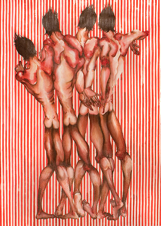
this is Hermes. he's totally over those old winged sandals at home, with today's DNA technology there are better ways to go really really fast.water colour and felt tip pencils, all wetted up and run down the paper.
as almost all my works, this has a whole story to it. you don't have to read it.
it started out as a doodle in my art class, i had finished my human tangle ([link] ) and had nothing to do for 20min. i had looked a bit in a book with aquarium fishes, and i thought i'd illustrate tori amos' song "pandora's aquarium". then i just drew a bunch of legs holding a small aquarium. thought it would be fun to draw out from a square instead of circle, since most of my recent works have been circular or rounded. i got tired of the aquarium thing, and how fishes aren't rectangular, so i tried to do something new. the little square in the multi-legged creature's hands turned into a box of light, then a brick, then i drew a whole wall infront of it. i tried to do another creature with too many limbs on the other side, but that didn't work out, so i reduced it to just some hands sticking out of the hole in the brick wall. that was from the art class.
then i came home, got sick of the whole thing a couple o' days later, erased the wall and the hands. the funny thing about it was that i still hadn't decided what was to be up and what down, because this works from especially two directions. put like this, with the face facing right, it looks like it's moving really fast. if you flip it counter-clockwise so the face turns upwards, it's suddenly all relaxed and sitting comfortably in a legchair (word pun, haha. armchair - legchair. haha.) and so on. you can see it here: [link]
at last, i decided to make a runner because i wanted to be slobby with water colour. then the hermes-thing, godspeed (as in ! you black emperor) and all that just popped up while i was painting it. it was fun.
Related content


Comments: 9

Great job! I like the merging of the watercolours. What is it that he's holding? You might wanna outline the back of the leg that's right behind the head more strongly, as when I first looked at this I thought the space between the leg and the head was part of the leg, giving a bit of a deformed foot/calf. I would agree with what was said above about the 'backwards' leg.
What are felt tip pencils? They sound cool!
👍: 0 ⏩: 1

felt tip pencils are... tuschpennor. err. i don't know what they're called in english, but the packs usually say "felt tip pencils". they're somewhat like magic markers, but thinner? normal colouring tool for children, but not crayons.
he's holdin a letter, therefore the folds  (Smile)")
aah, yeah, that line just soaked up. i'll make it clearer
the backwards leg i think makes it interesting. it's a bit of a mindstopper, like "heyy, that leg is turned... what? backwards?" also, i wanted a leg that looked more flying than running, and the space just seemed more suited for a leg turned that way.
thanks!
👍: 0 ⏩: 1
So are they the same as felt tip pens?
Ah, a letter. That makes sense.
Fair enough about the leg. You're certainly right that the eye is drawn to it!
👍: 0 ⏩: 1
ah, of course! dammit, i knew i got some part of it wrong. felt tip pens, yes. >.<
👍: 0 ⏩: 0

This is well-done.
👍: 0 ⏩: 1
i disagree on the leg-part ")
thanks for this kind comment!
👍: 0 ⏩: 1
Ah, I see and you certainly got the effect you wanted, because I kept looking at the "wrong" leg again and again. Guess it all depends on what you want to do. Working with unexpected elements can be very interesting.
👍: 0 ⏩: 0

Wow, that looks brilliant, Great job on anatomy, and everything, and then the soft blended sort of colors, and the way he's holding the letter work really great. Nice concept too.
👍: 0 ⏩: 1