HOME | DD
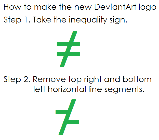
 mikusingularity — New logo does not equal

#da #deviantart #logo #graphicdesign
Published: 2014-12-05 05:05:16 +0000 UTC; Views: 1682; Favourites: 20; Downloads: 4
Redirect to original
Description
My thoughts on the new DeviantArt logo. It just doesn't equal DeviantArt.I get that it's supposed to be a "deviated A" but it's just not working all that well, at least for me.
Other people have noted that it also looks like a Z with a slash through it. Or a slanted x or percentage symbol (%) when viewed from afar.
edit: they say "people might not get it right away and, like all great art, it challenges perceptions and perspectives."
But logos are supposed to be recognizable with the brand, especially if it actually meant to be a stylized dA (or tessellating As) but with the sides cut off.
Related content
Comments: 8

👍: 0 ⏩: 0

👍: 1 ⏩: 0

I can't beleive they changed the logo! I liked it before, it was prettier! At least this one's easier!
👍: 0 ⏩: 1

search up platzkart, a russian railroad... same logo.
Deviantart took logo from russian railroad company
👍: 0 ⏩: 0

It looks kinda like my garden fence after last night's storm, if a leprechaun puked on it
👍: 0 ⏩: 0


