HOME | DD
 Muarw — CS Buhaji redo
Published: 2007-08-11 13:25:46 +0000 UTC; Views: 194; Favourites: 1; Downloads: 2
Redirect to original
Description
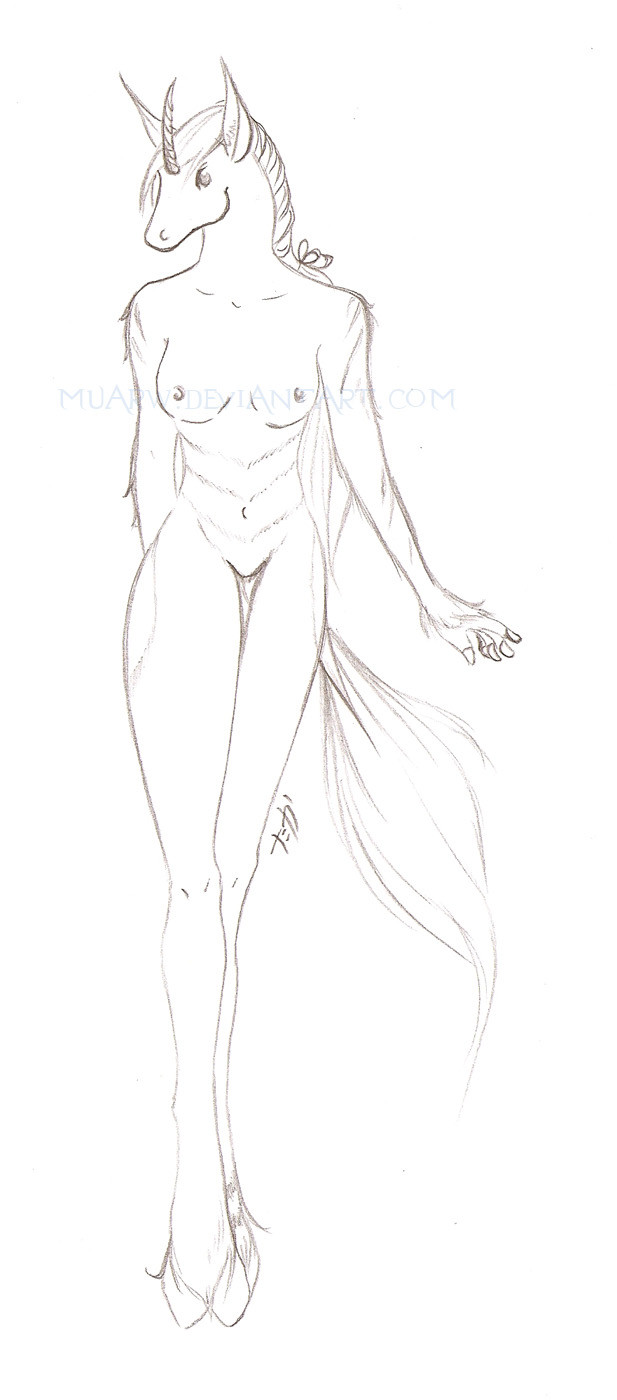
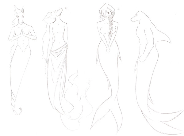
A redo of Buhaji as a mixture between mine and warwind's stylecharacter belongs to
art belongs to me
Related content


Comments: 7

Dear Muarw;
I think that you know by now that I can pick most anything apart with my critiques, but I want to tell you - and truthfully - that my first impression of this revision is a good one. Still a few "minor" points, but I will not press you with them.
Um, make that just one point. She seems very tall, in the legs especially. Sorry. I can't help myself.
Cringingly,
~ Skyler
👍: 0 ⏩: 1

true, but if the legs are shorter she may look abit stocky.....hmm, maybe view as a perspective view? for artistic sake ^^
im sure the comic artists will still get the general concept.
are the minor points applicable to the unicoe in general or just to buhaji? i may need to know them when im drawing up osniature.
👍: 0 ⏩: 1
Good point about perspective. I do want her to look willowy and graceful. I have rerely seen such exaggerated legs, though.
Yes, the comic artists should prove sharp enough.
Perhaps some specifically for Buhaji, but I had the unicoe species more particularly in mind. the "hoovgits" especially. Warwind had them about right, and Zersen has "nailed" them near enough for your reference. I may have had other points in mind before, but they escape me now.
That is all, my faithful Muarw. You may go and groom your hansom coat of fur now...
Thank you.
👍: 0 ⏩: 1
ah perhaps the way i draw them makes them look not as you intended.....ive tried to shape the hoovgits as the blunt part of the fingers but anyway.
👍: 0 ⏩: 1
Dear Muarw;
No terrible thing, but, yes, not quite what I had envisioned.
The hoovgits are meant to be more like a fingernail. Thicker, true, and wrapped around the finger, but the "blunt part of the fingers" is supposed to be just that, sticking out from the end of the "hoov".
I hope this clarification helps,
~ Skyler
👍: 0 ⏩: 1
ahhh so it's meant to be flatter rather than round. hopefully i'll get it next time round.....i think
👍: 0 ⏩: 1
The hoovgits flat at the rim of the bottom edge, yes, but the feeling tip of the "fingers" rounded, as normal.
👍: 0 ⏩: 0