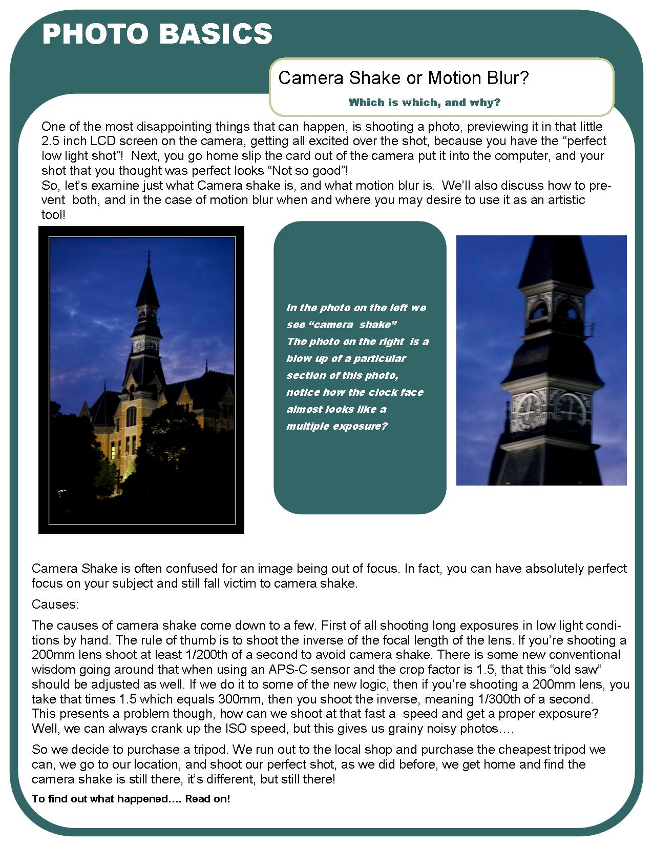
HOME | DD
 nobstutorials — 'DiscountEyewear' Website
Published: 2007-12-19 13:41:13 +0000 UTC; Views: 1994; Favourites: 8; Downloads: 0
Redirect to original
Description
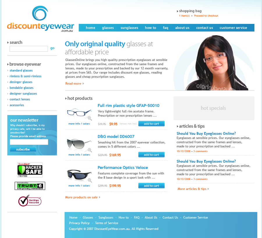
Making some practice designs lately, here's one... With new portfolio being my number one priority, still no time to make more tutorials...Tell me what you think about this one!
Related content


Comments: 12

The design is very clean and professional looking. I can imagine running into it on the big, scary interwebz!
Of course, white is always a rather striking base color. Not sure if there'd be a better choice, but that's really the only problem I can see. Overall, quite lovely.
👍: 0 ⏩: 0


Very good using of colors and clarity with alignment
Great work my friend, hope you the best
👍: 0 ⏩: 1

Thanks Mohammad, glad you like it
👍: 0 ⏩: 0

This looks quite good dude. I agree about the font size, it's somewhat hard to read, but not too bad
👍: 0 ⏩: 1
Thanks for feedback, much appreciated  (Smile)")
👍: 0 ⏩: 1
Oh, that would explain it than
👍: 0 ⏩: 0

I personaly think it's a great design.
The content is well organized and everything is clean. As a customer, I would know exactly where to find the information i'm lookin' for on the site, and that, my friend, is design. Don't forget that effects must be used to grab attention on certain elements that needs a particular attention, not to decorate.
On the other hand, I find the text a bit small for my eye, especially in the "our newsletter" box.
That's all, overall it is a great design, keep it up

👍: 0 ⏩: 1
Thanks a lot for your comment, it means a lot to me
")
👍: 0 ⏩: 0

for sure its too white in my opinion... and not enough effects that gets your attention...
keep up the work man
👍: 0 ⏩: 2
Thanks for your feedback!
It's a kind of a wireframe design, to establish the balance and composition first so I didn't spend much time on effects...
👍: 0 ⏩: 0