HOME | DD
 Peachfuzz — Hello and Goodbye
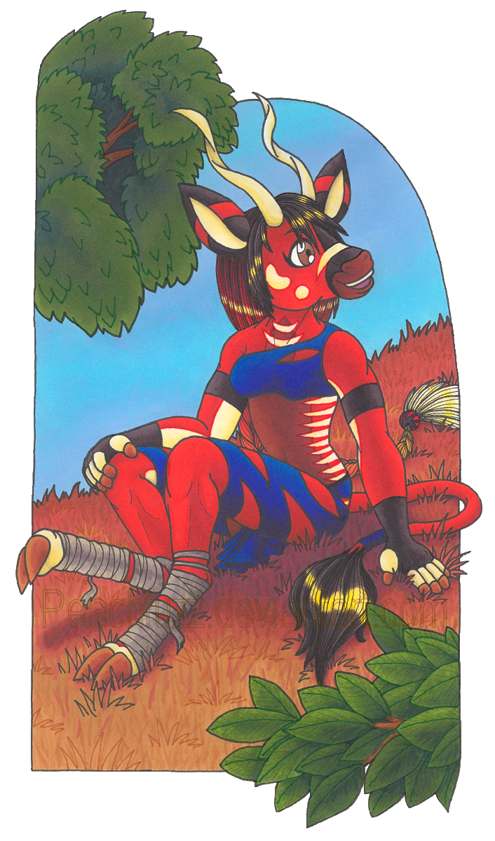
#anthropomorphic #markers #prismacolor #prismacolormarkers #traditional #traditionalart #anthrocharacter #anthroantelope #bongocharacter
Published: 2008-09-30 15:26:32 +0000 UTC; Views: 1279; Favourites: 26; Downloads: 4
Redirect to original
Description
The scan may not show it well, but I honestly think this is one of my best pieces to date (despite the weird semi-background). I tinkered with levels and all sorts of things in various programs but still can't recapture the rich brightness of the original. Still, this is actually one of the better digital representations of my art.Except the blue of her clothing.
 That scanned like absolute crud, especially on her top. I used three distinct but smoothly-blended blues, and the scanner both homogenized and chopped them. Chaka's orange-red fur color also suffered, and the colors of the grass are much nicer in person.
Anywho, enough about scanner woes.
") I'm really pleased with this piece. I still have anatomical issues (like the darned torso!) but I feel that this is some of my best anatomy yet. I'm especially happy with her neck/shoulder area. That part of the body is massively hard for me.
I'm really pleased with this piece. I still have anatomical issues (like the darned torso!) but I feel that this is some of my best anatomy yet. I'm especially happy with her neck/shoulder area. That part of the body is massively hard for me. I spaced the white parts on her thighs, for the most part.
") Whoopsie. I also completely messed up and forgot an important thing, but drew on my creativity and art supplies to add it in. I'm not going to point out what it is, though the correction looks totally obvious to me since I already know. I want to see if it actually is obvious or not.
Whoopsie. I also completely messed up and forgot an important thing, but drew on my creativity and art supplies to add it in. I'm not going to point out what it is, though the correction looks totally obvious to me since I already know. I want to see if it actually is obvious or not.By the way, the title has a real meaning to me. This drawing is the last page of the drawing book I have been pecking away at for the last two years. "Hello" refers to the new season, the new school year, and my new drawing book. "Goodbye" refers to the former of each.
Col-Erase colored pencils, Pitt Artist fine point pen, Sakura Pigma Micron size 01, Staedtler Triplus Fineliners, Prismacolor markers, plus minor use of other media for correction.
Chaka and artwork © me, Peachfuzz .
Related content


Comments: 67

Goodness! 
Nice gallery, by the way.
👍: 0 ⏩: 1


Still, you're using the same pose-template you always use and the head is really a jumble of unconnected shapes. Head, hair, muzzle, eye, ears, and horns all have their own independent orientation.
👍: 0 ⏩: 1
Thank you for the well-thought-out input! Especially about the head. I knew something was quite amiss about it but I couldn't put my finger on it at all. ^_^ That really helps.
👍: 0 ⏩: 0


Thank you for the kind comment, and the watch!  (Smile)")
👍: 0 ⏩: 1


i actually really like the " weird semi-background" it would e a cool comic panel and the coloring id grat!
👍: 0 ⏩: 0

Oh wow this is just wonderful! 
👍: 0 ⏩: 1
Thank you so much for your kind comments and favs. 
On the foreground leaves, I used a sneaky wet-into-wet underlayer technique that really makes the colors silky, rich, and bright. The scanner was a bit rude to that part but I'm glad that the coloration there caught your eye.
👍: 0 ⏩: 1
Aw. I like commenting and faving on your artwork! They're absolutely full of awesomeness!
Hm. I'll keep that in mind when and if I color with markers. You know alot about coloring.
👍: 0 ⏩: 1
I would say that I'm self-taught, in that no one taught me any of the markering techniques I use. I've been using Prismacolor markers since 2003, and I developed all of my basic markering abilities with cheap Crayolas long before that. So I have a lot of marker experience under my belt. But I didn't get where I am today alone. I developed a lot of my markering tricks using input from other artists and from learning about the use of pastels and paints!
If you ever try them, don't limit yourself to the techniques discussed in instruction books or tutorials. Don't listen if anyone tells you that such-and-such way or thing isn't good. Experiment with all sorts of techniques and papers. There are infinite ways to use markers, none of them wrong. My unique approach is a super-saturated, wet-into-wet painting method. But it's not the only way to make nice art with markers.
👍: 0 ⏩: 1
Ooh! Late reply, I know, and I'm sorry. D:
Hmm, to me, you seem very experienced.
Thanks for the advice, however, I don't think I'll be working much with traditional art now. You see, I'm taking an art class next year (which is a requirement for graduation), and art classes usually waste tons and tons of paper. So, for the safety and sake of our dying environment, I'll try to stick to digital art from now.
👍: 0 ⏩: 0

This is amazing. Your art block hasn't been for nothing. I love the partial background, it's kind of storybook. The anatomy is getting better all the time. At first I thought maybe her head was twisted too far in one direction, but really.. this is an animal that could easily chew on its own tail end if need be. The grass is beautiful (great work on that kind of texture with markers!!!!!!...!!!), the angles are beautiful, the details are beautiful, the composition is beautiful. It looks like there was some shading in the sky that was stolen. I think you're at the point where you should be doing a storybook or artbook or something. It's so much fun to be able to watch someone who is improving with every.single.drawing. I wonder what her hands would look like if her fingertips were shaped more like her toes. Maybe scary ^^0
👍: 0 ⏩: 1
Gosh, thank you! 
I actually do have a story in progress that I would like to turn into a comic, but it's years away from being developed enough to begin. I still have a lot of improving to do with my work, as well as much more work to be done on the story itself.
👍: 0 ⏩: 0

Beautiful work. I can tell you put a lot of time and effort into this one. There is an amazing amount of detail in everything, from Chaka to the lines on the leaves.
How do you get the marker colors to be so smooth?
👍: 0 ⏩: 1
Thank you so much for taking the time to comment on my latest two pieces.
I use wet-into-wet blending techniques. I get the paper sopping wet with ink and mix colors into each other while they're wet.
👍: 0 ⏩: 0

She is a fun character, and I love her colors! So pretty...
👍: 0 ⏩: 0

I love the colors here, they're exceptionally bright and well blended, nice job. It is perhaps the best piece you've done so far.
👍: 0 ⏩: 1
That makes me so happy. <3 Thank you!
👍: 0 ⏩: 1

Wowww.... I really think this IS you best piece so far. The perspective is awesome... and I love the way you did the background (the border is perfect, with parts sticking out... something I might do ")
👍: 0 ⏩: 1
Awwww, thank you!
Here: [link] I traced the anatomy of her torso in an imaging program, then removed the clothed drawing from under it. Do the breasts still look different sizes without the clothing to possibly trick you? If so, feel free to red-line that to show me how I could improve it. :3 You see to be quite... Uh... Adept at that part of the body.
👍: 0 ⏩: 1
Hey now... I can't tell if that's an insult or not 
👍: 0 ⏩: 1
Alright, then.
And that wasn't an insult.

👍: 0 ⏩: 1
Ah yes... I'm terrible at giving pointers, good thing you're good at self-advice.
👍: 0 ⏩: 1
I'm learning to eke out of people the information I need to improve my work.

👍: 0 ⏩: 0

love the bright colors and I agree that this is your best to date and I am sure you will out do it very soon. (I always love out-doing older pics)
👍: 0 ⏩: 1
Thanks a ton, Spookowl! 
👍: 0 ⏩: 1

i LOVE the background and the smooth way you framed it. it looks marvelouse.
👍: 0 ⏩: 1
Thank you so much. <3 I'm trying to get back into the swing of backgrounds.
👍: 0 ⏩: 0

I adore the colors in this, especially in the leaves and the reds. As always so vibrant and alive! The sky is in nice contrast and her expression... its a wonderful piece this one and I would agree your best to date. ;3
Nice way to finish off a sketchbook Id certainly say!
👍: 0 ⏩: 1
Thank you so much for the awesome comment and the fav.
Normally the first and last pages of a drawing book come out terrible, so this was an exception.
👍: 0 ⏩: 0

What a lovely piece! I can see why you'd be so happy with it. Chaka looks very sweet. I actually like the background; I think it fits with the whole graphic art style... thing, artsiness, you've got going on there. The composition is great too... hmm... I'm sorry, I don't really have much more to say. This is a relatively simple piece for you, but it works beautifully. The colours are very nicely balanced and... well, I'm done for the moment.
👍: 0 ⏩: 1
Your comment made me so happy. 
👍: 0 ⏩: 0

really quite a lovely job! I think the thing that pleases me the most is your use of a frame...with just bits of leaves, etc, sticking out. Its very appealing to the eye, and it does not use as much medium as some of your other drawings. And also, I like that the background is in a very different angle than most of your drawings, and it makes its very interesting...nice composition! And the anatomy is very nice, I especially like that she seems to be inviting someone outside of the picture to come sit down next to her.
👍: 0 ⏩: 1
Aw!
I'm especially grateful for what you said about the angle of the background. Chaka is pretty straight up but I established a sort of diagonal feel with the leafiness being on opposite sides. So I crossed it with the grass going the opposite way. I wasn't sure if the composition worked or not, so that's really nice to hear!
👍: 0 ⏩: 0

I think the anatomy, the body and arms and feet really go well. and the background come out well. the white space make the leaves standing out and the front leaves become vivid. you make use of the merit of the semi-background.
👍: 0 ⏩: 1
Thank you, my friend.
👍: 0 ⏩: 0

Really impressive work, I would have to agree and say this is your best piece to date. Very nice, the posing and expression look great and the colors and details are impressive as always. Wonderful work.
👍: 0 ⏩: 1
I appreciate all of your kind comments, Baha.
👍: 0 ⏩: 1
Of course, I'm sorry it took so long to get to commenting on them.
👍: 0 ⏩: 0

that's a really cool title x3
anyways, I really like this =3 I have to say that Chaka is my second favorite of your characters. 

👍: 0 ⏩: 1
As always, thank you, Poo.
The parts with the bandages are her feet. Can you be more specific at all about why they strike you as odd?
👍: 0 ⏩: 1
You're welcome. ^^
oh uhm....I guess it's how long that section is compared to the rest of her leg...and the way the joints are...
👍: 0 ⏩: 1
I based her legs on real bongo anatomy, but warped them for bipedalism. [link] See how their feet are just as long or longer than the length from knee to ankle? That would be freakishly huge for a human, but I didn't think it was unreasonable for a bongo anthro. Their anatomy is less similar to ours than cats and dogs, so I went with a different proportion on the legs.
Some people I have talked with in person have interpreted her ankles as "backwards knees".
👍: 0 ⏩: 1
ahhhh I see X3
yeah...I was thinking about the way I draw Breloom feet on that...
👍: 0 ⏩: 0
| Next =>