HOME | DD
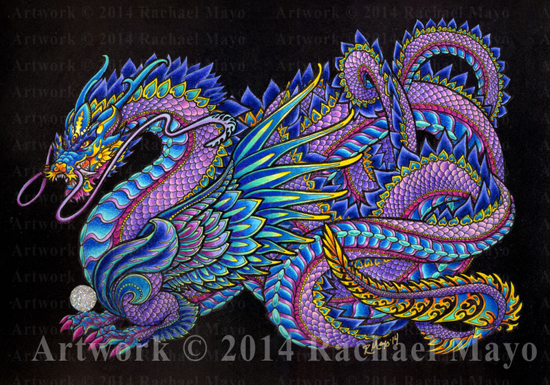
 rachaelm5 — Lapis Lazuli Breeze color variant

Published: 2014-06-08 21:59:59 +0000 UTC; Views: 5369; Favourites: 406; Downloads: 0
Redirect to original
Related content


Comments: 92

That little color wheel thingy that we studied in elementary school actually turned out to be useful...
Actually, I had some color theory in college and found through practice and experiments that I really like double-split complementary color schemes for just about everything I do. It takes me some effort to break out of that schematic in my mind if a picture calls for anything else. Earth tones? AUUUUURGH! Hard work! - Whereas this crazy scheme is a no-brainer.
 (Wink)")
👍: 0 ⏩: 1

I know nothing about colors, i generally go by my intuition and my eyes! When i see a complicated image with layers of colors, i have always wondered how does one learn that...thanks for the tip on the color wheel...(wish i went to school in America, even for one day...)
👍: 0 ⏩: 1
Here is a good, simple diagram that talks about the color schemes I like to use: www.signsforsandiego.com/Porta…
I made a quick search for "color schemes" in Google and found many, many different resources, so there's information out there for you! Also, it's very good to trust your intuition and your eyes when it comes to color. It may take some experimenting to figure out how to get an effect that you like, but your eyes will almost always help you figure out what works well and what doesn't.
👍: 0 ⏩: 1
You are very kind! Thank you so much for the link and your advise. I appreciate it deeply.
👍: 0 ⏩: 1
I am glad to be of service. You are always welcome to ask questions if you have them.
👍: 0 ⏩: 1
So...sorry if this sounds too aggressive...can you take a look of my gallery and let me know what can i improve on my color arrangements?
👍: 0 ⏩: 1
Sure, I'll get back in touch with you after I've had a chance to make a dash through your gallery.
👍: 0 ⏩: 0

So beautiful! I love the contrast between the blue and the red!
👍: 0 ⏩: 1

Oh WOW, this just glows! The colors are so rich and vibrant, I love it!
👍: 0 ⏩: 1

Absolutely gorgeous use with your reddish color scheme.
👍: 0 ⏩: 1

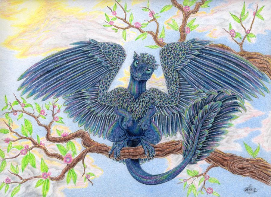
Gorgeous with the red! I think this is my favorite of the two. :]
👍: 0 ⏩: 1

Welcome. Just. How do you color your drawings?
👍: 0 ⏩: 0
")

Ha! I hadn't thought of that. Fire and Ice definitely works for this pair. Thanks!
👍: 0 ⏩: 0

Really loving the lovely colours and detailing put into the scales and feathers, of this amazing looking Dragon
👍: 0 ⏩: 1


I love every piece in your gallery.
And the colors...
...those vibrant strokes...
...beautiful.
BRIAN
👍: 0 ⏩: 1
Thanks very much, Brian!
👍: 0 ⏩: 1


Oh, wow, Rachael, this is gorgeous. Love the brilliant color, especially the red and blue, against the black.
👍: 0 ⏩: 1
Thanks very much!
I thought about doing a swirly background like I did for the Saltare color variant, but the more I thought about it, the stronger this dragon looked against solid black in my mind's eye. I definitely like this effect for the bold contrasts.
👍: 0 ⏩: 1
Good choice. Swirly would have been awfully busy.
👍: 0 ⏩: 0

red ruby skin a glitt'ring suit
azure wings, color of dawn
a palette of the morning
to sweep away mourning
and burn away death's dreary cobwebs
with sunrise's light
-Sunrise-
Corcon
Love the colors.
👍: 0 ⏩: 1
 (Smile)")
👍: 0 ⏩: 0
<= Prev |