HOME | DD
 radsechrist —
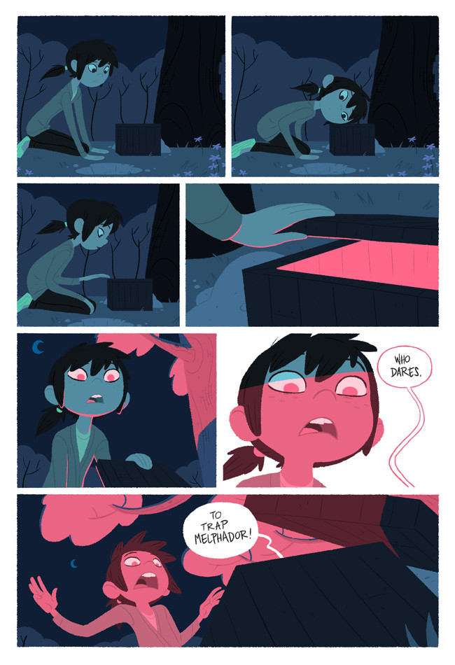
Comic page 'Explorer'
radsechrist —
Comic page 'Explorer'
Published: 2011-11-30 08:21:57 +0000 UTC; Views: 43344; Favourites: 1693; Downloads: 462
Redirect to original
Description
This is a page for my story in "Explorer" in stores this march!Related content


Comments: 93

Looks Super Cool and entertaining!
I already like the character i see here in this sneak peak of the comic.
👍: 0 ⏩: 0

 (Smile)")


I have it, its lovely work. You should be very proud of it.
👍: 0 ⏩: 1

where can i find this pray tell? do i need to type in anything specific on amazon.com?
👍: 0 ⏩: 1

the book is called "Explorer" the mystery boxes.
👍: 0 ⏩: 1


You really like contrasting blue and pink together. That's a interesting contrast I never thought of before.
👍: 0 ⏩: 0


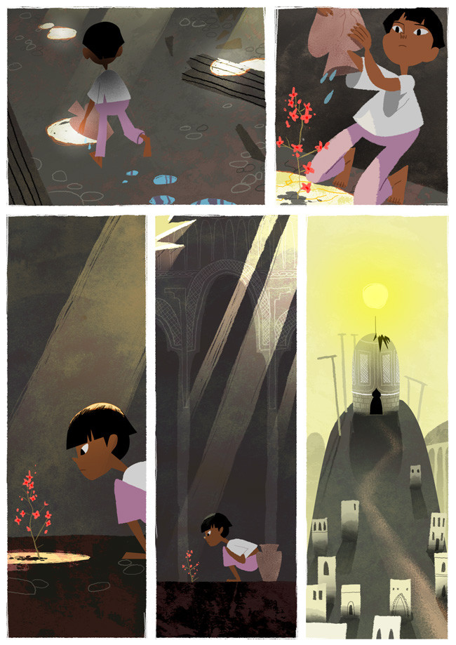
Panel 5 might be one of my favorite illustrations ever.
👍: 0 ⏩: 0


👍: 0 ⏩: 1


Hmm i would like to see more i really like the artwork here.
👍: 0 ⏩: 0


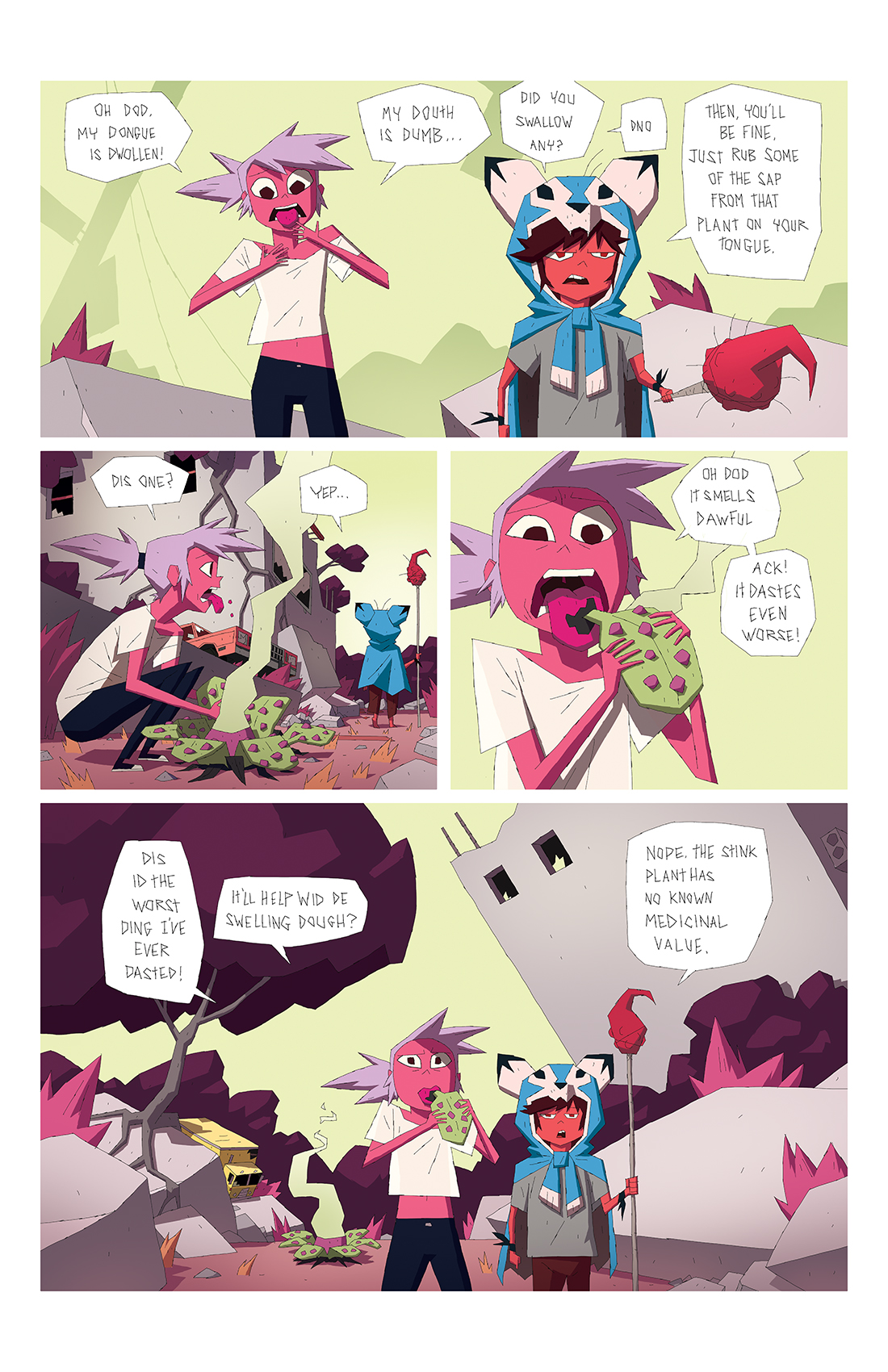
This is very good, and I love the colors; but the last three faces look very similar-- it takes away from the impact in the last panel a little. I would advise going from a more scrunched face in the second to last panel (probably from squinting at the light) to the more wide, open face in the last panel. It would add contrast. It's quite wonderful otherwise, your lineless artwork and paneling really sets the suspenseful atmosphere.
👍: 0 ⏩: 1
AH, good point, I hadn't thought of that. I kind of was just treating it like a storyboard, but I can see that having some contrast would be nice.
👍: 0 ⏩: 0

this is the type I want to do. Looks like a disney animation that turned comic.
👍: 0 ⏩: 0


My comment is who is Melphadore? Lol and why is the box talking?! Btw the person you drew looks familliar...although I can't put my braincell on it.
👍: 0 ⏩: 0

THIS.looks so very familliar......do you draw for Disney?
👍: 0 ⏩: 1


I WILL BUY THIS BOOK!!! It looks similar to this Dracula comicbook I bought a while back in middle school...Loved it! Congrats on the DD!!
👍: 0 ⏩: 0


")


Raaaddd! So excited! Can't wait to see what you guys have been cooking up ^_^
👍: 0 ⏩: 0


OMG this is really awesome
nice job, the colors are perfect
👍: 0 ⏩: 0
| Next =>