HOME | DD
 RobCaswell — 2001 Reprint
Published: 2012-03-17 16:48:46 +0000 UTC; Views: 3136; Favourites: 50; Downloads: 289
Redirect to original
Description
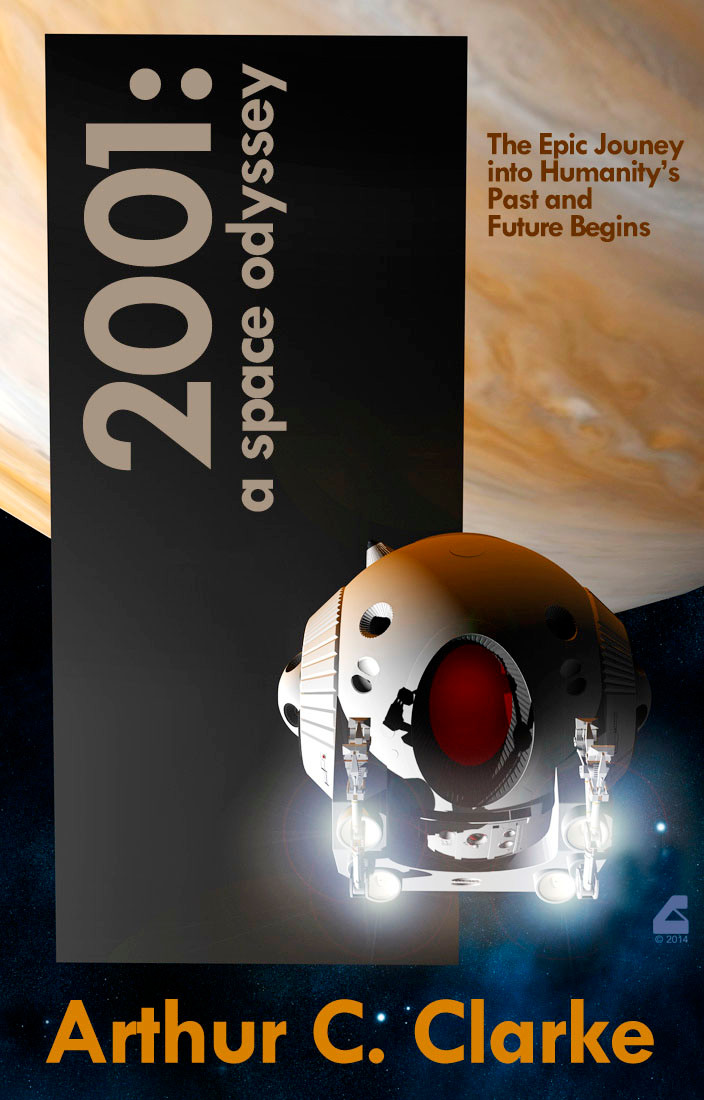
A run at doing a cover treatment for Clarke and Kubrick's 2001. One of the tricky choices to make is whether the cover should be faithful to the movie (set at Jupiter) or the book (Saturn). This decision is complicated by the fact that all Clarke's subsequent sequels are following the movie. So in the end I went with Jupiter.... but we're so close and without an identifying red spot in frame that you can pretend it's Saturn and we're just too close to see rings.... if you like
I may take another run at this subject, but this format struck me a good one to do all the books with a united theme. Each would feature the monolith, but the vehicle and background setting would change in each one.
==================
The Pod model is the new one by Alvatar, available on ShareCG [link] . The Jupiter map is from NASA/JPL photography mapped onto a primitive. Rendered in DAZ Studio, final layout in Photoshop.
Related content


Comments: 55

Somehow it doesn't surprise me that Arthur would figure it all out. And that's why I loved his work. There was more under the hood than you got on a first read. People like he and Hal Clement really set the standard for "HARD SF". And sadly they're both gone now....
👍: 0 ⏩: 0


I like the red glow of the cockpit - very reminiscent of HAL
 (Wink)")
👍: 0 ⏩: 1
Careful - you might give someone a major Matt!
👍: 0 ⏩: 0

I forgot about the change in setting. And wasn't one of the monolith in the center of a crater on one of Saturn's moons. I always loved Clarke's description of traveling through the monolith, being pulled through and seeing the photo-negative of the universe: black stars on an infinite white field. I always thought that was better than infra-red footage of lava flows...
Great work on this... (Smile)")
Mike
👍: 0 ⏩: 1
Yeah, the novel's monolith was centered in the large dark circular spot on Iapetus.
Ooo. Now I'm gettin' the itch to reread it again! I'm such a Clarke junkie....
👍: 0 ⏩: 0

Professional looking cover Arcass! Speaking of 2001-ness have you peeped this alreadyt? [link] Pretty cool HAL-style screensaver, have the free version on my ma-cheen.
👍: 0 ⏩: 1
OooOOoo! I hadn't seen that! Thanks!!!!!

👍: 0 ⏩: 1
You bet, the flashing data screens are quite L33t nerd-tastic...
👍: 0 ⏩: 1
I copy that, X-Ray Delta One.
👍: 0 ⏩: 0

Heh, in miniature I thought it was HAL's eyepiece peering out of the pod window ")
👍: 0 ⏩: 1
Yeah, I was going for the red interior light as an homage to one of Ron McCall's original promo pieces: [link]
👍: 0 ⏩: 1
I seem to remember the pod interior was red in a few scenes:
[link]
I guess the toned it down so it wasn't red backlight + red suit
👍: 0 ⏩: 1
Yeah, the red light makes sense for maintaining proper night vision and not blinding you to the view out the port.
👍: 0 ⏩: 0

I suggest you adjust the kerning. In the poster, the kerning was extremely close. Even if you use a slightly looser kerning, the "2" and, especially, the "1" are further from the "0" than the "0"s are from each other. The colon is also pretty far.
Question: How long before this movie is referred to more frequently as "Twenty Oh One": A Space Odyssey?"
👍: 0 ⏩: 1
Good catch! You're totally right. Gave me a good opportunity to fix a few other things, too
👍: 0 ⏩: 1
Sorry to be a nitpicking kerning weanie as well, but it seems the R in Arthur feels a bit smashed into the T than balanced by being closer to the A that has more negative space.
👍: 0 ⏩: 1
Maybe you're right.... but until a publish decides to pay me for it, I'm done with tweaks for now
👍: 0 ⏩: 1
Nice...so true, it's torture!
👍: 0 ⏩: 0


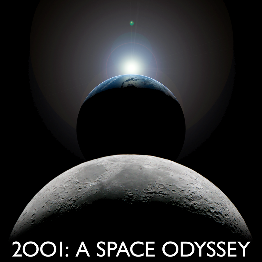
Great to see a version without discovery.
Saturn instead of jupiter now thats an idea for an alternative universe the rings behind the obalisk
👍: 0 ⏩: 1
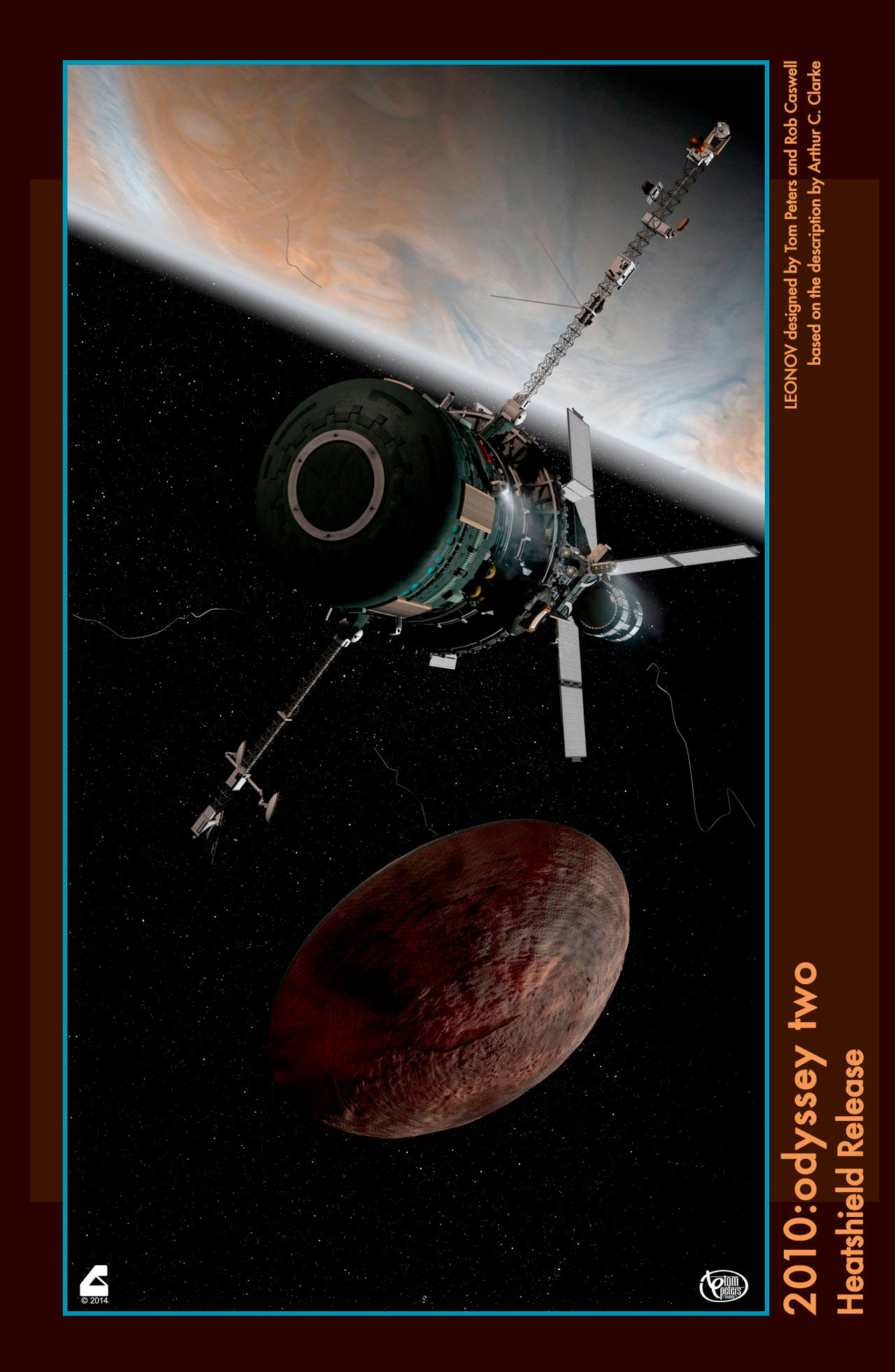
Well in the book (Saturn) version, the monolith was on the surface of Iapetus.
👍: 0 ⏩: 1
")
Not really! It was handled quite well in the book and ties in with the (real life) enigma of Iapetus' large dark spot. This was the plan until Trumbull couldn't find a good way to do Saturn's rings and they made the last minute decision to move everything to Jupiter.
👍: 0 ⏩: 0

BEAUTIFUL! And much more evocative than most of the covers that have been put on the book. BTW, Jupiter was never swapped for Saturn in the book. Although other changes were incorporated into Clarke's text, as the book and movie were being produced pretty much simultaneously, the locale change of "TMA-2" never changed. I bought the hardback that was produced in the year 2001, and the text is the same as the text in my falling apart 1968 hardback.
👍: 0 ⏩: 1
As I thought. I'd never seen any mention or identifiers of different (content) editions.
👍: 0 ⏩: 0

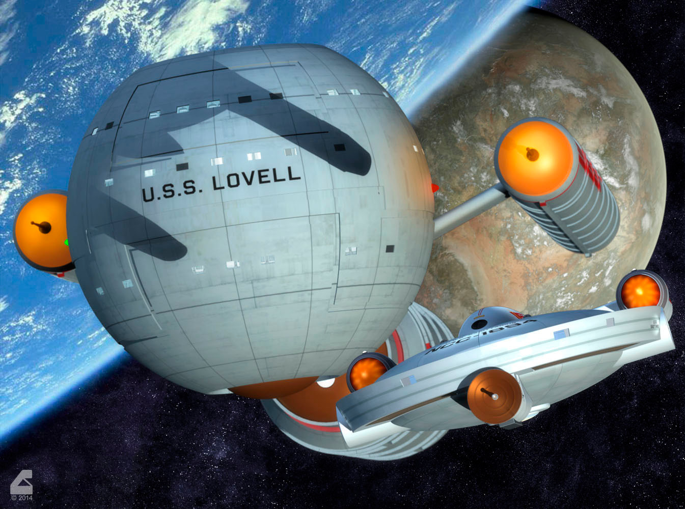
The big ships usually get all the press
👍: 0 ⏩: 0

Remember that the original book was reedited as the movie was being made to match the movie, so there are two versions.
👍: 0 ⏩: 1
There are? I only read the one - the original release. I wasn't aware Clarke ever brought his text into final synch with the film?
👍: 0 ⏩: 1
Many years ago, right after the film was released, I watched a "making of" thing. It was really intriguing to watch and was one of the things that completely hooked me on SciFi. In the video it shows Clarke and Kubrick going through the sets and discussing changes that need to be made to make the book and movie match. The version I read in 1969 or 1970 used Jupiter. There are a bunch of videos on YouTube. Here are a couple of links.
[link]
[link]
👍: 0 ⏩: 1
Are you sure?? There's no mention of two versions in the Wikipedia summary: [link]
And I've never spoken to anyone who read any other version. I recall when the novel 2010 was about to be rolled out in the early 80's, it was a point of interest that Clarke chose to make a sequel to the movie, using Jupiter, instead of his own novel, using Saturn.
Clarke was holed up in a hotel working on the the novel as the movie was in production. Saturn was the plan from the get go but Trumbull, try as he might, could never do the rings to his satisfaction - an itch he made Silent Running to scratch, in part. There was lots of give and take since the novel and movie were being created simultaneously, but they weren't able to synch on the last bits - probably because the novel was largely finished before they went into FX post production.... and it was the days of typewriters so editing a few chapters was not as simple a proposition as today.
From the Wikipedia entry on the 2010 novel: "The novel 2001: A Space Odyssey has the second half of the story take place around Saturn, with the Monolith embedded in the surface of the Saturnian moon Iapetus. 2010 follows the continuity of the film 2001, which places the Monolith and Discovery in orbit between Jupiter and the Jovian moon Io."
👍: 0 ⏩: 1
Hell no! I'm not sure, this was forty plus years ago. LMAO
Could it have been Lost worlds or something like that.
👍: 0 ⏩: 1
Well "Lost Worlds of 2001" was Clarke's sorta making-of book. Been a while since I read that. I'm sure it mentions the film and novel differences.
👍: 0 ⏩: 1
Bingo!
And it's got the Sentinel, which has nothing to do with 2001 except the concept of leaving something behind to tell you when the grasshoppers get smart.
👍: 0 ⏩: 0

Instant fave! Coolness! ")
You know Clarke was a bit of a lazy arse, why didn't he do a Tolkien and release a revised edition? Thinking about it the publishers could have probably done that without his assistance, but permission.
Wow...long comment...wasn't gonna go that far in depth.

👍: 0 ⏩: 2
I'm OK with Clarke being the lazy ass he was. He STILL wrote more books than I ever will!!!
👍: 0 ⏩: 1
Yeah, I'm okay with it. Just can't believe some enterprising publisher never went 'hey Art, how about a revised special edition for the X anniversary' ka-ching! $$$
👍: 0 ⏩: 1
You mean kinda like how no one did a huge special edition DVD in 2001?
👍: 0 ⏩: 1
| Next =>