HOME | DD
 sakimichan — Refining/editing /background voice over tutorial

Published: 2018-07-15 01:11:30 +0000 UTC; Views: 64705; Favourites: 2007; Downloads: 0
Redirect to original
Description
Pixiv ll facebook llOnline Store ll Tumblr ll PatreonllArtstation l Instagram gumroad(tutorial store)
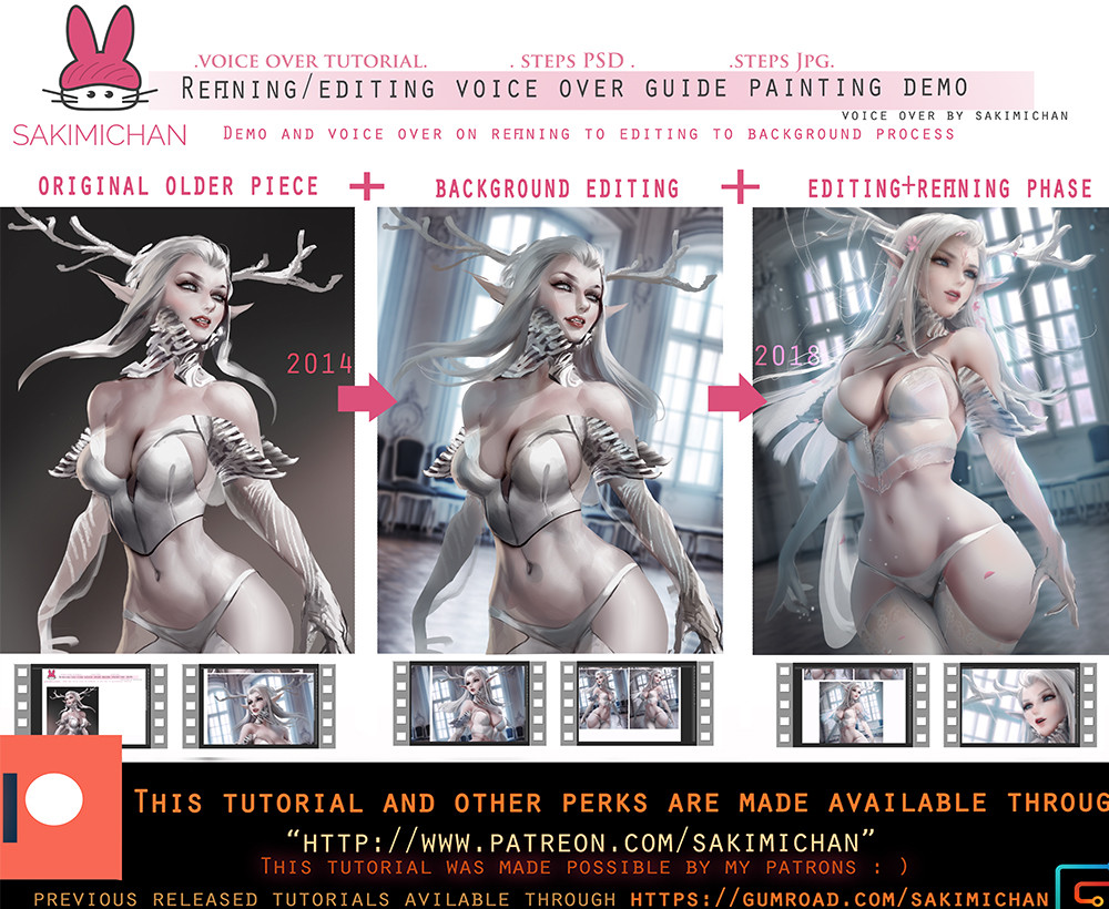
Before and after edit result for this term's tutorial on editing/refining :3 2014 to 2018
❅PSD steps
❅Jpg steps
❅2hr 30 min voice over video tutorial
Patreon reward archive ( see what rewards you can get by helping support me !)
FREE RELEASE! Enjoy ^_^
____________________
Hair voice over tutorial
please go: gumroad.com/l/ojqB
used the promo code: hairy ( unlimited )
more tutorials here :gumroad.com/sakimichan if you guys are interested !
www.patreon.com/posts/18431891
Related content


Comments: 60

I think I like 2014 better. Mayve because of the hard lines. And she looks alot girlier in 2018, 14 says more power to me :3
Your skill is amazing regardless! ^_^
👍: 0 ⏩: 0

Was reading comments down below and thought I'd leave an extra one because of it.
To all ya'll saying that women with thick legs like that don't exist or aren't "natural" with that body shape: you need to open your eyes and get out more.
Stop placing women in certain categories because you only look at what appeals to you.
There's tons of girls out there with that body shape. Some oven more exaggerated than that.
I've been to many places and seen several different types.
When writing your comments, don't you think about how you could affect other people?
"Thick legs on a girl isn't right or appealing"
I was born with thick legs. Dieting doesn't affect my legs, the gym just makes them more muscular. There have been guys that straight up negatively told me my legs were thick and wondered why because everything else is so normal.
I know I'm not the only "thick" leggy girl reading so many negative comments about our bodies. You're looking at online models so much that you don't realize that: yes, Saki is drawling a real person's body.
You turn your head to what appeals to you and don't notice that the girl in your class/work has the same body that you're dissing about to your friends, not knowing/caring that she can overhear you and is silently thinking her body isn't good enough because it's not like "everyone else's".
This body shape is fine. So fuck you.
👍: 0 ⏩: 0
There's parts of 2014 and 18 that I both like and don't like. You've grown in your style the few years, but overall I like 2014 more.
Anyways.
2014 has great muscle structure, the rough shading for the skin looks better overall and I say that only because the other one looks too... idk fluffy? Airy?
2014 has it's little things that could be touched up on, such as fixing the hair and that middle boob shading. Then again you have the same issue with the arm in 2018... so...
2014's face sorta looks like she's getting away with something and about to giggle about it. Maybe I'm just imagining that. 2018's face, though much more attractive, looks so generic and non-expressive. She's like those girls you wanna be seen with, but can't have a conversation on a date because she has zero personality.
2018 just looks a bit boring to me. I've noticed you do a certain body type and do the same over and over again, give or take a few pounds. Issue I have with the clothes, as much as I enjoy your art because you're not afraid to have the skin going a bit over them, GIRLS DON'T LIKE THEM DIGGING IN! That's what it looks like with the underwear. Like OMG that poor thing needs the next size up. So uncomfortable. And it's a tiny strap too, so it would make it even more so.
Idk if I already left a comment like this before, or if I just thought of it while looking at this pic, but thoughts stay the same.
I prefer 2014
👍: 0 ⏩: 0

")

I think I like your earlier drawing better mostly because I think she looks a little more creepy in that one than your recent one.
👍: 0 ⏩: 0

 (Smile)")


2014 looks better, in my opinion. She looks darker and more evil, and her expression is easier to read/understand. 2018 looks soft and seems more serene, more like a goddess than a person. It gives a completely different vibe than 2014.
2014 looks more natural, where as 2018 kind of looks like she put on a ton of cover-up. I guess the best way to describe it is 2014 was a forest nymph and 2018 is a goddess/deity.
👍: 0 ⏩: 1

That's an on spot review, I agree.
👍: 0 ⏩: 0

2014 looks better for me. More realistic and natural.
👍: 0 ⏩: 0


wonder that its not just refining but also adding some "mass"
I like this style but cant say that wide legs can apropriate for any girl
👍: 0 ⏩: 0

well that's a fast transaction of an evil snow queen to a cute and sexy princess.
👍: 0 ⏩: 0

To think that what I thought was perfect then got even better! So inspiring!
👍: 0 ⏩: 0


Yeah, my thoughts exactly. Kinda Michelin-mascot style in 2018.
Whoever likes 'em bodies fluffed up like that, idk.
👍: 0 ⏩: 0


Is kinda interesting how the commentary section is divided between people that prefer the older one, people that prefer the new one and those who like both. I know people, probably, will not stop watching Sakimichan's art, but nowadays her watchers are constantly getting in conflict. I'm afraid how it can change her relationship with the followers and if she will take these comments into consideration and change her art style or target audience
👍: 0 ⏩: 1

To be brutally honest, her current main audience are....horny people. She does nsfw option on every picture, so it may not that bad to target a different audience. But then again, she makes money off of it so I doubt anything will change
👍: 0 ⏩: 1

To be brutally honest, don't make assumptions about the people who follow her work. It's insulting and nullifies your points. A NSFW picture version doesn't mean that all of her followers gravitate for one or pay for one on Patreon. Then again you'd have to do some better research into her actual followers to make a valid argument and research is harder than going with your feels.
If you don't agree with her 2018 versus her 2014 style, don't look at it. As long as she's happy with her art, that's what matters.
I hope you feel better for trying to insult a bunch of people and a hard working artist. If not, you may wish to do some soul searching into your own happiness.
👍: 0 ⏩: 1
There is a difference between main audience (who she aims to please with her art) and "all her fans". Her main audience are the people who pay for nsfw, which in return makes it profitable. Sex sells and the artist knows that, like any smart business person. I doubt it's insulting to her since she uses this fact to make money and has obviously no problem providing sexual content for those who want to see it, or else it wouldn't be so dirt cheap to access in her patreon while tutorials are a lot more expensive. (If you never noticed, almost all of her art has a hint of sexual innuendo, she isn't drawing innocent little children rainbow art. Are you even a fan? Does not look like it) If it was about just pretty art, there wouldn't be an nsfw option for literally every one of her submissions. So it's pretty clear where the priorities are laying. Literally none of my words have anything to do with her hard work being invalidated, it's not even the topic of the conversation? Sure, there are fans who just admire her paintings, but the cruel harsh truth is that most of her money will be paid by those who want to see her nsfw. And you can cry about that all you want, but it's how it is.
Research on followers? How would you even do that, become pen pals with every single one? Followers are not a statistic. Have you "fan" ever taken a look at her patreon? Every second post is nsfw. Your points are the only ones who don't follow any sort of back up, you're just a butthurt child. If you looked at the discourse on one of her most recent pictures it was quite obvious that the majority of her followers just cared about the sexual aspect of the picture, not how it was painted, because there were endless arguments about exactly that. And she didn't even take problematic pictures down when hundreds of her fans told her she was drawing problematic content, and she lost a bunch of watchers over it, so the priorities are pretty damn clear. But keep living in your fantasy world, little child. Because you're legit the only one who "goes with their feels" here.
Also I never once implied I didn't like her work, unlike you I'm an active supporter of her art, which is why I'm aware what her fanbase is made of, since I've been a fan for several years. (Stop reading things no one wrote, it makes you look quite stupid btw) Don't agree with my comment? Don't look at it. Right back at you 
👍: 0 ⏩: 0


I don't get why many people here think that the left one is better. Right one has much better anatomy, lighting, composition and the background. Also, it's more detailed...
👍: 0 ⏩: 5
Actually the legs in the right one make absolutely no sense. Not even a big butt causes such large thighs and the ankle wouldn't work at all either, she'd be breaking her leg a bit. The rest of the anatomy is way better but it's really off throwing how the legs look on the right
👍: 0 ⏩: 0
Is more about the right one being a generic Sakimichan drawing, better proportion? Those "thicc" legs are kinda proportional but are not natural. The other aspects like the details and background are obviously better, but talking about the concept of the art, it sounds more original in the older one. A good drawing is not only how beautiful it is, the idea behind it is what makes them special ( in general of course)
👍: 0 ⏩: 0

I agree!! The left one looks a lot less "soft" (how do I describe it) than Sakimi's recent stuff though, and I do prefer it in that aspect. It'd be nice to see a closer recreation of something rougher like that with their current skill level.
👍: 0 ⏩: 0

It the feel. Left one is more monster like, while right one look better, but more like some pretty girl do cosplay
👍: 0 ⏩: 0

I think it's her face honestly, not that it's drawn better. She looks more feral. But I prefer the right one aswell
👍: 0 ⏩: 0


I agree. The background is definitely improved in the right but overall the left one is better
👍: 0 ⏩: 0
you must be joking... xD
👍: 0 ⏩: 0

I also think the old one is better. The face actually has personality while the new one is just your standard, expressionless anime doll. Also, the old one has a better body, more defined. Female attributes are overexaggerated in the old painting too but the body is somewhat realistic. The new one is too soft, shapeless and completely out of proportion. In my opinion, the artists technical skill has improved compared to the old work but the general look and impact of the new painting is worse.
👍: 0 ⏩: 4
I thought I was the only one who had the same perception. I agree with you in all points
👍: 0 ⏩: 0

Agreed. The new one lacks definement and has no personality anymore.
👍: 0 ⏩: 0

I highly disagree with you. I don't think either one is worse than the other, just different.
👍: 0 ⏩: 0


Really enjoy left version more than the finished product XD
👍: 0 ⏩: 0


why cant i find the image on deviant art i want to favourite it
👍: 0 ⏩: 0


Even the old version looked amazing. But the obvious amount of skill gained after 4 years is crazy.
👍: 0 ⏩: 0


I'm really impressed with all the extra details added to the newer version. This is awesome! <3
👍: 0 ⏩: 0


An extra ordinary improvement on the overall feeling of the artwork
It would be better if there is more incorporation on background light source, the integration between the object and the background seems off, but of course it's just my 2 cent
👍: 0 ⏩: 0


| Next =>