HOME | DD
 sec — SMASH_OUT
Published: 2004-02-22 15:56:19 +0000 UTC; Views: 2597; Favourites: 75; Downloads: 1215
Redirect to original
Description
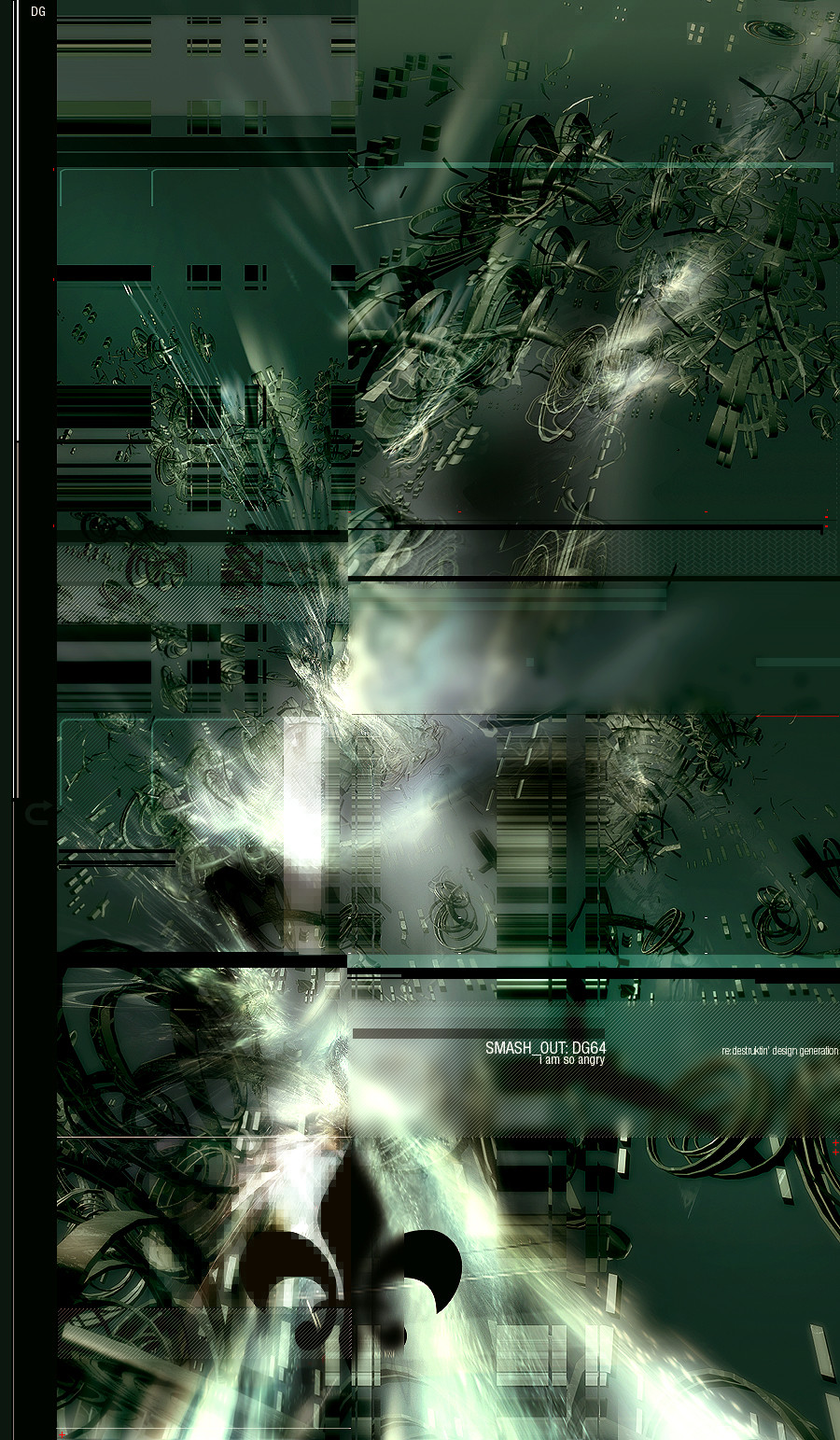
this image describes my feelings at the moment, i dont wanna tellyou why i am angry and sad, but ye, believe, i am.
enjoy.
Related content


Comments: 83


WOW i am still loving ur style!!! gj making me 
👍: 0 ⏩: 0

Wow, this is crazy good, fantastic work sec, I'm once again amazed by your work.
👍: 0 ⏩: 0


ahh if u create nice art like than when your pissed  (Smile)")
👍: 0 ⏩: 0


I like your work, but here is to much detail and no main point that an eye can realax on it...
But otherwise it is really nicelly done...

👍: 0 ⏩: 0


i think everything looks cool except the "pixelated" area.. otherwise bad ass
👍: 0 ⏩: 0


those are some sick renders m8 ")
👍: 0 ⏩: 0


a very very nice an chaotic pic...love the colores the 2d and the great ideas u use on this pic! GJ
👍: 0 ⏩: 0

oh my god that is fukin pro.
i love all the different elements of the pic.
fav.
👍: 0 ⏩: 0


The spade is kind of random but I love the rest...great work!
👍: 0 ⏩: 0

Really impressive!!
nice 3D object, except those cubes..
👍: 0 ⏩: 0

i love this peice, its not like a hore absract, this is like an abstract i can see starting a trend, very unique styel love it +dw
👍: 0 ⏩: 0


So......you think that quebec should separate from the rest of canada, then? Thats my interpretation, anyway
")
👍: 0 ⏩: 0


very innovative
awesome render and brushing as always
unique 2d
👍: 0 ⏩: 0


awesome work sec, i really like the brushing at the bottom its soo beautiful. keep it up bud!
👍: 0 ⏩: 0

amazing, +fav, really great
(yay, a 'fleur de lys' `
👍: 0 ⏩: 0

good work on the renders, 2D is superb, the difference between the several parts of the image is superbly achieved and marks a spot. i luv it.
👍: 0 ⏩: 0


 (Wink)")

amazing as always! Love the renders, great work on the brushing!
👍: 0 ⏩: 0


fuck me bro...very sweet image, love the mixed styles all in one, I hope u keep it up high :]
👍: 0 ⏩: 0

its verry cool but i think you could better remove that black symbol thing at the bottom it doesn't fit imo
👍: 0 ⏩: 0

wow, this peice is really emotional. I love the pixel blurring and the render, it's awesome! great job, hope you feel better
👍: 0 ⏩: 0


great work , really amazing , render is great colors are awesome and 2D is very neat 
👍: 0 ⏩: 0

In my slightly drunken manner I like the solid shapes and colour, it looks kinda destructive in some way...I dunno.

👍: 0 ⏩: 0

Very solid work. Some of your viewers are mistaking the Fleur-des-lie as the boyscout logo. Might be a good idea to explain(or inform) the involvement of this French symbol in your artwork.
I'm assuming there's an issue with someone french or the french in general ?
[link]
👍: 0 ⏩: 0
| Next =>