HOME | DD

sec — SMASH_OUT

Published: 2004-02-22 15:56:19 +0000 UTC; Views: 2604; Favourites: 75; Downloads: 1215
Redirect to original
Description 
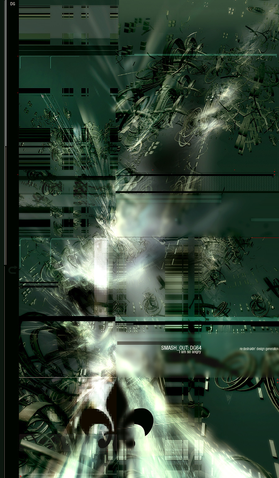
this image describes my feelings at the moment, i dont wanna tell
you why i am angry and sad, but ye, believe, i am.

enjoy.
Related content
Comments: 83

shuni [2004-02-22 18:24:47 +0000 UTC]

damn that's awsome!

👍: 0 ⏩: 0

rev62 [2004-02-22 18:23:54 +0000 UTC]

ah...this is your best work
They forced you to AUK ?

👍: 0 ⏩: 0

nytrix [2004-02-22 18:13:09 +0000 UTC]

This is really sweet bro. I love this style, great brushing...great render(s), sweet color choices.. nice work!

👍: 0 ⏩: 0

dreamr [2004-02-22 17:54:04 +0000 UTC]

damn, i really enjoy the composition of this piece. +fav

👍: 0 ⏩: 0

phenn- [2004-02-22 17:38:27 +0000 UTC]

fucking fuck thats awsome.

👍: 0 ⏩: 0

5Dreamweaver5 [2004-02-22 17:37:57 +0000 UTC]

Great... beautiful...

👍: 0 ⏩: 0

monografik [2004-02-22 17:36:21 +0000 UTC]

Awesome work mate too bad ur angry n sad but it if it helps you make more of this ..by all means .. do get mad more often nice one man , keep it up

👍: 0 ⏩: 0

Icecore09 [2004-02-22 17:34:25 +0000 UTC]

wow
awsome

👍: 0 ⏩: 0

DagothUhr [2004-02-22 17:33:28 +0000 UTC]

very nice duude

👍: 0 ⏩: 0

bliz [2004-02-22 17:12:43 +0000 UTC]

bra sec

👍: 0 ⏩: 0

skargrim [2004-02-22 17:00:42 +0000 UTC]

Not sure on the 2d... but the rest is nice... maybe needs some more depth where the focus moves up to the top... kinda flowing depth of field? Nice work, great colours.

👍: 0 ⏩: 0

new-model [2004-02-22 16:47:55 +0000 UTC]

doesnt fit my mood.. i cant look at it right now. just got a real bad headace.

not from the pic thou

👍: 0 ⏩: 0

yellofury [2004-02-22 16:32:02 +0000 UTC]

looks great man
i dunno about the trois de fleurs
aka boyscout logo

👍: 0 ⏩: 1

inception8 In reply to yellofury [2004-02-22 18:20:31 +0000 UTC]

For the politically correct - It's 'Fleur-de-lis'

Little history - [link]

👍: 0 ⏩: 2

yellofury In reply to inception8 [2004-02-24 03:48:43 +0000 UTC]

yessssss
thanks for finding out the details

👍: 0 ⏩: 1

inception8 In reply to yellofury [2004-02-24 05:44:22 +0000 UTC]

sorry. hope ya didn't mind.

👍: 0 ⏩: 1

yellofury In reply to inception8 [2004-02-25 04:43:21 +0000 UTC]

not at all my friend I appreciate the info

👍: 0 ⏩: 0

NullVoiD In reply to inception8 [2004-02-23 10:35:56 +0000 UTC]

heh, u have to teach so many people

👍: 0 ⏩: 0

vo1ume [2004-02-22 16:31:44 +0000 UTC]

nice work, you combined a lot of different styles...i love it
the color is great

👍: 0 ⏩: 0

AlexiaN [2004-02-22 16:29:55 +0000 UTC]

Lovely piece man

👍: 0 ⏩: 0

fcukwit [2004-02-22 16:20:23 +0000 UTC]

amazing +fav but get rid of boyscout logo tho lol

👍: 0 ⏩: 1

inception8 In reply to fcukwit [2004-02-22 18:19:02 +0000 UTC]

it's actually not a boyscout logo -

Little bit of history - [link]

👍: 0 ⏩: 2

inception8 In reply to inception8 [2004-02-22 21:58:05 +0000 UTC]

Eh. Just thought I'd pass that along.

👍: 0 ⏩: 0

fcukwit In reply to inception8 [2004-02-22 19:42:46 +0000 UTC]

my bad!

👍: 0 ⏩: 0

darkevil [2004-02-22 16:09:54 +0000 UTC]

Cool...

👍: 0 ⏩: 0

djspinnet [2004-02-22 16:05:51 +0000 UTC]

sweetttt

👍: 0 ⏩: 0

videa [2004-02-22 16:05:17 +0000 UTC]

lol. toi blurraus tos yhes kohas on ihan priima.
hieno on ja silleen

👍: 0 ⏩: 0

Vision-Eagle [2004-02-22 16:01:41 +0000 UTC]

WoW thats soooo amzing pice of an art +fav

👍: 0 ⏩: 0

bloodpixel [2004-02-22 16:01:38 +0000 UTC]

yeah man amazing stuff

👍: 0 ⏩: 0

dsymetry [2004-02-22 16:00:40 +0000 UTC]

very nice good work dude quite unique and i think its well balanced well i dunno maybe something at the top but still great work

👍: 0 ⏩: 0

Acid666 [2004-02-22 15:59:21 +0000 UTC]

dude, be more angry and sad you make excellent stuff ! fave

👍: 0 ⏩: 0

silentms [2004-02-22 15:57:41 +0000 UTC]

AWESOME! GJ

👍: 0 ⏩: 0


<= Prev |