HOME | DD
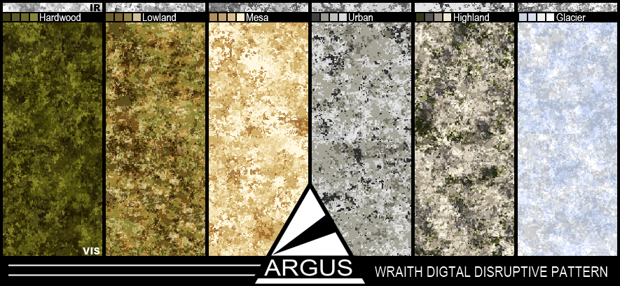
 sharp-n-pointy — Wraith Digital Camo
Published: 2011-09-15 22:27:05 +0000 UTC; Views: 10497; Favourites: 73; Downloads: 1057
Redirect to original
Description
I really like how these came out, though the swatches don't show enough of the pattern to show it off very well, but I really didn't want to put up a 4000x6000 pixel full sheet just to include the entire pattern for each. Might upload the individual swatches if people like this much.Related content


Comments: 25

These are some great looking patterns!!! Nicely done!
👍: 0 ⏩: 0

Wow. Just wow. Highland looks like a hybrid between urban and a snowy lowland. I think Lowland is my favourite.
👍: 0 ⏩: 0


It would be amazing if you sumbitted the full swatches, these are the best camos I have ever seen
👍: 0 ⏩: 0

HI Jason I am Paul; I was looking for a pattern to wrap a sea-doo with and came across your wonderful patterns. Is it at all possible to get these in High Res? or even in original format flattened would be fine as well.
Drop me a line i would love to hear back from you.
Thanks
Paul D
👍: 0 ⏩: 0


This might be a bit late, but I personally would also love a high resolution version.
👍: 0 ⏩: 0

I'd love to see the hi-res versions, especially a dark grey & black version
👍: 0 ⏩: 0

i really like the lowland and Highland patterns.
Especially the Highland looks like a great combo of Multi and desert camo.
👍: 0 ⏩: 0

If there is a way that you could provide the Highland Digital Disruptive Pattern that would be awesome. Could you please do that? Thanks for whatever you can do...
 (Smile)")
👍: 0 ⏩: 0

Wow, those are pretty damn cool. My favorite camo is the Digital Highland.
👍: 0 ⏩: 0

nicely done ... i actually really like the Highland
👍: 0 ⏩: 0


I'm totally diggin' that Lowland pattern; like what you did with it!
The design of the display is also very professional looking, looks like a legit advertisement from a defense contractor.
👍: 0 ⏩: 1

Thank you! Lowland is my favorite of the bunch as well.
👍: 0 ⏩: 0


Damn nice! What method did you use for making these? Any chance of a tut?
👍: 0 ⏩: 0


Hm. Hardwood may need a brown in there, otherwise it's very low-contrast. Some patterns work like this, but in forests I don't think it's a good idea, because there are usually so many different colours. Mesa, Urban and Highland look legit though.
Do you plan on doing anything RL with these?
👍: 0 ⏩: 1
It looses some contrast in the scaling (they are rather large swatches) which may explain why they seem so low contrast. Its sort of an ATac (micro-digital) and Multicam hybrid (internal pattern gradient) style. Hardwood would have been dropped by now but I love the Swedish M/90 pattern too much to just abandon it. Lowland and Highland are they two most recent with Mesa and urban being the second most recent.
No nothing RL, just NS as usual.
👍: 0 ⏩: 1

For contrast and preview purposes, it might be better to show a close-up of each pattern as opposed to the whole thing scaled down.
But very nice work.
👍: 0 ⏩: 1
This is probably what I should have done. I was worried Id show too little of the pattern, and obviously didnt want to make it massive, so I rescaled as a compromise. If/When I upload the swatches I'll probably do a 500x500 px 'true' size swatch for each, though that's only 1/16th of the true swatch it would atleast show the contrast(and internal pattern) better since the individual shapes don't get squished to an indistinguishable level.
Thank you for the advice!
👍: 0 ⏩: 1
")