HOME | DD
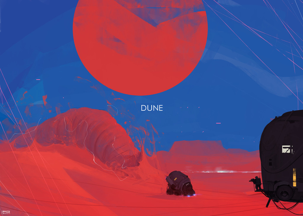
 Shnek — Dune Cover

Published: 2011-09-02 02:13:57 +0000 UTC; Views: 2572; Favourites: 38; Downloads: 0
Redirect to original
Description
Final project for my Illustration Markets class at SCAD. We had to choose our preferred illustration market and produce an illustration for it. I went for Science Fiction book covers, so I ended making a cover for Frank Herbert's Dune.Went for a different approach, rather than resorting to put a sandworm on the cover I used some other elements, like the crysknife which is holding the Duke's and water rings, at the same time catching the reflection of a Fremen eye. I liked the end result, but I do feel like it looks more like a graphic novel cover rather than straight up book cover. Oh well, live and learn anyways.
Related content


Comments: 19

Still it's pretty cool and that story is excellent!
👍: 0 ⏩: 1

Yep, the story was really cool. I need to get my hands on the other Dune books too.
👍: 0 ⏩: 1
I need to get the time! I bought the 2nd one but haven't had time to read it yet, do you want to borrow it?
👍: 0 ⏩: 0

Wonderful work, but I have to say that the knife does not make anysense. The whole thing including the shaft is made from the teeth of the worm and not metal. This means there would not be any reflection to the blade and that there would on be specular highlights. If this is a cover for the book, then that would be a very important thing to take into account as your cover need to reflect the source material of the book with your cover illustration.
Excellent work and a great way to avoid the cliches of a typical Dune cover, but the reflection needs to go if you are sticking with the Dune lore and story
 (Wink)")
👍: 0 ⏩: 1
Thanks a lot for the critique. Very good points you raise there. If I ever get to redoing this piece I shall take them into consideration
 (Smile)")
👍: 0 ⏩: 0

a mi me parecia la portada para un comic de Dune, esta genial, tengo q llegar a pintar asi XD
👍: 0 ⏩: 1
Sí, a mi también me daba esa impresión
Ahí toca darle y darle nomás a la pintura digital hasta que salga la nota, y eso que yo no estoy tan cerca del nivel que quisiera a estas alturas

👍: 0 ⏩: 0

pues estoy de acuerdo con el lui, parece una portada de novela grafica, bien podria ser la portada de la novela grafica de Dune o una portada muy original para la novela, jeje, ya puedo verlo con logo de la editorial, me da la sensación de que la mano esta plana comparada con los anillos donde si hay una mayor simulacion de tridimensional y profundidad, las manos son como un delineado grueso con algo de pintura por dentro, los anillos en cambio a parte de que tiene un delineado al cual le ayudan un poco esos pequeños cortes tiene una sombras mas intensas que facilitan la profundidad, creo que ponerle un poco mas de sombra a solo algunas pequeñas partecillas de la mano le podría ayudar un poco
👍: 0 ⏩: 1
Buenos consejos ahí Fabiancete, eso de los contrastes y las sombras aún me causa problemillas en algunas imágenes, pero ahí se le da con la ayuda de los panas
👍: 0 ⏩: 0

Pues sí se siente como una novela gráfica de Dune más que un libro... pero hey, eso también es muy bueno ")
👍: 0 ⏩: 1
Gracias loco, simón que parece portada de cómic (aunque un cómic de Dune sería una bestia
👍: 0 ⏩: 1
A veces la simpleza impacta más que la complejidad
👍: 0 ⏩: 0

Me gusta me gusta me gusta me… 
No se de qué es el libro exactamente pero me gusta. Todos los elementos, con detalles… pfff, muy buena onda!
👍: 0 ⏩: 1
Gracias loco. Si tienes chance ahí leéte el buen Dune, clásico de la ciencia ficción y un muy buen libro.
👍: 0 ⏩: 1

I think it turned out pretty well.
Only thing (if you ever want to go back to it) would be the reflection doesn't feel quite like a reflection yet.
Sort of feels like there's an actual eyeball growing out of the dagger.
👍: 0 ⏩: 1
Yeah, you're right about that. What would you suggest I could do to improve it, knock down the colors or maybe add some glare from the blade over the eye?
After showing my classmates all those oversexed Scifi covers on my presentation the other day, comments about One-eyed-swords where inevitable with this one
👍: 0 ⏩: 1
I think this picture is a pretty good ref
[link]
👍: 0 ⏩: 1