HOME | DD
 SiathLinux — 3DMG Inc Advert 1
by-nc-nd
SiathLinux — 3DMG Inc Advert 1
by-nc-nd
Published: 2009-03-09 02:44:10 +0000 UTC; Views: 1534; Favourites: 1; Downloads: 14
Redirect to original
Description
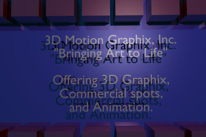
3D Motion Graphix, Inc. AdvertAnimation done with Blender 2.48a
A basic attention getting animation to use in my company to promote the company.
Copyright - 3D Motion Graphix, Inc. (a Florida Corporation)
3D Motion Graphix, Inc is solely owned by Randal Lovelace aka SiathLinux.
Related content


Comments: 43

Yeah it is a bit dark... too much light cause reflection issues - too little made it too dark - really hard to find the happy medium
👍: 0 ⏩: 1

yeah, that is a dilemma -
_full view is better - are U testing these on a TV, well i think U are -
you should find an answer``~...
👍: 0 ⏩: 1
They will be rendered at full 1080i for use on a Sony Bravia screen...
👍: 0 ⏩: 1


I'd think that since you're advertising for animation services, you might want to incorporate some more advanced animation and lighting techniques. It's like a tiny little demo reel for your company, in a way.
I'm not much for animation, but I can see if I can whip you up something after classes to show you what I mean.
👍: 0 ⏩: 1
I have 'newer better' animations - this one will probably get it's timing reworked as well as the 'view' of the words... the lighting ... hmm may just add a 'distant sun' to help the overall lighting but without affecting the shadows more....
I'd like to see what you can 'whip' up....
👍: 0 ⏩: 0


is little dark and the color is dark so...
but the base of the animation is god so just need little adjustment
nice start siath
 (Wink)")
👍: 0 ⏩: 1
Thanks - I think the dark came from me trying to keep the light reflect from be harsh on the cubes... so I turned it down too much... I'll redo this one - since I really like the concept of it...
👍: 0 ⏩: 0
thanks, I've better ones made - just can't load them here..
(and I really want to show them off....)
👍: 0 ⏩: 1

well... give us your youtube account and upload them there!
👍: 0 ⏩: 1
It's a copyright issue - I can't show the copyrighted content without signed authorization... here there or anywhere
👍: 0 ⏩: 1
hm well ok THAN we just have to use our imagination!
👍: 0 ⏩: 1
I just got permission! it will be up in a little while
👍: 0 ⏩: 0

Siath,
It is way too fast. I couldn't read it. Lights could be a little brighter, but speed was the main thing.
👍: 0 ⏩: 1
Yeah, well 15 seconds isn't a lot of time to put that much information in... but I agree the timing could be better.
👍: 0 ⏩: 1
hey this ones for you! make it 30 seconds!!
👍: 0 ⏩: 1
If I do that then I loose my 2nd spot (though seriously - if I hear back from =djeric today - I'll put up another video commercial - it's much better and uses his model (scene)...
👍: 0 ⏩: 1
mmmm I see. Maybe you could edit the text a bit then?
👍: 0 ⏩: 1
Yeah, probably completely rebuild this...
👍: 0 ⏩: 0

👍: 0 ⏩: 1
Looking at this animation:
The lighting is too dark. If you can, try bringing up the global light in your CAD program, rather than using the spot light. The screen goes dark when I presume one of your red sculptures goes in front of it. Because the screen only goes black once, I get the feeling it was unintentional. When I think of something passing in front the screen, I typically think of multiple items doing it multiple times, like the Stars in the Paramount's logo to bring attention to them before they go to being in the background [link] .
I feel like there's too much text. I know I wasn't able to read it all on the first pass, and the fact that the spot light is pointed for the most part at the cent of the text, and your company name is at the top, I didn't even see your company name 
Thoughts for future animations:
I feel like the last image is rather off. Granted if you show this on a TV spot, the ad won't stop on the last frame, but still, you have "Bringing Art to Life" as the main focus, but it's in a gray two-dimensional text against a plain blue background, not exactly my idea of lively art.
Of course, I'm not entirely sure what your intent for this animation is. I'm writing this as if you are tying to wow a bunch of patrons of a Pixar film. Rather than having a few red pillars that move around the screen, I'd like to see some real backgrounds, like have your ad take place in a city with CGI buildings. Each part of your ad could be placed on a different billboard, all the while showing off the cars moving around the periphery of your vision, giving you the impression that you are in the city. And if you chopped up your statements, I think it would help you immensely. If you had one area that said "Offering 3D Graphix"
Good luck with your company

Thank you -
This is not my first animation - but this is my first on that was designed for my company.
Your thoughts are spot on, and my skills to do some of the suggested things are lacking... however, I've made several, and I must say much better animations since this one, but as they contain proprietary information I can't place them here... ie I don't own some of the copyrights used.
I have 1 that I may be able to put here, but I'll have to ask the artist permission (models used are not my own in that one) before placing it here.
👍: 0 ⏩: 1
~my skills to do some of the suggested things are lacking
 (Cool)")
~I have 1 that I may be able to put here")
👍: 0 ⏩: 1
I have a commercial which I just was granted permission to upload (as the mesh used belongs to =djeric )So, as soon as I finish with the message center - I'll upload it
👍: 0 ⏩: 1
 (Smile)")
👍: 0 ⏩: 1
I choose not to show past the building as there is not 'city' behind it...
👍: 0 ⏩: 1

👍: 0 ⏩: 1
hmm, the model doesn't actually have a roof, though I could add one...
👍: 0 ⏩: 1

👍: 0 ⏩: 1
I may have some 'future uses' which could show more than is seen from the camera angle used here....
👍: 0 ⏩: 0

you spelled graphics wrong
it makes it look unprofessional imo
👍: 0 ⏩: 1
It's my company name... 3D Motion Graphix, Inc.
Otherwise do you like the animation...?
👍: 0 ⏩: 1
as a company name it's neat, but when it's used in a sentence it looks off
Also, I think you have to show a little bit more for the animation...It seems to me like 3d text is something that movie maker or powerpoint could do...I know it's harder than that in reality, but it comes across that way
I think you have to really pull out all of the stops on a commercial...why not an animated chess game? That set you made is really neat
👍: 0 ⏩: 1
I am already working on animating the chess set, it's a system hog though, so I may have to animate it on a different computer (lots and lots of poly there)
As for the customer commercials, those will be whatever the customer needs/wants - a balance of the two, I've several artist/3d artist/animators that I can call on for a variety of styles and such.
I know my skills are limited, improving, but I keep resources available to me for those that I lack.
👍: 0 ⏩: 0

I gotta say, that's pretty cool. Could be a bit brighter though. Also, put the contact info at the end instead of just before the end, so it's the last thing you see!
👍: 0 ⏩: 1
When I redo this those last two sets of words will be 'swapped' ... as that just makes more since..
👍: 0 ⏩: 1