HOME | DD
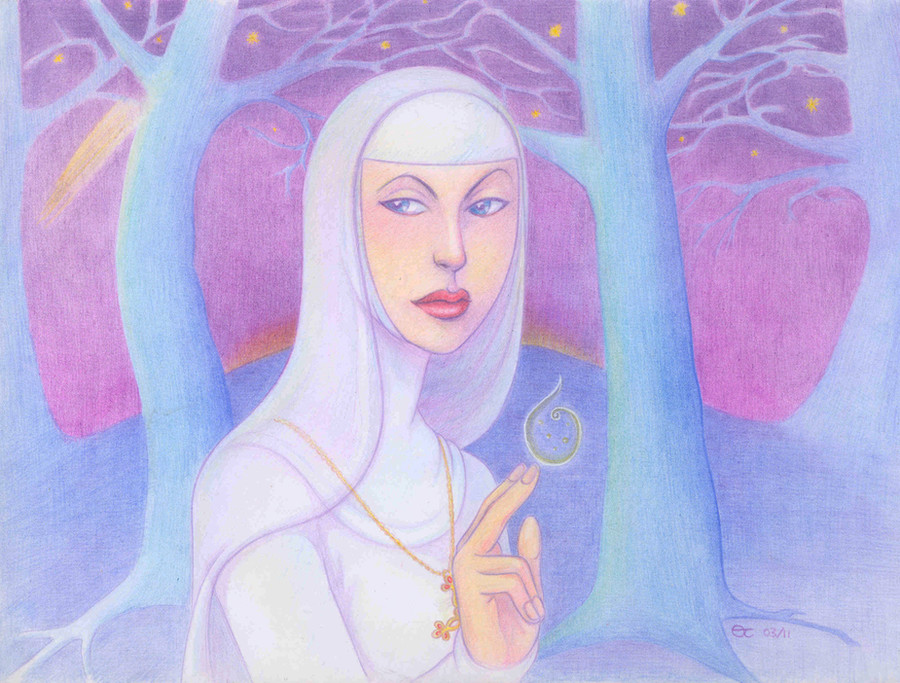
 Sigune — By the Book

Published: 2011-08-01 21:36:02 +0000 UTC; Views: 1268; Favourites: 44; Downloads: 0
Redirect to original
Description
This picture was made as a character concept for Morgana as she appears in my Gawain comic, sorting out her costume and colour (or lack of it") ). It's also supposed to give me a taste of colouring for the comic.
). It's also supposed to give me a taste of colouring for the comic.Because the details are quite fine, I resorted to my trusty Staedtler pens. It is really pleasant working with them in my watercolour Moleskine.
So:
Staedtler pens, Winsor & Newton + Cotman watercolours and a touch of white gouache in a Moleskine sketchbook.
Related content


Comments: 22

Ms. Sigune, I have long admired your depiction of Morgan le Fey (there's something delightfully fitting about The Lady Morgana wrapping herself in the robes and the power of a MOSTLY-Christian abbess) and I have to admit that this is probably my favourite rendition; the lady looks so far above reproof … and yet I think one can just about detect a certain calculation in this fine image of innocence!
👍: 0 ⏩: 1

She's a smart woman, she can't help but think about what she sees and hears... Morgana is one of my favourite characters. She's quite sincere, but her fairy nature makes her ... different? Arthur doesn't really understand her (and she doesn't understand him either, haha). I'm really looking forward to a big confrontation that has taken a very definite shape in my head but which is still far off at my current pace :/.
I'm glad to hear you like my Morgana! She is great fun to write and draw  (Smile)")
👍: 0 ⏩: 1
Morgan le Fay and Morgause really ARE two of the more entertaining characters in the Arthurian Mythos (it must be all that scheming!).
👍: 0 ⏩: 0

Great image, and I much love the colours!
👍: 0 ⏩: 1
Thank you! I still struggle with colours, but I try...
👍: 0 ⏩: 0

I think this is a great piece, the movement is nice and you have a great variety of line weight. The character has a great gesture and this does much for the story as well as the overall composition. I might suggest pushing the atmospheric perspective in the background a little deeper. I don't think the line work in the background is necessary, I think it might be detracting from the more interesting an beautiful work in the front. Overall I think this is superb. : )
👍: 0 ⏩: 1
Thank you very much!
Perspective - of all kinds - is the bane of my drawing life... I need to work on it, but I simply have difficulty "seeing" it ")
👍: 0 ⏩: 0

")

Really nice job ! As always I love the "ancient" look of your illustration, with your inking who's remind me, medieval painting and some engravery (not sure fot the word, in english, sorry
👍: 0 ⏩: 1
Thank you!
I like 19th-century illustration - that was often black-and-white because reproducing colours was really expensive. That's how I explain the fact that I always fuss over my lines but don't understand a thing about colour  (Wink)")
👍: 0 ⏩: 0

Nicely done. Use of shadows as accents will helpwith the background. Also if you darken the far background it will help the foreground stand out as a separate piece. Line density and variation throughout the scene, not just with Morgana, would help. The colors are quite nice and far more subtle than what I can do. Looks good.
👍: 0 ⏩: 1
Thanks!
I tried to paint more subtly than usual; I think I tend to over-paint normally.
Shadow and light are things I really struggle with. I'm trying to eliminate them from my colouring for the comic because I'm just too inept; I'd rather not do shadows than ruin the rest of the picture by doing them badly. Contrast is also a sore point. (I know: what DO I do well?!) Here I was thinking that a) the background would have to be dark-ish because Morgana is dressed in white and otherwise she won't stand out; and b) as the background is at the back, it should be paler than the foreground to create some depth. So those two things were kind of contradictory 
👍: 0 ⏩: 1
Try textures to create contrasting planes/areas that accentuate tour main focus. Not as good as using light and dark but will do in a pinch.
👍: 0 ⏩: 0

She is beautiful! Morgana was always one of my favorite characters in the Arthurian legends!
👍: 0 ⏩: 1
Mine too! I've adapted her story quite a bit for my comic, though. I wondered how people would react to her being a nun, but I'm certainly very happy I wrote her like that - it's great fun
Thank you!
👍: 0 ⏩: 0

is it intentional, that she has A.Jolie's face (or at least looks very much like that)?
👍: 0 ⏩: 1
Goody, no! I went for a Standard Sigune Girl Face with Alluring Mouth and Arched Eyebrows option (TM)
👍: 0 ⏩: 0

You can do better with the trees in the background.
Morgana looks too fantastic to have a poorer background
👍: 0 ⏩: 1
But I hate drawing backgrounds
- No, seriously: the trees can look better if I elaborate them more, but I thought thicker lines would push them more to the front. Would they? I tried to get them to fade, though arguably with little success
Drawing this reminded me how much I loev lines. Inked lines, especially 
👍: 0 ⏩: 1
I don't think they need bolder lines; they need a less generical shape, and this doesn't mean going toward realism. You can be more styilised, playing with spirals and curves like you do with hair. Just go very Sigune with the trees as well
On the other hand, the tree on the foreground-left would be better with a thicker line.
👍: 0 ⏩: 0