HOME | DD
 StephOBrien — Drifting Between Life and Death
#frisk #undertale #undertalefanart #frisk_undertale #undertale_frisk #undertale_just_cause #undertalejustcause
Published: 2019-07-02 22:57:16 +0000 UTC; Views: 647; Favourites: 20; Downloads: 3
Redirect to original
Description
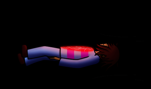
Floating in the void between life and death, Frisk reflects on the decisions that brought them here, and wonders what is coming next...
The work-in-progress preview for page 45 of my Undertale fan comic, Just Cause, is ready, and this is one of my favorite panels.
You can read the comic from the beginning here .
If you want to help me make art faster, get early access to completed art, and get exclusive access to works in progress, please consider supporting me on Patreon . If you want to help me without the monthly commitment, you can also support me with a one-time donation on Ko-fi.Related content


Comments: 30

Heya, Im from ProjectComment and I like ur piece. Im a fan of undertale myself ^^ . Anyways, ur piece is nice but it kinda looks flat. Nut then again, the whole surrounding is black, so I can really blame u on that. The lineart is sooo smooth and nice. I'll be honest, i feel so at ease just looking at the lineart XD Ur shading is smooth too . Considering this is Frisk, I wouldn't expect any facial on them I do wish that the heart or soul in this matter, is brighter, by brighter I didn't mean adding white highlights or anything. Just more red highights, not too much. Just enough too illuminate the character. Anyways, love ur piece, hope u do more^^
👍: 0 ⏩: 1

Thank you very much for the feedback! I'm glad you enjoyed this picture and it set you at ease.
Increasing the red highlights the soul cast on their body probably would have made it less flat and more dramatic; I'll keep that in mind for future save screen scenes. Thanks!
👍: 0 ⏩: 0

Hello !
I'm from , more specifically the weekly comment project.
Quite an atmospheric piece you have here! Even without the description under it, the viewer can easily get the feel that you wanted.
Frisk is also done in such a way that he, I’m guessing you went for the male version, is easly recognizable.
That said i do feel like in the overall this piece is a bit to dark. Yes, i know that it is done on purpose but there are a lot of ways to do the "falling into darkness" panel. In this case you have Frisk falling deeper and deeper into darkness but you also have a light source coming from his chest and stomach, and while we can see the effect of this light in Frisk it doesn't seem to emanate to anything but him. Doing a bit of an weak light effect, maybe using an airbrush in an very small opacity over the light source it would be fixed.
A bit about ht e background, i know the feel you are going for, and it is done very well, but i did have some ideas that you may like. Right now he has an "stable" feel about him, not falling into darkens nor going to the light, he is just floating though the darkness, if you want to give a losing battle to the dark vibe to him i would suggest making the darkens more in compensating and maybe give it a bit more of living style to it you could make “tentacles" of darkness dragging him down. On the same note if you want to give him a going to the light or waking up vibe you could make him look like he is being dragged up to a unseen light source, and make the darkness weaker the closer he seem to it.
The pose will also be very important in both cases, right now he does seem to be just driffiting but if he was supposed to be dragged to the darkness than a slightly falling pose would be good, same for the going up, a more being held by wherever part of his body you want to focus going up, this last one is also good cuz you can easily use his body to show how deep in the dark he was.
So overall she has quite a nice design
👍: 0 ⏩: 1
Thank you for the feedback! The version of Frisk in the comic this comes from is actually intersex, and I deliberately kept their appearance gender-neutral, so some people see them as male and others see them as female.
Having the soul cast more of a glow into the darkness, as opposed to just on Frisk, sounds like a good idea. Thanks for pointing that out.
Frisk isn’t falling; they’re just drifting, weightless, in a space between life and death where there is no gravity nor any light source besides their soul.
A losing battle to the dark wasn’t the effect I was going for here, but the tentacles sound like a good idea if I do draw a picture where that is the intended effect. In this panel, they aren’t moving closer to life or death; just drifting motionless, undecided, somewhere in between. Later in the same comic page, the “Reset” and “Continue” options appear, and then they do move toward that light.
I think you write pretty well for someone who isn’t speaking their first language.
Thanks again for the compliments and suggestions!
👍: 0 ⏩: 1
Thanks!
And i'm glad that even if i got somethings wrong the overall was still usefull
 (Smile)")
👍: 0 ⏩: 1

The lighting ad shading on the drawing is very nice,the hair looks great,though it kinda looks abit stiff to me,in all honesty this is very well made i see you put alot of effort into this,you can keep on practicing,i really like the idea btw
Also from the group projectcomment
👍: 0 ⏩: 1
Thank you very much for the feedback! Could you tell me what it is about the hair that makes it look stiff?
👍: 0 ⏩: 1
Your welcome,and i do't know to me it just kinda looks stiff,if frisk(i think it's frisk)is falling maybe have the hair fall abit more,and looking back again,the artwork is still amazing
The hair does flow abit,but it's your choice,if you want to change your art style,if you are happy with you art style,then that's good,again it is you choice if you want to change it
👍: 0 ⏩: 1
Frisk isn't really falling in this picture; they're drifting motionless, so maybe that's why you think the hair is stiff? Because you think it's supposed to behave like it would if they were falling, and it isn't?
Thank you for the compliment.
👍: 0 ⏩: 1
Ok sorry for well thinking that,I mostly have a hard time giving criticism,again I'm sorry
👍: 0 ⏩: 1
No need to apologize; it was just a misunderstanding. I appreciate you looking for ways in which my art can improve.
👍: 0 ⏩: 0

The lighting in this drawing is vary pretty. Not bad at all!
I personally think that the line art is to thick however. It's a little weird next to the black background.
👍: 0 ⏩: 1
Thanks for the feedback. I tend to find that lines thinner than 2 or 3 pixels look choppy when drawn in Photoshop, so I do tend to draw them at least that size.
👍: 0 ⏩: 1
I understand.
Maybe try making the hole canvas biger, then you can have lines that look thiner.
But I barely know what I'm talking about.
👍: 0 ⏩: 1
That would have worked if I was drawing large to begin with. This was a panel in a comic page, so I needed to make it fit inside the page, but your solution sounds like it would work for situations where making thin lines is a priority. Thanks.
👍: 0 ⏩: 1
I see the problem.
Oh well. It's still a nice work.
👍: 0 ⏩: 1

no prob! it's kinda hard to find a good undertale drawing
👍: 0 ⏩: 1
I'm a member of a few Undertale groups, and they share a LOT of art, so if you want to see some good fan art, here are some options:
fans-of-undertale.deviantart.c…
undertale-for-all.deviantart.c…
undertale-club.deviantart.com/…
👍: 0 ⏩: 0

Thanks! This is my interpretation of the save screen.
👍: 0 ⏩: 1

Huh, that’s a cool interpretation!
👍: 0 ⏩: 1
Thank you. It does add some drama to the scenes that take place there.
👍: 0 ⏩: 0