HOME | DD
 Trellia — Goth Types ENHANCED preview
Published: 2008-03-31 19:55:58 +0000 UTC; Views: 57762; Favourites: 219; Downloads: 0
Redirect to original
Description
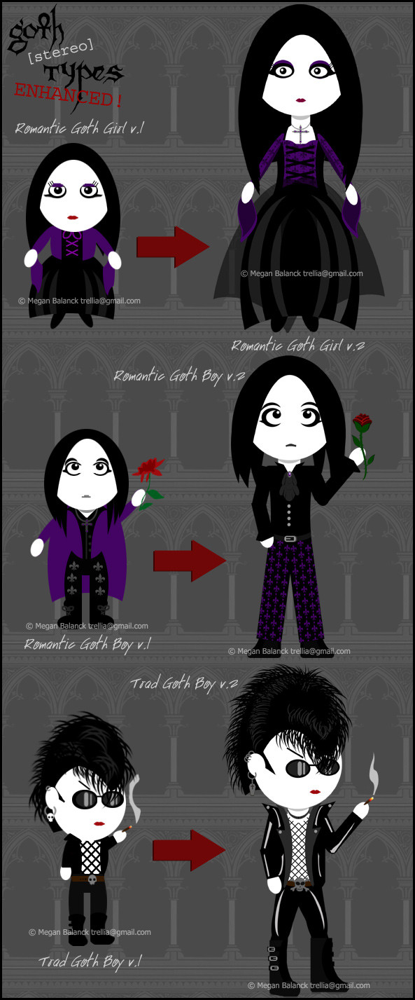
So yes, I'm currently in the process of re-artworking all my Goth [stereo] Types, with the ultimate goal of creating merchandise and hopefully publishing a book of my art.So here's a preview of the images so far - PLEASE let me know what you think! As you can see, I've made each image more detailed and given the goths slightly more realistic proportions.
What do you think of this? Do you like the new art upgrade? Or do you prefer how the originals looked? Please let me know either way, I truly do rely on your feedback!
As with all my work, this is copyrighted. Do not use it without my express permission.
Related content


Comments: 238

your vetor work is wonderful as is, but if you want to try iincorporating some subtle gradients here and there is might help with a bit more depth.
i know its a bitch but the mesh tool is great for this after you get use to it.
👍: 0 ⏩: 1

Actually, none of these are drawn in vector
👍: 0 ⏩: 1


i really really dig your stuff.
but i feel that you must include the "geisha goth" and the Goth Drag Queen.
those are two stereotypes as well.
👍: 0 ⏩: 1
I do have Asian Goth on the to do list
As for Goth Drag Queen...I also have Glam Goth on the list, which will probably cover the look for Drag Queen too.
👍: 0 ⏩: 1

Hmmmm... I like this new style. It definitely has more detail and gives you a better idea of what their goth style is like.
Something about that last one bugs me though.... oh, right. His boots look off.... maybe it's his pose? or perhaps one boot looks bigger than the other... I don't know, 'cause I'm not an artist but it just looks weird for some reason
👍: 0 ⏩: 1
Thank you very much for your feedback!
👍: 0 ⏩: 1
Despite how useless it may be!
Yeah, I feel more confident con-criting stories; my only specialty
👍: 0 ⏩: 0

Is it wrong for me to find romantigoth girl somewhat attractive now? I really like this upgrade, but I'm not sure if I like it better. I'm sort of both ways with it actually. I think they look better because they are more detailed, but they are somewhat less cute this way.
👍: 0 ⏩: 1
Hehe, I'm so glad you like them  (Smile)")
👍: 0 ⏩: 0


I've been silently watching your goth stereotypes (oooh, creepy stalker 
If I only had money and a credit card etc. I'd love to buy merch with these! 
👍: 0 ⏩: 1
Thank you very much! ")
👍: 0 ⏩: 0

When a saw the oldies I thought that nothing could be done more perfect than that and then The new ones came out and these are more perfect even¡¡
👍: 0 ⏩: 1
Wow, what a great compliment! Thank you
👍: 0 ⏩: 0

I think that the new types are a lot better. They still maintain the charm of the earlier ones but look more realistic and professional. Please let us know if you get it published; I'll be wanting to buy a copy.
 (Wink)")
👍: 0 ⏩: 1
Thank you very much! I hope I can get published in the near future...
👍: 0 ⏩: 0

I do like the updated versions- they look more willowy and gothic, a lot more fitting than the little chibiesqe ones. Which were very cute, but maybe didn't fit for certain ones.
👍: 0 ⏩: 1
Thank you very much!
👍: 0 ⏩: 0


Yeah, I agree with everyone else (for what its worth) the new ones are much better, they still have the original charm but look more professional.
👍: 0 ⏩: 0

Tell me when your book is published and I'll be more than happy to buy it.
Btw, your work is more than just badass.
👍: 0 ⏩: 1
Thank you very much for such a supportive comment!
👍: 0 ⏩: 0

I like both the old and new, but yes, the newer proportions are more human-like. Good luck on your goal; I'd thoughtlessly buy your stuff, if that goal would ever come to be.
👍: 0 ⏩: 1
Aww, thank you very much for such kind words of support!
👍: 0 ⏩: 0

I like the lessening of the monochromatic schemes there, especially as it relates to RomantiGoth Boy. I can see where the highlights on TradGoth come in, but I do agree that they might just be a little over much.... maybe a subtler highlight, like the grey of the lapels for slight emphasis, but in the same highlight pattern currently used, so it doesn't detract from the style... just a suggestion. Out of curiosity, what is TradGoth's fishnet doing at the top? Is it a separate collar he's wearing, or do the nets not actually reach the top of the shirt? Figured I'd mention it, because they just seem to end randomly, lol... ")

👍: 0 ⏩: 1
Thank you very much for your feedback
👍: 0 ⏩: 0


I like the newer ones better. I don't know why, I just do.
👍: 0 ⏩: 1
Thank you very much!
👍: 0 ⏩: 0

OMG! THE TRAD GOTH BOY LOOKS SO FOCKING HAWT! *¬*
👍: 0 ⏩: 1
Thank you very much!
👍: 0 ⏩: 0


The new style is great!
Trad boy = love
He looks so sexy!
👍: 0 ⏩: 1
Thank you very much!
And I'm glad you like Trad Boy
👍: 0 ⏩: 0

I like the new, even though they sorta look like teenagers... I think you should still include the mini goths somewhere in the book... table of contents, maybe? or maybe you can pattern them faintly on the back of the front and back covers (the parts that are usually blank white)
👍: 0 ⏩: 1
Thanks for your views
👍: 0 ⏩: 1
Any time : )
I think that would look cute and it would give them some use!
👍: 0 ⏩: 0
<= Prev | | Next =>