HOME | DD
 windfalcon — Mentor - Contest Entry
Published: 2009-06-25 19:49:00 +0000 UTC; Views: 6006; Favourites: 77; Downloads: 69
Redirect to original
Description
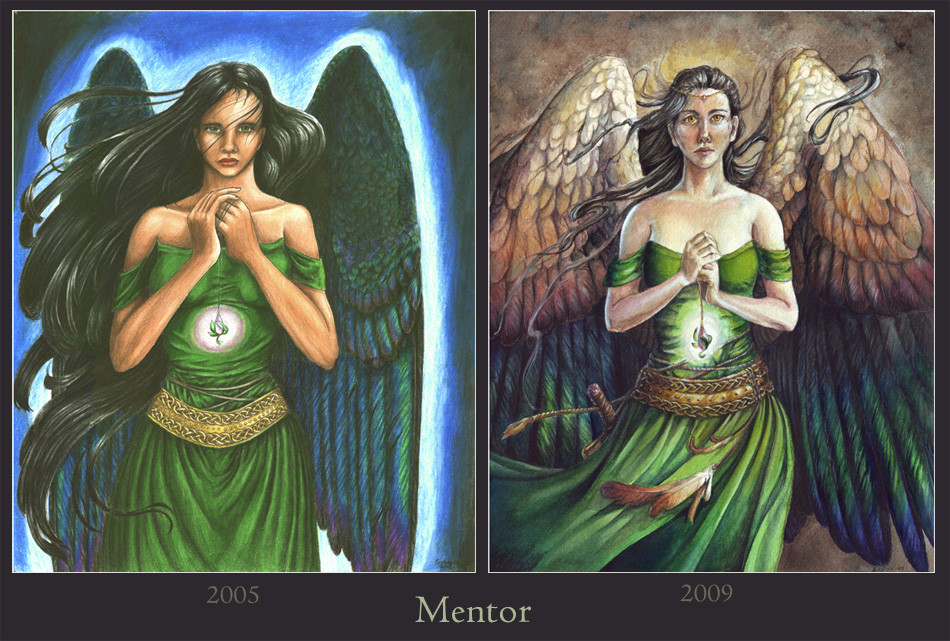
Category: TraditionalOld version: [link] (Colored pencil, 2005)
New version: [link] (Watercolor, 2009)
Description/Critique: Here is my entry for the Kick Your Own @ss contest. Interestingly enough, I had forgotten about this contest until after I started the new version of "Mentor." I've wanted to redo that picture for a while now, and finally started a watercolor version. I suppose it was just happy coincidence that I rediscovered this contest as I was painting it!
This is a character that I created (or discovered wandering in my head?) back in 2005, back when I was writing a lot of stories with =ladydove7 and *InsaneJudge . She is my character Iolani's unnamed mentor, who taught her the art of blacksmithing and how to fight.
Four years ago, I had the image of Iolani's mentor in my head - a strong, beautiful winged woman holding a sacred object. Her wings were inspired by the iridescent feathers of magpie tails, and even after I finished the drawing, there were things I wasn't happy with. As years went by and my understanding of anatomy and color grew, I because more and more unhappy with portions of the piece.
Now, four years later, I finally found the inspiration and confidence to revisit this piece, and redo it in the medium I have grown to love - watercolor. Unlike the original, her expression isn't soft and weak - I feel I was able to give her the presence of strength I always intended with the original. I strayed away from the pure, dark wings in favor of lighter tones, fading into dark. I think it gives it a more dynamic composition, as well as the addition of flowing feathers and other elements.
In the end, I'm very pleased with the outcome of the new version, and it encourages me to try my hand at redoing some other old pieces.
Related content


Comments: 42

To be honest, I like both pieces but for different reasons. The one on the left for its use of saturated colours, youth and vibrance. The one on the right I like because of its firm linework, textures, gradated colours and apparent appeal to the Old Masters.
So, well done to both the you of four years ago and the you of now.
👍: 0 ⏩: 0

Awesome, well done! You definately kicked some ass, haha!
👍: 0 ⏩: 1

It's hard to say which one I like better~
I really like the hair and the way the person's drawn in the original. But I love the oufit and wings in the more recent version.
Oh well, both are good
👍: 0 ⏩: 1

There are parts I like from the old one, too. I prefer the older one's hair in some parts, but overall I think the newer one is an improvement.  (Smile)")
👍: 0 ⏩: 1
You're welcome ")
👍: 0 ⏩: 0

This piece has been featured in my journal features here: [link]
If for whatever reason you would like me to remove said feature, please reply to this comment saying so. Thank you.

👍: 0 ⏩: 1
Thank you for the feature!
👍: 0 ⏩: 1

It's tough to say which version I like better. I think I prefer the face on the original and I love the dress on the original, but I also love the dress on the remake as well as the wings.
👍: 0 ⏩: 0

Thats a huge leap in a relatively short time! everything from body language to lighting is improved
👍: 0 ⏩: 1
Thanks!
👍: 0 ⏩: 1
Better doesn't begin to describe it. your first one was good to begin with and dazzled us all, then you make this one and it blows us away! You certainly are getting your educations worth
👍: 0 ⏩: 0


I love checking out these progression pieces. While they are both lovely, the earlier one seems like just nice art while the more recent is much more realistic. I think it's funny that the second one seems a bit older and all the body proportions are a bit lower, like she really has aged. Anyway, fantastic work!
👍: 0 ⏩: 0

You are amazing. You continuously remind me of Jeffrey Bedrick. I am faving this. You are an amazing artist.

👍: 0 ⏩: 0

I like the new one better, except for her eyes: her left eye seems to slant a bit too much upwards to me. Her dress and belt look wonderful, and her wings look much more real. Her skin's improved amazingly, too: You've worked the color beautifully.
*loves watercolor*
👍: 0 ⏩: 0

This is quite an interesting look of the old and the new artwork. I like both pieces a lot. The first drawing is more like a romp in the forest with those lovely colors. Her expression is confident, gentle, yet strong. The later drawing shows just how much you've improved in your knowledge of the anatomy of the human figure. Her wings are just lovely, and I love magpies too. The face shows more of her power and strength than in the original colored pencil drawing. Watercolor is such magic. Hope to see more of your old & new artworks.
Which DA artist is having the Kick Your Own @ss contest? I like all of my artwork, yet it's so hard...
(My problem is to pick just one artwork from my huge span of drawings from 1996 to 2009. Might have to look through all of my sketchbooks again. Or I just might do several pieces like you, hon.)-


👍: 0 ⏩: 1
It's actually an official contest: [link]
👍: 0 ⏩: 1
I have been having a tough time with getting my Inspiration back from school.
👍: 0 ⏩: 1
I just saw this contest in the news - [link] it's similar to the Kick Your Own @ss contest, but the deadline isn't until September 1.
👍: 0 ⏩: 1
I will thank you very much for the information on this contest and for the link. All for doing your best and having fun with another contest which is similar to the Kick Your Own @ss contest, yet I'll check it out and give it a go.

👍: 0 ⏩: 1
Eep, this was a really really old comment! The deadline for the contest was back in September of 2009!
👍: 0 ⏩: 0

Hmm. I really like them both. I love the wings on the new one, and also her arms seem more realistic and posed to suggest more strength and confidence..
However, i personally feel that the first one's eyes are actually 'stronger' feeling.. The new one actually seems more wide-eyed and innocent, to me.. And her face overall seems a little more heart-shaped, with a narrower chin.. which also makes it seem a bit more feminine, to me. She seems a bit sadder and wiser than the original. Unafraid to look the viewer in the eye.. but more.. 'resilient' than 'strong', in my opinion.
👍: 0 ⏩: 0

ok now that i fangirled for a second, i want to say how impressive the advancement in a mere 4 years is. anatomically, it looks like a real human you captured on paper, instead of the cartoonish idea of one like the first picture. the arms and shoulders do look a bit soft (and a bit small compared to the head/neck) for a powerful blacksmith, but they do look womanly and human  (Wink)")
i also like how her eyes turned to yellow this time. i dont know if i would say she quiiiiite looks powerful, she looks less introverted to be sure. at the very least she seems calm and comfortable in her self, the look in the eyes radiates a feeling of total awareness and ease.
ramblerambleramble ~
👍: 0 ⏩: 0


The difference is quite staggering! I love the form and volume to the new piece, it's much more like she's stood in a 3D space rather than being a flat drawing. I really like her strength of presence in the latter one too, she looks a lot more sure of herself, but not without a certain degree of fragility.
👍: 0 ⏩: 0

I really like both, but the face of the first one appeals much more to me. It's more gentle and innocent, in my opinion and I also really like the fullness of her hair. A lot of the newer angel's hair is hidden behind her winds. I do love all those amazing details you added in the new one, and the wings are just incredible. A great job on both.
👍: 0 ⏩: 1
Ah, see, the gentle and innocent face was actually a mistake in the first.
It's refreshing to see what people like from each, though. Thanks!
👍: 0 ⏩: 0

I love your anatomical understanding and the gentle power your redo holds, but the sheer richness in color and steadfast way she holds herself in the original makes me prefer it over the newer one. *chuckles* Maybe that isn't a good thing in your opinion, but in my eyes the first holds more strength and draws my attention the most.
👍: 0 ⏩: 1
Yeah, there's something to be said over an amateur use of color, in that sometimes the vibrancy can make up for mistakes 
👍: 0 ⏩: 1
*chuckles* You never know 'til you try! ;3
👍: 0 ⏩: 0

I LOVE seeing Growth like this wonderful wonderful!!!!!!!!
👍: 0 ⏩: 0

The new version has a lot more form (really good) and detail to it. Very nice.
👍: 0 ⏩: 0

I really like them both, but I certainly think the new one is more dynamic and flows well. I love the wings especially

👍: 0 ⏩: 0

I hadn't heard of the Kick Your Own Ass contest but I really like that concept of going back and redoing one of your older pieces in your current style and ability.
You can really see what a difference 4 years can make -I think I'm gonna try this with one of my pics from 10 years ago, just for fun. It should be interesting.
👍: 0 ⏩: 0

Oh... my god... I have no chance in this competition at all after seeing this 


👍: 0 ⏩: 1
Aw, don't say that! It's not just the quality of the finished piece that they're looking for, but how much you've improved.
👍: 0 ⏩: 1
Hmm, I guess! ^_^; I can already tell my WIP thus far is about a 100000% improvement on my old piece (no joke, it really is that bad 
👍: 0 ⏩: 0

