HOME | DD
 YCL101 — Elements of Music
Published: 2012-07-05 03:04:47 +0000 UTC; Views: 2698; Favourites: 21; Downloads: 0
Redirect to original
Description
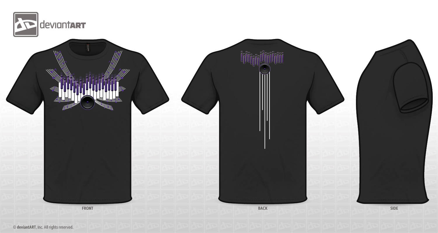
Music inspired T-shirt design for the Deviant Art Contest, hope everyone likes it. I'm always up for suggestions on how my designs can be bettered (Smile)")
I wanted to incorporate different elements of music into my design: Piano keys, equalizers, speakers and staff lines with notes on them as wings
Related content


Comments: 301

ahh nicee ")
 (Wink)")
👍: 0 ⏩: 1


I think it would be really cool if you centered the whole design and then made the measure wings extend further upward and curve in. I don't know if you know exactly what I mean so feel free to ask me to explain it better. Good luck in the contest and I would definitely wear your shirt, too! <3
👍: 0 ⏩: 1

I think I know what you're talking about, and I will give it a shot! Thanks for the advice!
👍: 0 ⏩: 1
No problem! I hope it comes out how you want it to!
👍: 0 ⏩: 1

Really love how you incorporated all of these things into the design. Nice work.
👍: 0 ⏩: 1

This is cool, I like it. It reminds me of a synth and a piano at the same time...
👍: 0 ⏩: 1
That's the point! I'm so glad you saw it!
👍: 0 ⏩: 0

You have made a great choice of colour! I like the design! It is pretty good!!! [link]
👍: 0 ⏩: 1

I really like your choice of color but I wish it wasn't so top heavy. I like how you have the lines running down on the back of the t-shirt design. I feel like something similar tot hat on the front design would really help it. ^_^ Really nice choice of colors though.
👍: 0 ⏩: 1
That's true. I agree. Thank you for the advice!
👍: 0 ⏩: 2
You are so very welcomed. ^_^ I kind of wish we had a little more time to work on the design X.x I found out that i messed up on mine lol
👍: 0 ⏩: 1
I know, me too! How did u mess up?
👍: 0 ⏩: 1
X.x I forgot that I put the design I wanted on the front on the back and the one I wanted on the back on the front LOL ^_^
👍: 0 ⏩: 1
Lol oh no! At least u still get to showcase the design, maybe DA would allow u to make the change since ur not changing ur design at all?
👍: 0 ⏩: 1
possibly. X.x I posted a question on the main page of the site but I am guessing I won't get an answer for a while lol ^_^ It's ok it was a fun design to do anyway.
👍: 0 ⏩: 1
oh man, well at least DA will know where the design is supposed to go
👍: 0 ⏩: 1
Man... now u got me thinking again haha!
👍: 0 ⏩: 0

Woah nice, purple with black is a good combination, good luck, bro
👍: 0 ⏩: 1
Thanks a lot! Glad you like it!
👍: 0 ⏩: 1

i like it
👍: 0 ⏩: 1
yup ur right! thanks for the advice!
👍: 0 ⏩: 0

lol, yeah, it does a little bit!
👍: 0 ⏩: 0


mm~
it's nice and simple (x
for advice: i'd say that the speaker is... it looks realistic...
and the rest look kinda..... yeah hahah
to me, that looks kinda weird ya kno? :/
and the equalizers look too similar; ya could've made em more different from each other
other than that, i will say no more hahah xD
it's great (:
👍: 0 ⏩: 1
Thanks so much for the advice! I agree with you!
👍: 0 ⏩: 0

Thanks for the comment on my design, i really like the design on the back, it is pretty original. nice job.
👍: 0 ⏩: 1

great job i love it the colors and some details are awsome
👍: 0 ⏩: 2

Very nice! I like it, it's very clean and simple. I'm not sure what the white lines on the back are, though?
👍: 0 ⏩: 2
They're called staff lines, where the music notes are on. Thank you so much!
👍: 0 ⏩: 0
i'm guessing those are staff lines since there are five lines
👍: 0 ⏩: 1
That's what I thought too, but since they're all different lengths and a bit far apart from each other, I wasn't sure.
👍: 0 ⏩: 2
I meant to look like the speaker is bleeding out the staff lines lol, weird, i know
👍: 0 ⏩: 0
cmon man, lets not think complex hahah ;D
its just creativity (x
👍: 0 ⏩: 0

seriously i didn't se this yesterday!
mm... my comment is only for color pick.. i wonder why u use purple?
👍: 0 ⏩: 0

Thanks for commenting on my shirt. (: I really like your design. :3
The only thing that just irritates my brain is that the keys are off-center on the back, but I understand that you were taking the same ones as off the front (at least, that's what it looks like). But that's the only thing I see. (: Great design!
👍: 0 ⏩: 1
Yes you're right. Thank you so much!
👍: 0 ⏩: 1
<= Prev | | Next =>