HOME | DD
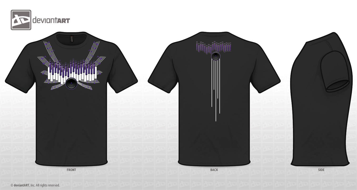
 YCL101 — Elements of Music
Published: 2012-07-05 03:04:47 +0000 UTC; Views: 2698; Favourites: 21; Downloads: 0
Redirect to original
Description
Music inspired T-shirt design for the Deviant Art Contest, hope everyone likes it. I'm always up for suggestions on how my designs can be bettered (Smile)")
I wanted to incorporate different elements of music into my design: Piano keys, equalizers, speakers and staff lines with notes on them as wings
Related content


Comments: 301


Nice shade of colors you selected! I love how the music notes are flowing out in all directions~
just a personal thought- I would suggest you make the design bigger on the shirt next time- it need to show out more.
but it's a great idea! Great job you did here ")
Voted!- and good luck
 (Wink)")
👍: 0 ⏩: 1

Thank you so much for the advice! I will make the corrections on my personal version! Thanks!
👍: 0 ⏩: 0

very detailed design.
check out mine
-------
Design 1: [link]
Design 2: [link]
👍: 0 ⏩: 1

I like the design in the back too, i like the elements of the music (piano etc) how do we vote? lol
👍: 0 ⏩: 1
Click "I want this!" next to the shirt, thank you so much!
👍: 0 ⏩: 1


nice design
i actually like the back more
👍: 0 ⏩: 1

Nice. I love the simple design and emphasis on symmetry. The speaker is put just in the right spot.
You have my vote!

👍: 0 ⏩: 1

this looks cool.. kinda reminds of chorus or even an organ somehow xD
👍: 0 ⏩: 1

Very nice symmetry, and I like how the keys are up and downs instead of staying flat.
👍: 0 ⏩: 1

This is a solid shirt idea my man (or woman). I particularly like the overall composition of the design, the only thing I would say is just get creative with these contests. There's nothing to lose, the worst thing you can be is too timid with the creativity.
Overall, I like it. I think you did a good job capturing the concept of music! You got my vote no doubt!
👍: 0 ⏩: 1
(man) Yea i agree with u, thanks for the tip!
👍: 0 ⏩: 0

that's a pretty awesome design. Using those elements to make a form of "angel wing"
the back is great too. I would probably add some small stuff on the sleeves, but maybe that's overkill.
👍: 0 ⏩: 1
No, thats a great idea, but for the contest we are only limited to 2 print areas... Thank you!
👍: 0 ⏩: 0

Ooh, this looks very nice :3 I'd wear this.
👍: 0 ⏩: 1


i like it! and like purple too ) it reminds me of some alien spaceship and it's cool )
if you want advice, it is just i'd do something with the perspective of the 2 upper "wings" a bit, as the whole composition seems floating towards the spectator while the upper part is moving down...
and a little curved (left and right) lines on the back would look better, i think
may be it is all just my vision )
👍: 0 ⏩: 1
well, you have great vision! Thank you for the advice!
👍: 0 ⏩: 0

well executed design with plenty of detail, just the right amount of colour
👍: 0 ⏩: 1

This is cool stuff, but I wish the purple was brighter!
👍: 0 ⏩: 1
I agree, it looks alil dark on a black shirt lol. Thank you!
👍: 0 ⏩: 1

I really like this, especially the music lines cuz' they remind me of wings. Was that intentional?
👍: 0 ⏩: 2
Btw, love all ur pieces!
👍: 0 ⏩: 1


Nice design! I like how made the wings for the front
👍: 0 ⏩: 1

Very creative way to make wings!
👍: 0 ⏩: 1

Wow, I really like the back and the color (:
good job
👍: 0 ⏩: 1

Wow! F.Y.I. Nice shirt! Lol, I like the way you developed the wings and broke free from the stereotypically styles. My only concern is your use of a gradient on the speaker, but I have to say I am fond of the design. Keep up the great work!
👍: 0 ⏩: 1
Thank you so much, I was also concern about the gradient! But the other one that i made with only black and gray did not look as pleasing lol... "/ Thanks again!
👍: 0 ⏩: 0


..nice concept..voted
Check my [link] ..Please vote for my design as well ..Best wishes for you
👍: 0 ⏩: 1
<= Prev | | Next =>