HOME | DD
 YCL101 — Elements of Music
Published: 2012-07-05 03:04:47 +0000 UTC; Views: 2698; Favourites: 21; Downloads: 0
Redirect to original
Description
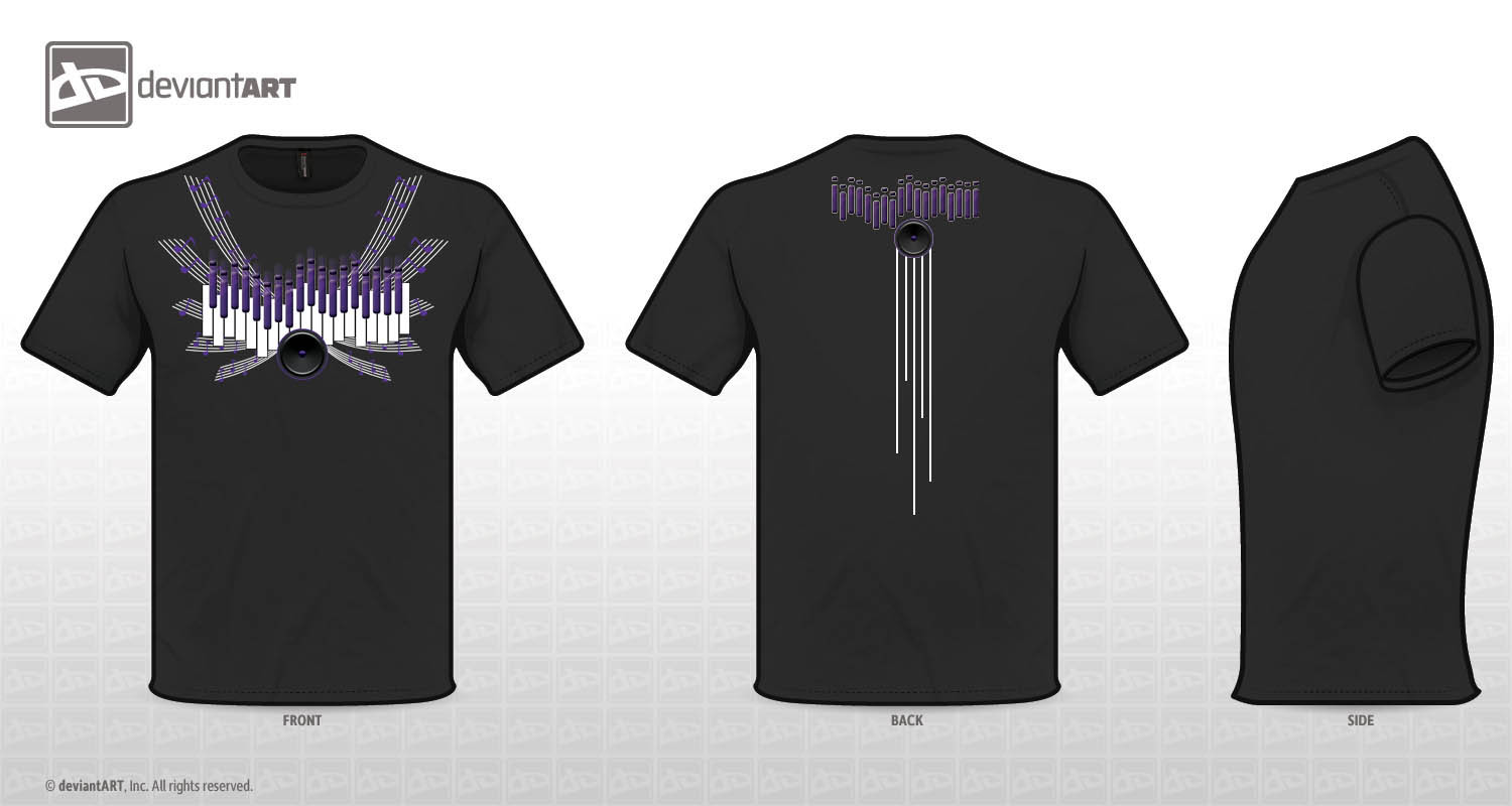
Music inspired T-shirt design for the Deviant Art Contest, hope everyone likes it. I'm always up for suggestions on how my designs can be bettered (Smile)")
I wanted to incorporate different elements of music into my design: Piano keys, equalizers, speakers and staff lines with notes on them as wings
Related content


Comments: 301


Love this design ! It has purple in it! It's a win in my book! Ha ha! The only advice I would give is to dim down the color usage. The shading seem to make more than 5 colors and I think that's all this contest allows. But that said it's really a great design!
👍: 0 ⏩: 1

Yes! Thats what i was afraid of lol. Thank you so much!
👍: 0 ⏩: 0

I like the symmetry of it the best. I don’t know if the speaker at the front was necessary. It’s perfect for the back but at the front it’s not clear if the speaker or the piano keys are the eye catcher. But all in all a very harmonizing design. Good job!
--
I don’t want to go to haven! It’s boring up there!!
👍: 0 ⏩: 1
Cool, I will play around with it some more, thanks for the advice!
👍: 0 ⏩: 1
Anytime my friend
--
I don't want to go to haven! It's boring up there!!
👍: 0 ⏩: 0

Wow, nicely done! I really like the design- I love all the elements- and I can see you put a lot of effort into it!! ;D The music wings are fantastic-
As for the advice- I must say something about the colours- because the comp was asking for 5 distinct colours--- and I'd be worried about the shading... and also the purple is a little dark (for a black t-shirt)- so I'd surround it is with a lighter colour to help it stand out...
But seriously- the design is gorgeous---

👍: 0 ⏩: 1
Thank you so much for the compliment! I agree with ur advice, i was afraid that the shadings would disqualify my design, but i've already taken so much color out... I was also thinking maybe i should put a brighter red instead. Thank you for your advice!
👍: 0 ⏩: 1
A brighter red is also a great way to make the lighter colours pop- ;D
And I totally understand- I had so much trouble limiting colours-! <3
👍: 0 ⏩: 0

Hi, YCL101!
I voted and wish you good luck!
Have a nice day, YCL101!
Best,
repris
................................................................
Please, look/vote for my desings:
[link]
[link]
With joyful thanks!
👍: 0 ⏩: 1
My pleasure, YCL!
Best,
repris
................................................................
Please, take a look/vote for my desings:
[link]
[link]
With joyful thanks!

👍: 0 ⏩: 0

thanks for commenting on mine by the way
👍: 0 ⏩: 1
No prob, great design! Good luck!
👍: 0 ⏩: 0
clean and beautiful dude you got a good look. im game dude worth the vote
👍: 0 ⏩: 1


love it
👍: 0 ⏩: 1

Looks nice
 (Wink)")
👍: 0 ⏩: 2

Overall your design fits the theme. The only thing I really wonder about are the number of colors. For printing purposes, shading can be complicate and the limit is 5 colors. I'm afraid the gradient in the speakers and fade above the keys would put you over that. So for the future try making the colors a little more distinct from each other. But good job anyways.
👍: 0 ⏩: 1
Yea... that was my concern as well lol "/ Thank you for the advice!
👍: 0 ⏩: 1
you're welcome.

👍: 0 ⏩: 0


Looking at this the first thought that came to my mind was "music has wings". Nice composition of elements. Thanks a ton for your vote, hope you like my other design submission (this one has been very popular) as well: [link]
Let me know your thoughts
👍: 0 ⏩: 0

I especially like the wings! Many people drew normal wings but this is way better. It makes me feel good ")
👍: 0 ⏩: 1

Hey, thanks for the comment! Yours is pretty good too. I like how you were able to make your lines so clean and make your objects so linear. The speaker looks great too. I can't tell from the distance, but what are the purple figures above the white keys? I think they should've been spaced like black keys on a piano, because as it is, it seems sort of cluttered. The scales and notes accent it well. Great job! : )
👍: 0 ⏩: 1
Thank you! The purple figures are supposed to be both equalizers and the black keys on a piano, i should have deleted a few of them... "/
👍: 0 ⏩: 1
Hey, no big deal man. I look back at my own entry and see a few things I wish'd I would have changed, but the important thing is to learn from your past, and keep on drawing for the future. : )
👍: 0 ⏩: 1

I like it. Does it have special meaning to you? If it does, then that's all that matters. Taking life as you see it and feel it and putting it down in art so that other people can get a chance to connect with it. Thanks for sharing your link with me.
👍: 0 ⏩: 1
Thank you. I actually entered the contest wanting to sharpen my graphic design skills, but once i dived in to the project, ideas just flowed. Music has been a great escape for me from the real world, so i definitely can relate to your design! Thanks again for checking it out!
👍: 0 ⏩: 1
Same here. This contest was a great practice opportunity, even if I don't get anything out of it. Next time though, I'm going to start on my entry a bit earlier instead of pulling an all nighter. XD
👍: 0 ⏩: 1
Haha, and i thought i was the only one! :-D
👍: 0 ⏩: 1
No man, I also think contests can be a great learning experience, and if handled the right way, you can really gain more by just what you learn. : )
👍: 0 ⏩: 1
I completely agree! I learned a couple new techniques and short-cuts while designing this piece. Feels good to be designing again!
👍: 0 ⏩: 0


reallly nicee! it kinda remains me of angel wings
👍: 0 ⏩: 1
Thank you! That was my thought exactly
👍: 0 ⏩: 0
<= Prev |