HOME | DD
 giadrosich — Tutorial: Part Ten
Published: 2008-06-01 05:26:38 +0000 UTC; Views: 1946; Favourites: 21; Downloads: 0
Redirect to original
Description
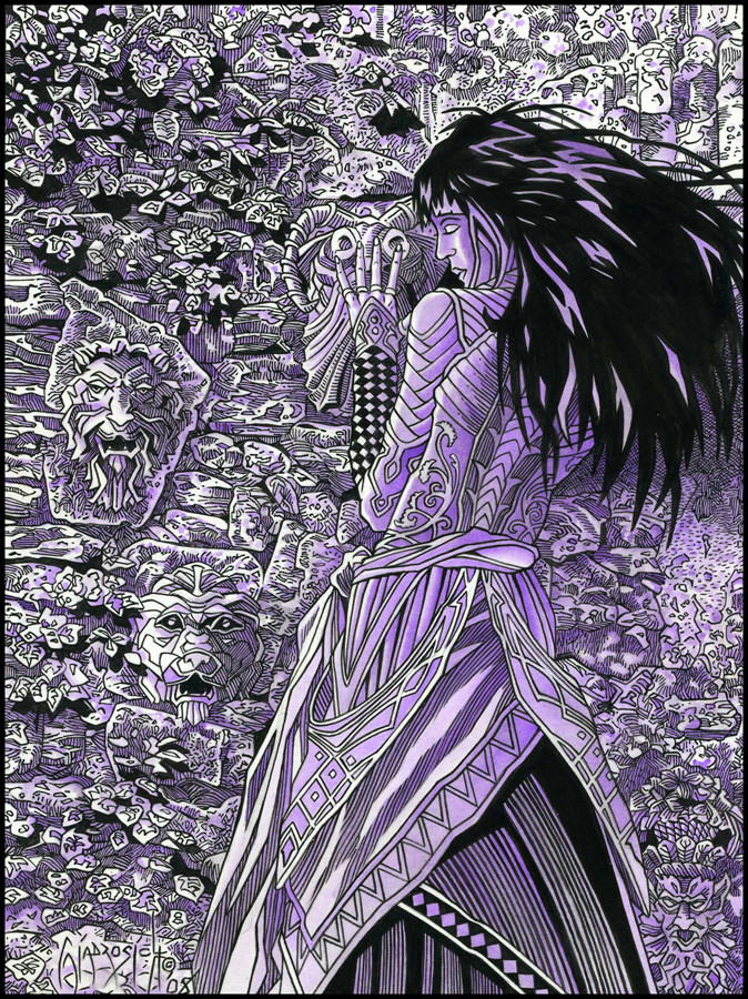
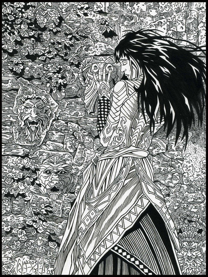
Original Size: 7.5x10Medium: Ink, Water-dyes, PrismaColor Pencils
Copyright Notice: 2008 by Bob Giadrosich/Sharayah Press. All Rights Reserved. Unauthorized reproduction prohibited by law.
Tutorial: Part One, Concept
Tutorial: Part Two, Pencil Outline
Tutorial: Part Three, Pencil Detail
Tutorial: Part Four, Ink Brush Work
Tutorial: Part Five, Ink Quill Work
Tutorial: Part Six, Under Painting Violet
Tutorial: Part Seven, Under Painting The Blues
Tutorial: Part Eight, Browns and Greens
Tutorial: Part Nine, Reds, Yellows and Oranges
Color Correction
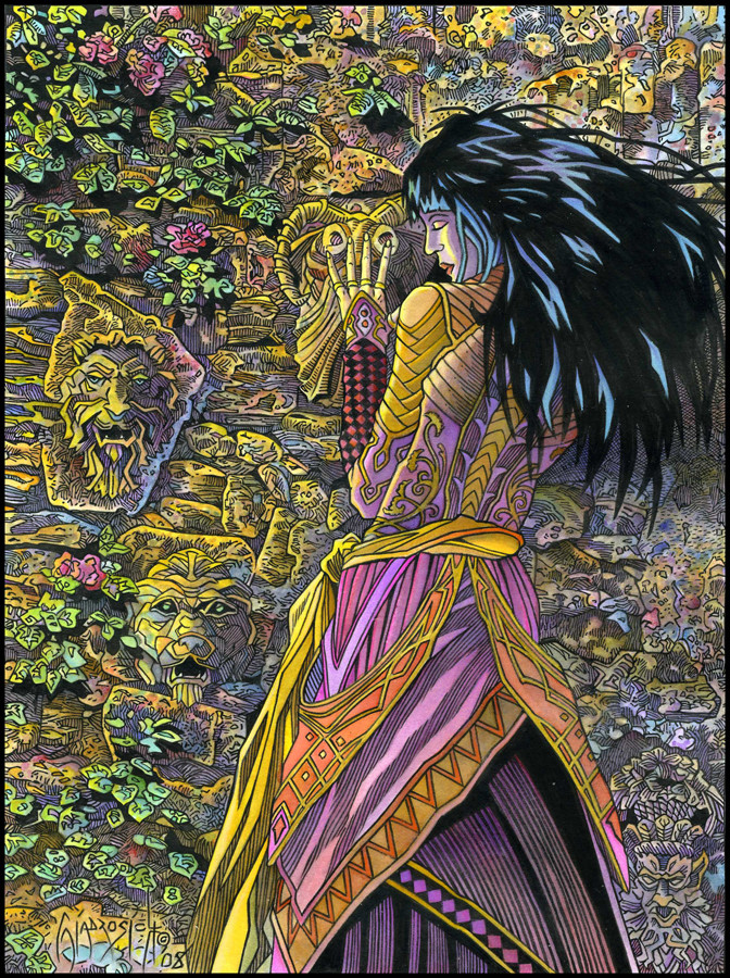
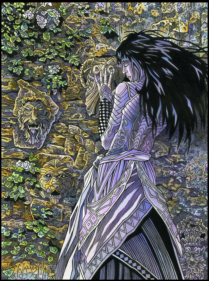
Before I turned to the Prisma Colors, I wanted to make sure that my base colors were exactly where I wanted them, so I did a bit of touching up with the water dyes. As I still had plenty of color left on my pallet, I rehydrated some of the colors to add additional shading here, a touch of color there.
You would have to look closely at Stage Nine and this one to see any real changes, because basically I added to the color that was already there. The one difference, now covered by Prisma Color, was the orange sash with the gold piping. I had to apply a few more layers of Tangerine in order to smooth the color out, because at the end of Stage Nine it was somewhat spotty in its consistency. Also, I wanted to go back in with the Sunshine Yellow and put another layer or two on the leaves, rocks, and the girl’s face to lighten these areas up a bit.
The only new water dye I used was Ice Blue on some of the leaves (in the detail), and on the tips of her hair (now covered with Prisma Color). All in all, I strengthened the colors which were already on the image. The colors are now brighter, deeper, and more prominant, ready for the application of the pencils.
I let the paper have a chance to dry overnight, and then went in with my colored pencils.
Processes of Highlighting
In this final stage, the results are probably the least noticeable but the most important. The very thing that gives the dyes their vibrancy is, when dealing with highlights, the very thing that works against them. Highlights are effective because of contrast. When a light is placed against a dark, it naturally jumps off the page or stands out in the viewer’s eye from the elements placed around it, creating the highlight. Here, I’ve tried to use the Prismacolor Colored Pencils in such a way as to help certain elements become brighter, as well as smoothing out other areas.
Here are the Prisma Colors that I selected and where I used them:
HENNA: A medium dark brown, this color was used in some of the shadow areas of the rocks to push them back one more time.
NEON PINK: On the left hand side of her dress, you’ll see the purple “v.” The piping here was gone over with the Neon Pink to pop it. Also, the left side of the flowers.
DECO ORANGE: A pale orange, I used this to pull out from the shadows the unlined shapes on the right side of the faces which appear in the shadows. Just something to add some visual interest.
SALMON PINK: Even after the added layers of Tangerine on the orange sash, I still wasn’t satisfied with the constancy of color, so I went over these areas with the Salmon Pink, unifying the different parts. The Tangerine was dark enough to allow the Salmon Pink to show up. I also went in on the left hand side of the forearm diamond design and colored the first two rows.
MEDITERANIAN BLUE: This was used sparingly in some of the rocky shadows, as well as on the right hand side of the image where her body is blocking the light.
DECO BLUE and DECO AQUA: These two colors were used to pop the highlights on the tips of her hair. The Deco Blue was used first, and then I came in with the Deco Aqua on the underside of the blue highlights. The Aqua is not very noticeable at all, but makes a difference in how the eye sees the Deco Blue.
SUNBURST YELLOW and SAND: These colors were used in combination to smooth out the fine piping on the dress which was affected by the bleeding of the other colors into this area. The sand also helped to bring out the piping on the diagonal sash with the diamond motif at the bottom of the dress.
CRIMSON RED: This was primarily used on the forearm design. I felt that the alternate colored and black diamonds weren’t strong enough, so I used the Crimson Red to deepen the design on the right hand side where the shadow was.
BLUSH PINK: Used in only one place. The corner of her eyelid.
LAVENDER: The Lavender was a great help in smoothing out different parts of her dress. Once again, the reds that were laid down a few stages ago were dark enough to hold color. Also, I used it on the interior of the “V” sash on the left hand side of her dress.
CREAM: The Cream was used on the highlight on her face and hand, as well as down the previously yellow highlight on the left side of her dress. You can also see where I touched up the highlight on her shoulder and the gold bands along her back, bringing the color down the left hand side of the dress and along the yellow sash to help separate it from the background.
DARK PURPLE: Used sparingly in the lined area at the bottom of her dress beneath the sash with the triangles to push the areas back in shadow.
ORANGE: The one part on the belt/sash, as well as the piping on the sash with the triangles.
Conclusion
So there you have it. The concept and sketch beginning this tutorial was posted on May 1st. Here we are with Part Ten, and the conclusion on June 1st; one month and (including this part) approxiamely 10, 868 words later.
Thanks to everyone who has been watching this tutorial unfold and commented along the way, and I hope, in some small way, this has helped to show the possibilities of this wonderfully versatile medium! I’m sure there are many more ways that they can be utilized, as of yet unexplored. That part, of course, is up to you.
Related content


Comments: 10

Bonjour
De dire que vous êtes un perfectionniste serait un euphémisme. Tous vos dessins respire le souci du détail. Une seule chose a dire : bravo
👍: 0 ⏩: 0

Hmm, have you thought about doing a book on Color with Water Dyes?
👍: 0 ⏩: 1

While I was doing the tutorial, I did flirt with the idea a little, but that would mean that I would have to completely systemize the method that I use for the color, lol! I think that was the hardest thing to do during the tutorial: to keep track of each step and then stick to it.
Usually, the process is much more intuitive, in that I often mix the steps as the need arises (except for the underpainting). On the other hand, I don't know if there are that many people who use the water-dyes this way anymore. Many folks use them as an airbrush tint, combined with liquid acrylic.
")
👍: 0 ⏩: 1
That you would. Even if you did several pictures all a little different you would have to hold the course. I think intuitive is what most of us do, and any artist creating a book probably has to struggle with keeping the steps in place.
👍: 0 ⏩: 1
"Struggle" is right! Sometimes I have no (well, very little) idea of why I do some of the things that I do, technique or otherwise. I feel as if I am blundering along, and when it turns out the way it does, I sit back and think "Gosh, did I do that?" It isn't what most people want to hear, but often, I don't feel like I am in control at all, lol!
👍: 0 ⏩: 1
Nope, it's not what they expect or want to hear, but that's the rest of the story.
👍: 0 ⏩: 0

As I said on the finished product, thanks SO much for this step-by-step walkthrough. It's always so fascinating to see how other artists work, and your steps were very clearly explained. Thanks!
👍: 0 ⏩: 1
Thank you, Heather! I'm glad that it helped in some small way. It was a lot tougher than I thought it would be, as I usually work much more intuitively, jumping around in the different stages as it takes place. I guess it is more organic, but for the tutorial I wanted to keep everything seperated so that folks could get an idea of what is going on!
👍: 0 ⏩: 0

Thanks, Olsie. I love the ink stuff, but I really enjoy the color work also. One of these days when I get the proper set up to shoot some of my oils, I post them. Since I like to paint large (usually around 3x4 feet) I don't have anyway to show the work here.
👍: 0 ⏩: 0