HOME | DD
 gppr — I'll wait for you
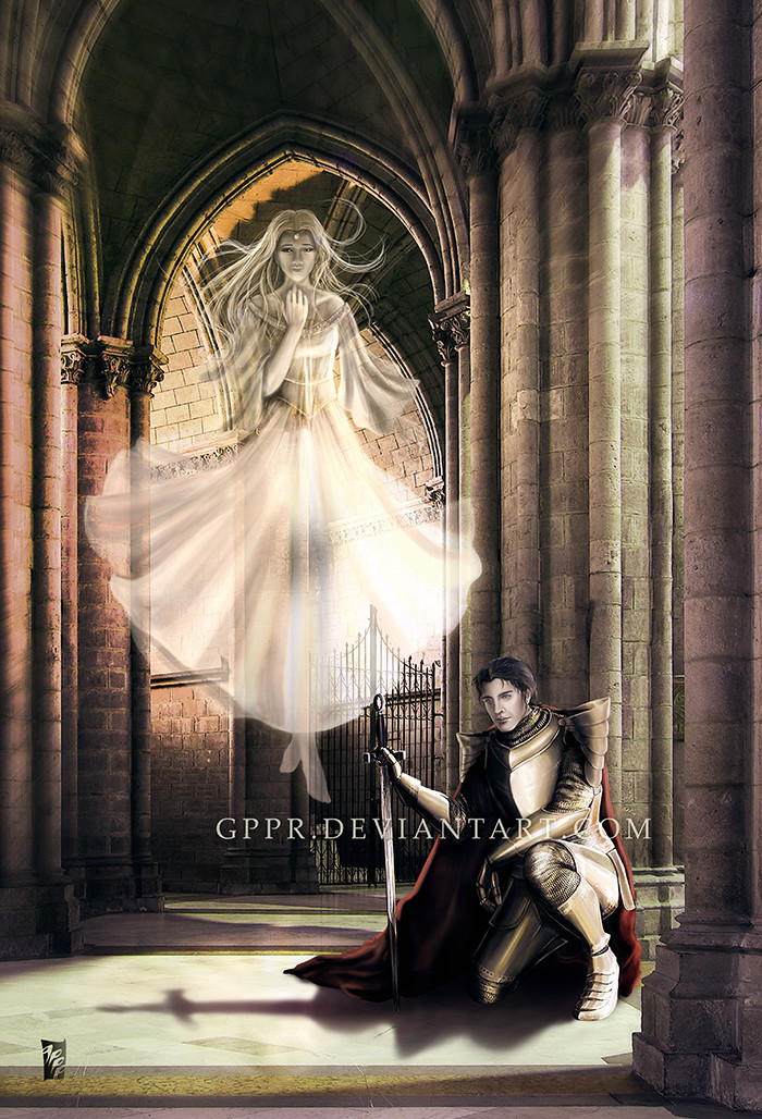
#castle #ghost #knight #middleages
Published: 2009-11-15 04:57:03 +0000 UTC; Views: 9588; Favourites: 339; Downloads: 0
Redirect to original
Description
Updated April 2021-----------------------------------------
Background photo from Itai Danan Neoluminance.com (manipulated with permission).
Related content


Comments: 192

the armor looks really nice already, you used the colors and light very well on that.
what you could work on a little bit more is the knights face, the color doesnt look very healthy especially in comparision to the bright vivid colors around him.
there are also some anatomical problems, but its not that bad at all, just keep practising!
i really love how you made the background and the ghost, its all so full of light and bright colors. maybe it would even look a little bit nicer if the ghosts face would shine a little bit more!
all in all a good piece!
👍: 0 ⏩: 1

Thank you very much for your feedback. Could you tell me what anatomical problems you see? I want to make this as good as it can be! And I'm not afraid of erasing and starting all over again if I need to... (although, I might not do it right away. ")
👍: 0 ⏩: 1
am i wrong or did you already rework it? somehow it looks much better already
what i would change a little bit is the leg he is kneeing on, it seems too much stretched away. im really bad at explaining so i tried a quick paintover, but its only a hint, not a rule! XD [link]
but like i said its already really good!
👍: 0 ⏩: 1
Yeap! I did. I'm glad it's looking better.
Thank you for taking the time to show me what you mean. It is very helpful and clear.

👍: 0 ⏩: 1
im so happy i could help!
and im impressed of how much work you put in your paintings, thats always good! keep it going!
👍: 0 ⏩: 0

This piece is awesome. First off, the overall color scheme is beautiful. The red really stands out. It helps with focusing on his life and vitality against her flowing, ghostly figure.
On the armor, the lighting is great. The only thing I can see is, there seems to be too much lighting on his inside leg. There's so much contrast in the shadowing on the rest of the armor, the other leg just seems somewhat odd.
The ghost looks beautiful. I have only two notes about her. One, her face is just very slightly off. Her nose is just a bit too low. Everything else is fine. But the key thing to remember is that the bottom-most edge of the nose is halfway between the eyes and the chin. Right now, the tip of the nose is at the halfway point. I don't know how easy that would be to fix. But even if you don't, she is still beautiful and would probably be fine with out it.
My other note is on her hair. The top half is fine. But the lower half closer to the tips is somewhat awkward. The strands are a little too think for the look you seem to be attempting. It could be easily fixed by filling it out a little more, or making the strands smaller. You want to be careful about making hair too stringy...otherwise it looks frizzy...of course the other way makes it look greasy. Uhm but it can be easily fixed.
Those notes though are more finer points. Everything looks great and it's obvious you have put a lot of work and effort into it. Keep it up!
👍: 0 ⏩: 1
Thank you very much for looking at this and leaving your feedback! I see what you mean about the proportions on the ghost's face very clearly now. I will work on improving that along with her hair and his armor.
👍: 0 ⏩: 1
No problem. It looks very good, those were the only details that stood out. Like I said, it's obvious you've worked super hard on getting it just right. I think you are very close to getting it. Once those things are tweaked, I think you'll find it satisfactory. ...maybe?
👍: 0 ⏩: 1
👍: 0 ⏩: 1

This is amazing. 
👍: 0 ⏩: 1
Thank you very much for you comment and the fave! I'm glad you like this, it has taken forever (and it's still not done  (Smile)")
👍: 0 ⏩: 1

Ok, here goes my try at commenting on something that isn't my my cup of tea. 


")
👍: 0 ⏩: 1
Thank you for your insightful feedback! I like the necklace suggestion... I'll see if I can pull that off along with the aging of the armor and the skin tone/scars for the knight. Thanks as well for adding this to your faves!

👍: 0 ⏩: 1

The armor is very good, especially the chainmail bits of it. I do wonder though if it's not a bit too shiny, too much bright light. Maybe a duller lighting would suit the mood better?
His face is overall pretty good as well, but it is somewhat flat on the emotion part. If he is supposed to be sad or remorseful I think you could tilt his eyebrows more or and maybe have his eyes half closed. And give his lip corners a downward slant.
If he is reflecting or remembering, just half closing his eyes is enough.
Something much harder to fix is his pose. It's not wrong I think, but if you had his left arm further away from his body, along with the sword, it would have made a more powerful pose to match the image.
As for the ghost face I think her eyes are a bit high in relation to the lower part of her face. It sort of looks like you wanted her face to be tilted down, which you definitely need to sink her eyelevel for. If it is down tilted we also would not see much of her nostrils
 (Wink)")
👍: 0 ⏩: 1
He's remembering. I think your suggestion regarding his expression a very good one. I'll work on that, or perhaps on adding emotion through a combination of lips, eyes and eyebrow revision.
The arm, do you mean the right arm, that's holding the sword? I think I'll move that. Comments on the earlier version of this did point out that he needed a bolder pose. Perhaps the closeness to the arm to his body is what caused that impression all along.
You have very keen eyes. Yes, I wanted her to be looking down originally but then changed my mind. I thought I had removed all traces of that, but I guess not. I'll fix the level of her eyes and the nostrils.
Thank you muchly for the detailed and very constructive feedback.
👍: 0 ⏩: 1
Glad to help
If weakness was something you wanted it could work out if his head was lower and his body tilted more towards the sword, leaning on it and keeping it close. To have both sword and arm further away opens up the pose. If you make it so that his shoulder and upper arm is higher so that he leans more heavily on the sword rather than resting his hand on it could look even better.
👍: 0 ⏩: 1
Thank you again for the suggestions. I can't wait to start working on them!
👍: 0 ⏩: 0

This is really nice. The ghost's face is really well done. Her expression is perfect.
I do have to say something about the soldier's right arm, though. It sort of looks like he's bending his arm inward to his torso, rather than letting his elbow hand straight down.
👍: 0 ⏩: 1
Thank you very much for your feedback. I'll try to correct that in my next revision.
👍: 0 ⏩: 0

with all due respect to the original this is so much better! even in a single revision the image seems more 'under control' as it were... the addition of the spirit in the background is really effective, and the lighting has been toned down perfectly. The work seems to tell more of a 'story as well, thanks to the spirit so I'd say it's a great improvement, well done!!
👍: 0 ⏩: 1
Thank you very much for the encouraging feedback. I'm glad you think the revision is effective. I got some more work to do still and I hope the next time it looks even better!
👍: 0 ⏩: 1
well it looks like you've put in a fair effort already so there shouldn't be too much to do now eh?
👍: 0 ⏩: 1
It shouldn't, but there is always something...
(g, who is never happy with her art XD)
👍: 0 ⏩: 0

Very very very cool. I very much like what you've done with the armor (sort of making it more "elvish" in design), and the emotion on the ghost's face is excellent. That sort of "about to cry, but the floodgates are straining to hold the torrent" look.
👍: 0 ⏩: 1
Thank you for commenting and faving this, dmaland! You caught the elvish influence on the armor and exactly what I wanted to do with the ghost's expression! 
👍: 0 ⏩: 0

Love the picture and the composition... it has lots of emotion.
Armor wise... I think the right thigh plate feels flat... and I think it could be fixed with a bigger gradient (adding new shades between the the gold and the dark.
I wonder... don´t you think the ghost feels a little to solid... I would have imagined her a little more like a smoke cloud... specialy in the air. I think ghost/smoke effect with the light rays would look great.
👍: 0 ⏩: 1
Thank you very much for your great suggestions. I particularly like the one about the smoke. ^^
I'll try that.
👍: 0 ⏩: 1

painting metalic crome effects can be a bit tricky. you have a nice start here, but the contrast between tones needs to be more extream. light and shadows dont blend much on metalics, they keep very sharp edges.
the ghosts face looks a bit plastic, i can tell you went for a wistful look, but it comes across as a bit bland. push her features a bit more and youl have it.
her pose also seems a bit static. my drawing professor called that being "flyswatted." try turning her body a few degrees off center for a more dynamic look.
love the color selection though. and good composition. you can easily read what the image is trying to communicate.
👍: 0 ⏩: 1
Thank you for your feedback! Yes, I think I understand what you mean with the edges on the colours of the metal needing to be sharp rather than blending. This is what I'm not certain how to do without it looking completely fake. But I will try and I will find some refs. You are right about the ghost's pose. lol. flyswatted! It would look better and more natural at an angle. Thank you for pointing this out.
👍: 0 ⏩: 0

This is great! The first thing I really see that bothers me is the light source. There seems to be two bright ones but you would only see the effect mainly of the one on the right. The right side of his face should be darker because it's in the shadow and comparing it to the armor, it looks rather awkward. Also, center of the armor should be more to the right or diagonal. After all, he's leaning, and the right side of the body seems too short. I love how you did the chain mail. I would love to see the details. The right thigh seems way, way too big compare to the left. The hands are great and there should also be more shadows on the thigh, imho. I like the sword, though the stretched out design bothers me. The right hand looks awkward. It's not the pose of a swordsman, and because of that, the sword seems a bit out of place. I suggest his hand should be on the handle rather than the pommel, and the sword a bit straighter.
The style of the ghost doesn't seem to fit with the rest of the picture. I think this is because of the dark lines around the top and around the hair. Other than that, I like it. I would prolly add some tears to her and make her lighter in the center, etc. Still, I like this.
👍: 0 ⏩: 1
Thank you very much for the detailed and awesome feedback. It is really helpful for me to improve. Funny but I actually moved the center of the armor to the left! :S All along it was fine... heh. I also had the impression of the thigh farther from the viewer to be too long. It matches the reference, but it does look off somehow. I'll correct that. Your comments on the shadows on his face also seem quite right to me (now that you mention it!). And definitely the way in which the hand holds the sword could be more natural. I wanted to let this sit for a while, I admit. But the feedback you and others have left me has given me direction and I'm eager to work on this again!
Thank you!
👍: 0 ⏩: 1
Yea, I know what you mean about letting artwork sit!
👍: 0 ⏩: 0
:icongimmiefeedback: This is great! The first thing I really see that bothers me is the light source. There seems to be two bright ones but you would only see the effect mainly of the one on the right. The right side of his face should be darker because it's in the shadow and comparing it to the armor, it looks rather awkward. Also, center of the armor should be more to the right or diagonal. After all, he's leaning, and the right side of the body seems too short. I love how you did the chain mail. I would love to see the details. The right thigh seems way, way too big compare to the left. The hands are great and there should also be more shadows on the thigh, imho. I like the sword, though the stretched out design bothers me. The right hand looks awkward. It's not the pose of a swordsman, and because of that, the sword seems a bit out of place. I suggest his hand should be on the handle rather than the pommel, and the sword a bit straighter.
The style of the ghost doesn't seem to fit with the rest of the picture. I think this is because of the dark lines around the top and around the hair. Other than that, I like it. I would prolly add some tears to her and make her lighter in the center, etc. Still, I like this.
👍: 0 ⏩: 0

I just have to say wow, even in this short time your art has improved incredibly! awesome work!
👍: 0 ⏩: 1
Thank you for your comment! I wish improvement came faster, though. The original knight is almost 2 years old...
👍: 0 ⏩: 0

Wow, I'm impressed!
This is an exceptional idea, and you pulled it off quite well. 
The only other thing that .. jumps out at me is that the rays of light seem to dictate the the source of light is in the top right. Yet the shadows of the knight's armour don't agree with that.
You might want to check that out. 
👍: 0 ⏩: 1
Thank you very much for your feedback and encouraging words. You have a very keen eye! I'll work on that lighting when I revise this.
👍: 0 ⏩: 1


Ah! I remember this piece from before the changes. Beautiful work!
I love the expression and form of the ghost's face, so my only critique is of the armor.
Excellent work and lighting all-around. The breastplate feels a little squished to me though. I think the reason is because the cast shadow from the left arm (his left) has a very smooth gradient. If the shadow was given a more solid, defined edge that would be all it needs. As is, the shadow feels more like an indention in the armor and not cast by the arm.
Marvelous reflection on the sword by the way! Hope this is a helpful critique. Great work!
👍: 0 ⏩: 1
Oh, indeed it does help. And it makes perfect sense. The metallic armor is what's given me the most grief on this piece. Thank you very much for the pointer!
👍: 0 ⏩: 1

Oh, I saw this recently! I noticed you took some things from your old picture and improved on others! The armour has a nice metallic look to it, maybe a little more shadow where the light doesn't hit directly? Although, I'm guessing with metal, you have reflections and such. I like the cape more in this one. For the girl, her face seems pinched in pain. Maybe a little more of a relaxed look? Unless, of course, you were going for the very painful expression. It's cool seeing what changes and improvements happen in a picture!
👍: 0 ⏩: 1
Thank you for your feedback! I was going for the pained expression for the lady. She can't keep her promise now... But someone made me think that if I change it to a grin, something more sinister would be transmitted.
👍: 0 ⏩: 1
<= Prev | | Next =>