HOME | DD
 mattdanna — User Interface Button Kit
Published: 2012-06-27 21:26:28 +0000 UTC; Views: 8563; Favourites: 154; Downloads: 0
Redirect to original
Description
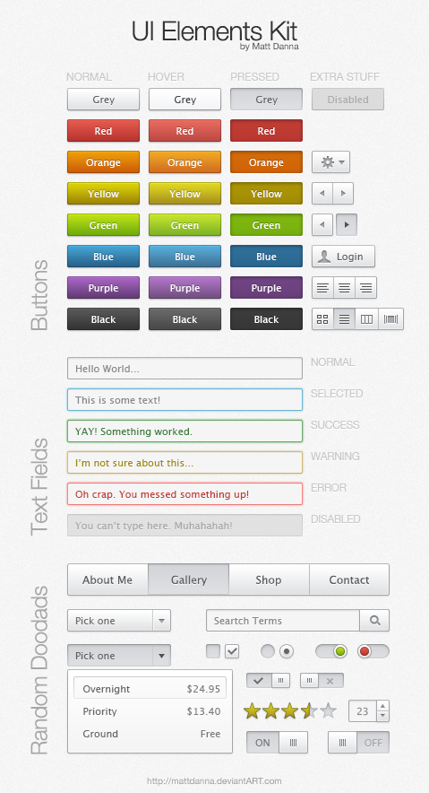
Here's a user interface button kit that I made for a side project. I thought I'd share because other people might find it useful.---
Update: Added in more UI elements...more to come!

Related content


Comments: 26


1. I know this is old
2. That's rude
3. It's cheap - $1.50 or 150 points.
👍: 0 ⏩: 1


They look so good! .3.
Can we use this in our deviantart's main profile page?
")
👍: 0 ⏩: 0


Wow! When I have more point's I'll buy this.
👍: 0 ⏩: 0

I couldn't stop laughing. This is really cool! I loved how you did this!
 (Smile)")
👍: 0 ⏩: 0

This is very clean and sexy.
One question, though. All of you buttons seem to use the "grayed when pressed" idea to show when something has been selected. This works out really well because it lends to the illusion of a button being physically pressed down in a virtual space when selected. Why then is your checkbox reversed? The empty, presumably default checkbox is grayed, and the check appears in the non-pressed box instead. This is counter to the rest of the buttons, in that if a user wants to enable a thing, they have to click on the grayed out box to ungray it and change the button to its "presssed" state.
In the grand scheme of things this is a teeny tiny nitpick. I was just wondering if you did that on purpose (with the idea that "checked" is actually the default) or if it just wasn't considered important.
Either way, keep up the great work!

👍: 0 ⏩: 0


")

Woops. Fixed the preview image.
👍: 0 ⏩: 1
 (Wink)")

Nice! Did you use photoshop? and if so, how did you get it at such a high resolution?
👍: 0 ⏩: 1
Yup! It's just Photoshop and the canvas has a resolution of 72 dpi (standard for monitors).
👍: 0 ⏩: 0


Why is the top-left "Red" in helvetica, but the other Reds look like Arial?
👍: 0 ⏩: 1


