HOME | DD
 SaViNgGrAcEs —
Blanched

Published: 2010-09-20 19:31:03 +0000 UTC; Views: 15378; Favourites: 583; Downloads: 304
Redirect to original
Description
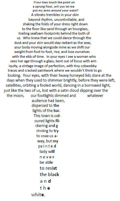
My first attempt at concrete poetry, submitted to 's concrete poetry workshop.The guidance was to try to re-structure a poem you had already written. Unfortunately, much of what I've written is pretty long, and I think this would have been more effective if I'd had something shorter to work with. Still, I enjoyed reworking an older piece, as it did help to add a new dimension of meaning to it for me.
EDIT: so I changed the picture to leave out any of the bold bits in the skirt. I've kept the shading on the legs, bevcause I don't think that was as confusing as the shading in the skirt


EDIT 2: Wow, DD?? Seriously?? Totally gobsmacked! Thank you to everyone for the lovely comments and the faves! Totally made my week


 This has definitely encouraged me to experiment more with concrete poetry!
Related content
Comments: 113

Thanks for your comments
I was just going for a vague skirt shape for the top half of the poem, and this was limited to my own drawing skills! I might see if I can clean some of the lines up though, keep it looking clear.
👍: 0 ⏩: 1

Very cool. Even as a straight/regular poem, it is good, but the visual element brings it to another level entirely.
👍: 0 ⏩: 1

Thank you, glad you liked it
👍: 0 ⏩: 0

I like the writing and the idea, but... the "shading" just confused me. I thought for a while there was some secret message in the bold parts. From the preview, it don't seem like the boldening adds much.
👍: 0 ⏩: 1

Thanks for your feedback! The 'shading' is something I'll have a look at. I was trying to play around with it looking more like an image than a bunch of words, but it seems to do more harm than good!
Thanks for letting me know your thoughts
👍: 0 ⏩: 1

Maybe you can just "highlight" in gradients of grey instead? Or have most of the image in a lighter grey and shade in with black letters here and there? I don't know how that would work out if you really wanted to make some changes.
👍: 0 ⏩: 0

I think it's a great piece of work. Seems to totally embody the concept of concrete poetry, and the verse itself is very good as well.
👍: 0 ⏩: 1

Thank you, I'm glad you enjoyed this
👍: 0 ⏩: 0

This must have been quite difficult to shape, i admire it. However I think the bold effect here and there has a random feel. I think the shape your poem made did justice to the typographical requirement. Otherwise, interesting work
👍: 0 ⏩: 1

Thanks for your comments
I was trying to get some movement into the 'skirt' bit, really, and add some shading of some sorts with the bold part. I don't know if this helped, but I based it on an actual drawing and wanted it to appear as image-like as possible. I guess after a while I stopped seeing the bold/non-bold contrast, so I needed an outside view to tell me it felt a little bit random.
Thanks again
👍: 0 ⏩: 1

Oh, I see, well if you were going for shading it might have been wiser to avoid bolding any of the middle parts, because light would technically fall on one part of the skirt and the other side would be darker in contrast.... anytime
👍: 0 ⏩: 0
<= Prev |


