HOME | DD
 SimonSoys — Color Comparison
Published: 2011-03-25 14:27:26 +0000 UTC; Views: 1044; Favourites: 31; Downloads: 13
Redirect to original
Description
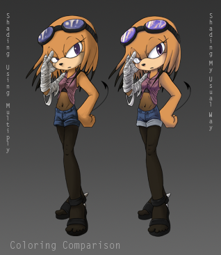
Just wanted to see the difference between the two submissions. It's small and stupid, but I like comparing things.
Related content


Comments: 12

i prefer the one to the right on the pic,purly because it has more detail in the sharing and effects in the goggle/glasses she has,but overaall,brillaint picture
")
👍: 0 ⏩: 1

Personally i think both ways of shading are pretty good. The shading done on the left gives a more darker look to her (in a way) and the ne on the right looks a tad more gentle. But they both look pretty good
 (Smile)")
👍: 0 ⏩: 1

Yeah, that makes sense. I prefer my usual style, but I did like the depth the one on the left has a little more. Something about it looks more... 3D.
Thanks~!
👍: 0 ⏩: 0


Oooh, thanks~ Me too. x3
👍: 0 ⏩: 0
