HOME | DD
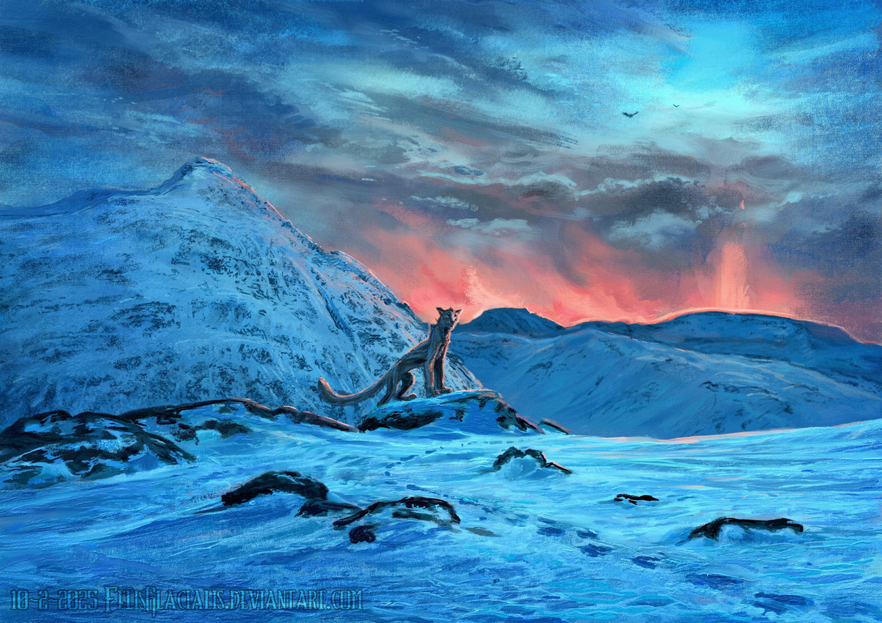
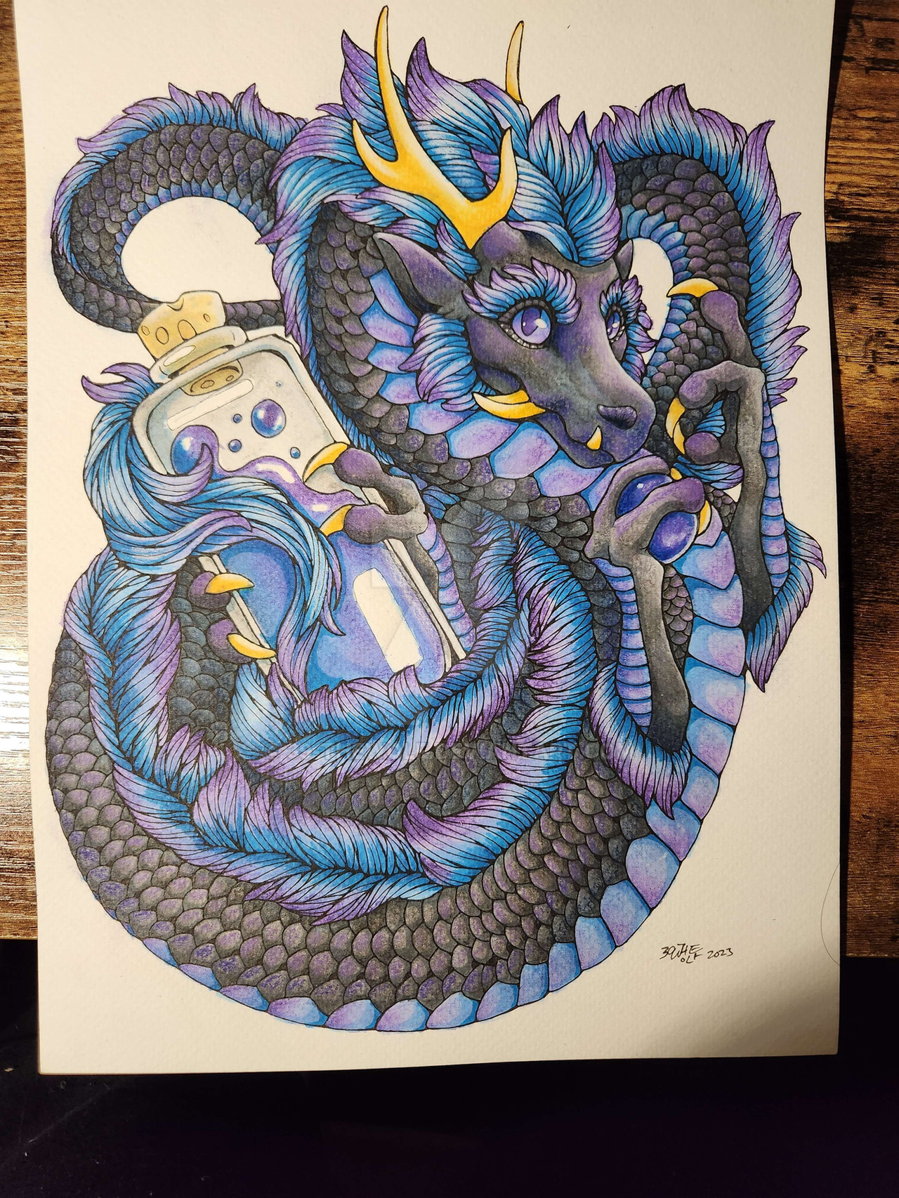
 zarathus — Oppression
Published: 2006-06-13 03:35:31 +0000 UTC; Views: 10427; Favourites: 378; Downloads: 1137
Redirect to original
Description
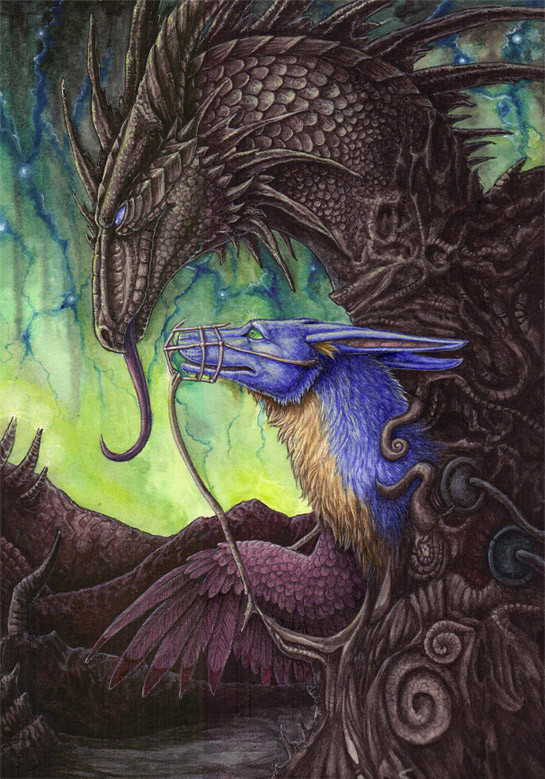
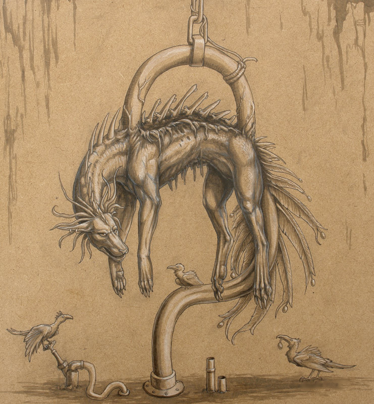
Something I started last year. I don't feel like I can really call this "finished" since there are so many things that bother me about it, but I can't be bothered spending any more time on it for now.And the scan made it look even worse. Blah.
Related content


Comments: 256

It's awesome, the details, everything! 
👍: 0 ⏩: 0

i realy cant see a single error with shading...Although i do suck horribly at shading. I think its great, the ammount of detail and the background
👍: 0 ⏩: 1

I was aiming for more contrast with shading in it, and didn't manage to acheive that, which is what my problem with it is. But thanks very much
👍: 0 ⏩: 0


ah, we are often our own worse critics, eh?
but I will say this: I think that this is perhaps one of your best works. The color, I can't quite place what it is about it, the real-medium as opposed to the digital coloring really amplifies the texture and detail of this picture. and the spirals/designs are a wonderful touch and a treat for the eyes to follow and get lost in. But that is just it: the detail, the method of how you colored this, I can't figure out how to articulate it without feeling like I'm repeating myself or not making any sense. From the background to the characters themselves, this is really a breathtaking piece.
👍: 0 ⏩: 1
Thank you. I've found that a few different subjects in art, usually look best in real media. Though in ways I'm just all around more fond of real media, opposed to digital. Watercolors for detail have also come across as being a lot easier than trying to atriculate finer detail in.. acrylics, for example. I guess I'd say out of the different sorts of paints I've used, watercolors would be my preference.
But yeah, thank you. I'm glad you like it.
👍: 0 ⏩: 0

Not sure if this has been asked yet or not, but how'd you do the background? It's preeeetty!
👍: 0 ⏩: 1
Well, the whole picture was done with watercolors. I did the sky first, then the rest of the background, and the characters from there.
👍: 0 ⏩: 1
-Nods.- I read that you had said it was done in watercolor, but I'm curious as to what specific procedures/methods you used to get the sky like that? Thanks!
👍: 0 ⏩: 0


👍: 0 ⏩: 0

this piece is very beautiful... very nice. It's artistic and yet not too surreal
👍: 0 ⏩: 0

oh wow...this is great....this rocks.
👍: 0 ⏩: 0

you're alive! nice to see your art again and although I don't see the flaws you're talking about, sometimes being a perfectionist is the best way to excell at something
👍: 0 ⏩: 1
I'm... sort of alive. I might try and submit something else some time soonish. And hmm. Perfectionism is okay, I guess, although it can be frustrating when you just can't get things to look right, and seemingly have to settle on something you're not happy with ")
👍: 0 ⏩: 0


the details are......incredible. the coloration is fantastic.
a realy cool picture....respectz of my site
👍: 0 ⏩: 0

oh just realised somebody had already asked that question x3
👍: 0 ⏩: 1
Heh, yep.. just watercolors. Glad you like it
👍: 0 ⏩: 1
wow friggieness!
I have to say I think it's beautiful! can't see what bothers you so much, the sahding looks fine to me
what kind of paint did you use, if I may ask so.
")
👍: 0 ⏩: 0

Simply breathtaking... and dog... theres are days at the moment that I feel just like that
👍: 0 ⏩: 0

i think its amasing. i cant judge the shading really, i think its awsome, but i love to hear that you dont think its perfect, which is great of you too think so. thats the sign of a true artist never truly happy with your work, but its amsing to my eyes
👍: 0 ⏩: 1
Heheh, thank you
👍: 0 ⏩: 1
hehe well least you always have that desire to improve ^^
👍: 0 ⏩: 0

Wow the details in this are so beautiful seriously I am like blown away.
👍: 0 ⏩: 0

You are the leet artist, all the different textures are amazing...I wish the zarathus rp board hadnt died...I had fun on it while it lasted :/
👍: 0 ⏩: 1
I guess I entirely forgot about the roleplay... seems like it died forever ago. But I guess I no longer have any desire to roleplay, other than maybe a particular anthro character of mine. But it's good to know you enjoyed it while it lasted.
And thanks.
👍: 0 ⏩: 0

I like it, it inspired me to make a draw.. hope I find the time to do it ._.U
👍: 0 ⏩: 1
Oh, cool... I'm glad it was able to inspire you ")
Thank you.
👍: 0 ⏩: 0

I love the bottom of the image most. Just that all of the detail and design in it make it stand out as really wonderful. This is oddly beautiful in some sense.
👍: 0 ⏩: 0
I think this is amasing... but thats only cuz I can't draw stuff like this, maybe you are rite and there are flaws 
-D.G.
👍: 0 ⏩: 1
Heheh, I'm glad the flaws aren't too obvious at least
👍: 0 ⏩: 0

Still looks pretty amazing all the same. beautiful symbolism, and the tonal qualities set the mood nicely.
Actually, the more I look a it, the more I see...
👍: 0 ⏩: 0

Ah, artists are always over critical on their own work. I think it's awesome. The details are so...detailed! It's like, wow! What media is it painted in? My guess is watercolour and acrylics.
Cerulean
👍: 0 ⏩: 1
Yeah, it was done just with watercolors. Thanks
👍: 0 ⏩: 0

Wow... that's all I can say is wow. You really beat yourself up too much; this work is so detailed and beautifully done that if there are any flaws, I certainly can't find them. The way you used color is excellent, and the shading and texturing are extremely realistic. I wish I knew how to do fur like that; my fur always looks so flat and too neat and trim to be natural fur. The details in the dragon cave/sculpture are mind-boggling; I can only imagine how long it took you to do this. The concept is also very interesting. It seems to be very open to interpretation, because the "muzzle" around the snout definitely says to me oppression of some sort. I don't know, but this work seems to say to me that someone, whether it be society or high individuals, don't want you to speak your mind. I'm probably way off, but that's how I interpret it.
👍: 0 ⏩: 1
Well, I'm glad the flaws aren't too glaringly obvious, at least. I can't seem to help but concentrate on them But as I said in the description, it's mostly just the shading I have issues with.
It's good to hear your interpretation, too. I always like to hear others' views on my art  (Smile)")
👍: 0 ⏩: 1

I know this is a late reply (picture is awesome as par always) but I think the reason why your so critical on your art whilst others may not understand why, is simple... you spend how ever many hours on a picture and these things usually become blantaintly obvious to you because youve been staring at it for ages and working through it... Im sure if I starred at this drawing for 4793084 hours id probably notice the flaws you speak off =3
But hey even so, its good to be critical apon yourself, helps you become even more better, just dont beat yourself up over it =3
Much love to you Zara *hug*
(must do fanart for you)
👍: 0 ⏩: 1
*nods* Yeah, exactly. When you sit and stare at something for so long, while comparing it to reference or whatever else, you really do notice whatever minor flaws it might contain. And I guess it's also that, which can lead to being significantly disappointed. Spending so long on something, but continuing to see endless little flaws in it despite that. It all kinda fails like that.
But thank you
👍: 0 ⏩: 0

A true artist hatest their artwork. Not sure if this is always the case, but meh...
The dragon pose looks like something I remember seeing from an OC with myself and Ged. The background is so very nice! You've mastered watercolours!
👍: 0 ⏩: 1
Dunno, I just find it difficult not to concentrate on the flaws in most of my stuff
And thank you
👍: 0 ⏩: 0

The symbolism is overwhelming. From the great black dragon bursting from the crawling roots of the floor, to your muzzled self and the horror/shock-filled eyes. It really speaks for itself.
👍: 0 ⏩: 1
Thank you
👍: 0 ⏩: 0

Awesome as usual! But you have really improved!
I really wish I could do something like that x__x
This dark creature reminds of the ones you spoke of, the ones in your nightmares...
But I'm very probably wrong :\
👍: 0 ⏩: 1
Oh, thank you
And no, you aren't wrong, actually. I continue to have a lot of, erm... odd sort of dreams which have all sorts of random creatures in them.
👍: 0 ⏩: 0
Ive found that if you stress about it too much you'll never be happy with the end result. So don't worry about it, it still looks brilliant
👍: 0 ⏩: 1
Yeah, that is true I suppose. Especially if you sit and pick over every little detail you consider to be incorrect.
Thank you though. I'm glad you like it.
👍: 0 ⏩: 0
I've found that if you stress about it too much, you'll never be happy with the end result so don't worry about it, it still looks brilliant.
👍: 0 ⏩: 0


im trying to think of what that sky reminds me -- but anyways very nice job on the thing -- only thing I could say is see if you could play w/ it to get a bit more contrast out of it ^.=.^
👍: 0 ⏩: 1
<= Prev | | Next =>