HOME | DD
 dev-IAN-t — The Tower of Religion

Published: 2005-08-01 22:18:32 +0000 UTC; Views: 153; Favourites: 2; Downloads: 13
Redirect to original
Description
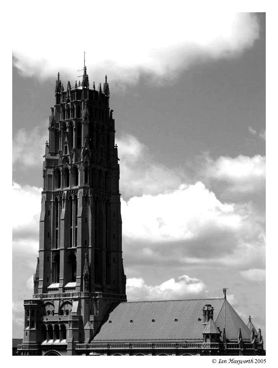
After requests to see this one in b&w and my own curiosity to see how it would turn out, I finally tried it and I think it is much stronger this way. It just might even knock to original into scraps I think. Here is the original [link] Give me your opinions...:EDIT: Worked with the levels a bit to give the tower more separation from the background. It was looking a little too flat and greyed out. Let me know what you think...


 :EDIT:
This is a shot taken from the balcony of my Aunt's apartment in NYC. It is of the tower of Riverside Church nearby. It is a Baptist church that was funded in large part by John D. Rockefeller Jr. and is built in the French Gothic style. The interior is based on the Chartres Cathedral, and the church's bell tower is based on Laon Cathedral and is actually a 21-story steel-frame high-rise. Yeah, I did some research...


 Not a bad view from the balcony either...
As usual, comments, critiques, and


 s are appreciated...


Related content
Comments: 6

That looks really nice, I think that in the black and white version the shadows are more defined, giving the scene more depth. Nice job
👍: 0 ⏩: 0

I think the b&w works better for this concept. It seems more harsh, more meaningful in the black and white. I think the colors detracted from that a bit
👍: 0 ⏩: 1

i agree with you from that point. i am just not sure from a compositional point if it is too greyed out...
👍: 0 ⏩: 1

even so, I think it still overpowers enough to make it better. The greyness, you may be cutting it close but how much can you do? the building itself wasn't actually white was it? I guess just fool around with it a bit more and see if you can't find a better contrast and brightness combo to make it look exactly how you want
either way, I think it's super rad
👍: 0 ⏩: 0

I love the black and white, this just gives me the chills.
Congrats on a fab piece
👍: 0 ⏩: 0

the black and white is very nice. sometimes, the black and white is necessary. gives a stronger sense of emotion, i think. is this for oneword?
👍: 0 ⏩: 0


