HOME | DD
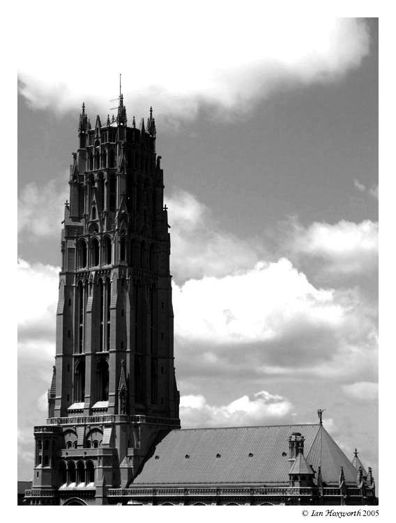
 dev-IAN-t — Nightfall on Walter Hall
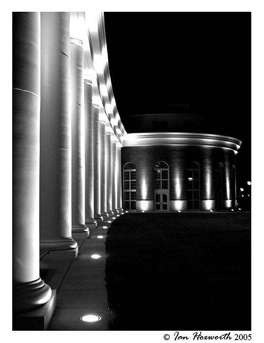
Published: 2005-05-11 01:18:16 +0000 UTC; Views: 700; Favourites: 20; Downloads: 109
Redirect to original
Description
This is the same shot that I took of Walter Hall . Take a look and let me know which one you like more.:EDIT: I sharpened the image up just a touch. I didn't want to make it completely sharp due to the feel that it has being just slightly blurred. Let me know what you think... :EDIT:
And, as usual, comments, critiques, and
 s are appreciated
  (Smile)")
Related content


Comments: 63

The depth and contrast just works. It's amazing. The lack of color makes it stronger.
My eyes went from left to right along the columns.. which is perfection.
Good work.
👍: 0 ⏩: 0

Wow, i love the contrast in colours
👍: 0 ⏩: 0

I agree with the previous posters: the B&W is awesome. I love the lines of light and the contrasting darkness. very awesome shot. You're quite talented!
Jenny
👍: 0 ⏩: 1

thanks very much for the nice words...
👍: 0 ⏩: 0


I really, really like this shot. It has great depth and contrast, and keeps my eyes moving. The only thing that I would change is - that I would remove the four lights on the far right.
👍: 0 ⏩: 1
thanks for the comment... i am planning to take some more shots of this building when i go back to school in the fall. there is plenty more that i want to try with it.
👍: 0 ⏩: 0

This one i like more than "Water Hall". It's maybe because the light effects come better in bw. faved.
👍: 0 ⏩: 1

Very, very beautiful. Did you get another photo, of just the pillars, just out of curiousity?

👍: 0 ⏩: 1
hmmm...i looked and i can't seem to find the other shots that i took that night... they must have not gotten backed up when i copied the stuff off of my computer at school ")

👍: 0 ⏩: 0

Very nice. The composition is beautiful, with the eye gradually being drawn by the columns at left to the building in the center. B&W was a good idea for this.
👍: 0 ⏩: 0


The lighting here is very dramatic and makes good effect. What I like most about this is that since the edge of the sidewalk is so dark, it seems like its a cliff to fall into never ending darkness.. Heh, that or 2:27 am. is too late for me to be right in the head.
👍: 0 ⏩: 0

Great contrast here... The light really seems to carve out shapes in the dark which adds a ton of interest.
👍: 0 ⏩: 0


i like this one better.. great angle and nothing distracting..
👍: 0 ⏩: 0

I really like this shot... there is some dead space but i think it is still balenced and flowing... good job...
my gallery.. [link]
👍: 0 ⏩: 0


I love the lines in this picture, however, it seems to be just barely out of focus... almost perfect, but not quite. Great shot!
👍: 0 ⏩: 0

i relaly like this, great black and white shot
👍: 0 ⏩: 0

Liking the b&w and how the lights look. It's cool how everything is illuminated.
👍: 0 ⏩: 0

The linear and light play of this photo are sooo cool!
👍: 0 ⏩: 0

no wonder you add it twice
I don't easily see black and white compositions where there is a lot of lights and possible colors. this is different and facinating in many ways. not the typical post card feeling in it due to the crop, and not the classical night shot due to the black and white scale. beautiful!
keep it up!
 (Wink)")
👍: 0 ⏩: 0


I love the lighting, blur, glow, everything. Very mysterious, and almost spooky! Black and white is always a winner.
👍: 0 ⏩: 0


very cool - I like the b&w better
the angle is interesting and the little lights give it a nice touch

👍: 0 ⏩: 0


I prefer this one, I have a thing for black and white work tho ")
👍: 0 ⏩: 0

that is amazing in black and white, great perspective.
👍: 0 ⏩: 1

this is great! the B&W serves it very well... the lighting is also very nice, it adds highlights to spots and makes it very interesting
👍: 0 ⏩: 1


lovely angle... looks a bit blur though.. or is it only me?
i'd love to go there.. it looks really nice

👍: 0 ⏩: 0

I think that this picture looks better this way b/w, the only thing I didn't like was the way that the top part of the building disappears because of the absence of light
👍: 0 ⏩: 0

Beautiful play with shadows and lights! Love it!
👍: 0 ⏩: 0


i love the contrast between light and dark values and I really like the continuing feel to it.
👍: 0 ⏩: 0


I absolutely -adore- this photo. The angle is perfect an the lighting just gives it an amazing feel. Really awesome!
👍: 0 ⏩: 0

The school building in b/w, marvelous! You can really see the contrast and beauty between the night and light in this now manipulated photo! Great work!
👍: 0 ⏩: 0

That's a very cool shot. I love the lighting.
👍: 0 ⏩: 1

nice shot, I like it much more in b+w..
all the contrast is awesome...
👍: 0 ⏩: 0

i like both the color and b&w shots, but i think ive got to agree, the b&w looks cooler, black and white is always elegant, but yeah, it works well and really brings out the contrast between light and dark, the pools of light, agina, this time projected up instead of down like in the alley pic, i'll have to remember that effect for designing stuff
👍: 0 ⏩: 0
| Next =>