HOME | DD
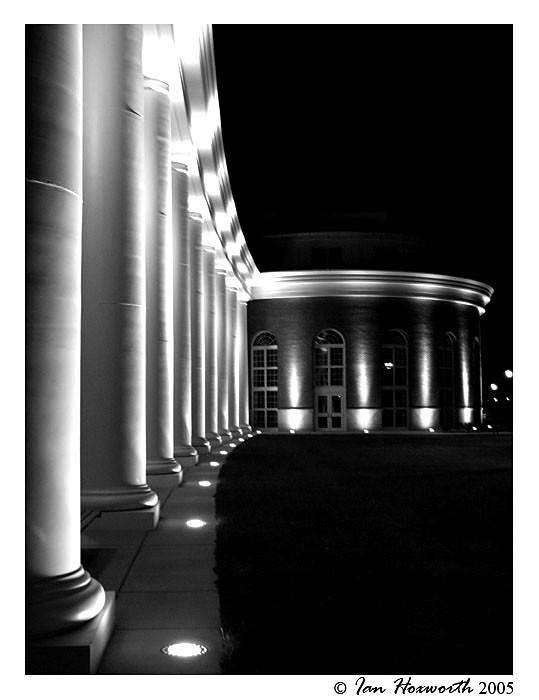
 dev-IAN-t — Nightfall on Walter Hall
Published: 2005-05-11 01:18:16 +0000 UTC; Views: 700; Favourites: 20; Downloads: 109
Redirect to original
Description
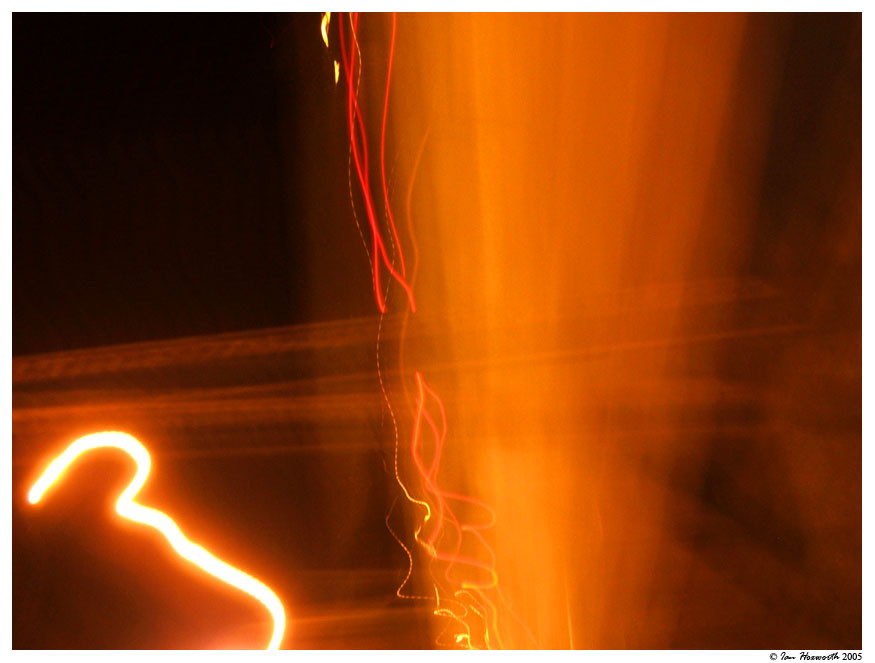
This is the same shot that I took of Walter Hall . Take a look and let me know which one you like more.:EDIT: I sharpened the image up just a touch. I didn't want to make it completely sharp due to the feel that it has being just slightly blurred. Let me know what you think... :EDIT:
And, as usual, comments, critiques, and
 s are appreciated
  (Smile)")
Related content


Comments: 63


i dont know which i like more, the color one adds more too it, and this one with the black and white looks cool. i cant decide, both are really good
")
👍: 0 ⏩: 0

Cool shapes. I like this a lot in black and white The light and the columns make awesome shapes.
👍: 0 ⏩: 0

OOOH....black and white. I lovvvve how this looks.
👍: 0 ⏩: 1

 (Wink)")


This definitely has potential.
I feel that there's too much black. It outweighs the light, making it feel a little lopsided.
May I inquire as to what's the big black square on the bottom right? Is it a pool, or just some tiles? Perhaps you could also enhance the brightness there.
The left column's light outshines the right... I don't really get a balanced feel. Perhaps you could tweak the brightness on the right a little higher?
Hope this helped~

👍: 0 ⏩: 0

i really like the curve leading into the shot, very nice, the corner looks a bit weird, a shot from a higher angle to the columns might have made that transition smoother, but its quite cool.
👍: 0 ⏩: 0

see ? a lot better
no distracting colours here.. just shadow and light play
and you get a +fav
👍: 0 ⏩: 1

thanks very much! glad you like it. i think it looks pretty sharp too. thanks for the suggestion as well.
👍: 0 ⏩: 1
sometimes colours destroy sharpness. especially when you don't use filters.
👍: 0 ⏩: 0